3 Make a plot
This Chapter will teach you how to use ggplot’s core functions to produce a series of scatterplots. From one point of view, we will proceed slowly and carefully, taking our time to understand the logic behind the commands that you type. The reason for this is that the central activity of visualizing data with ggplot more or less always involves the same sequence of steps. So it is worth learning what they are.
From another point of view, though, we will move fast. Once you have the basic sequence down, and understand how it is that ggplot assembles the pieces of a plot in to a final image, then you will find that analytically and aesthetically sophisticated plots come within your reach very quickly. By the end of this Chapter, for example, we will have learned how to produce a small-multiple plot of time series data for a large number of countries, with a smoothed regression line in each panel. So in another sense we will have moved quite fast.
3.1 How ggplot works
As we saw in Chapter 1, visualization involves representing your data data using lines or shapes or colors and so on. There is some structured relationship, some mapping, between the variables in your data and their representation in the plot displayed on your screen or on the page. We also saw that not all mappings make sense for all types of variables, and (independently of this), some representations are harder to interpret than others. Ggplot provides you with a set of tools to map data to visual elements on your plot, to specify the kind of plot you want, and then subsquently to control the fine details of how it will be displayed. Figure 3.1 shows a schematic outline of the process starting from data, at the top, down to a finished plot at the bottom. Don’t worry about the details for now. We will be doing into them one piece at a time over the next few chapters.
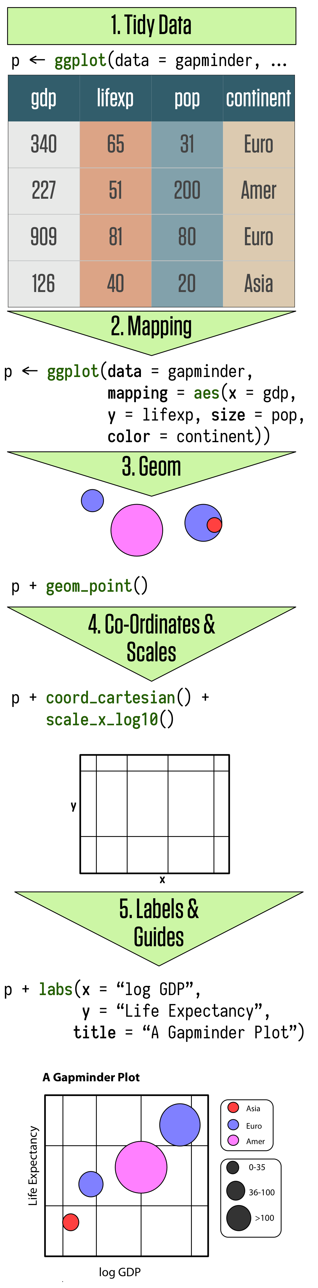 Figure 3.1: The main elements of ggplot’s grammar of graphics. This chapter goes through these steps in detail.
The most important thing to get used to with ggplot is the way you use
it to think about the logical structure of your plot. The code you
write specifies the connections between the variables in your data,
and the colors, points, and shapes you see on the screen. In ggplot,
these logical connections between your data and the plot elements are
called aesthetic mappings or just aesthetics. You begin every plot
by telling the ggplot() function what your data is, and then how the
variables in this data logically map onto the plot’s aesthetics. Then
you take the result and say what general sort of plot you want, such
as a scatterplot, a boxplot, or a bar chart. In ggplot, the overall
type of plot is called a geom. Each geom has a function that creates
it. For example, geom_point() makes scatterplots, geom_bar() makes
barplots, geom_boxplot() makes boxplots, and so on. You combine
these two pieces, the ggplot() object and the geom, by literally
adding them together in an expression, using the “+” symbol.
At this point, ggplot will have enough information to be able to draw
a plot for you. The rest is just details about exactly what you want
to see. If you don’t specify anything further, ggplot will use a set
of defaults that try to be sensible about what gets drawn. But more
often, you will want to specify exactly what you want, including
information about the scales, the labels of legends and axes, and
other guides that help people to read the plot. These additional
pieces are added to the plot in the same way as the geom_ function
was. Each component has it own function, you provide arguments to it
specifying what to do, and you literally add it to the sequence of
instructions. In this way you systematically build your plot piece by
piece.
In this chapter we will go through the main steps of this process. We
will proceed by example, repeatedly building a series of plots. As
noted earlier, I strongly encourage you go through this exercise
manually, typing (rather than copying-and-pasting) the code yourself.
This may seem a bit tedious, but it is by far the most effective way
to get used to what is happening, and to get a feel for R’s syntax.
While you’ll inevitably make some errors, you will also quickly find
yourself becoming able to diagnose your own errors, as well as having
a better grasp of the higher-level structure of plots. You should open
the RMarkdown file for your notes, remember to load the tidyverse
librarylibrary(tidyverse) and write the code
out in chunks, interspersing your own notes and comments as you go.
Table 3.1: Life Expectancy data in wide format.
| country | 1952 | 1957 | 1962 | 1967 | 1972 | 1977 | 1982 | 1987 | 1992 | 1997 | 2002 | 2007 |
|---|---|---|---|---|---|---|---|---|---|---|---|---|
| Afghanistan | 29 | 30 | 32 | 34 | 36 | 38 | 40 | 41 | 42 | 42 | 42 | 44 |
| Albania | 55 | 59 | 65 | 66 | 68 | 69 | 70 | 72 | 72 | 73 | 76 | 76 |
| Algeria | 43 | 46 | 48 | 51 | 55 | 58 | 61 | 66 | 68 | 69 | 71 | 72 |
| Angola | 30 | 32 | 34 | 36 | 38 | 39 | 40 | 40 | 41 | 41 | 41 | 43 |
| Argentina | 62 | 64 | 65 | 66 | 67 | 68 | 70 | 71 | 72 | 73 | 74 | 75 |
| Australia | 69 | 70 | 71 | 71 | 72 | 73 | 75 | 76 | 78 | 79 | 80 | 81 |
3.2 Tidy data
The tidyverse tools we will be using want to see your data in a particular sort of shape, generally referred to as “tidy data” (Wickham, 2014). Social scientists will likely be familiar with the distinction between wide format and long format data. In a long format table, every variable is a column, and every observation is a row. In a wide format table, some variables are spread out across columns. For example, Table 3.1 shows part of a table of life expectancy over time for a series of countries. This is in wide format, because one of the variables, year, is spread across the columns of the table.
By contrast, Table 3.2 shows the beginning of the same
data in long format. The tidy data that ggplot wants is in this long
form. In a related bit of terminology, in this table the year
variable is sometimes called a key and the lifeExp variable is the
value taken by that key for any particular row. These terms are
useful when converting tables from wide to long format. I am speaking
fairly loosely here. Underneath these terms there is a worked-out
theory of the forms that tabular data can be stored in, but right now
we don’t need to know those additional details. For more on the ideas
behind tidy data, see the discussion in the Appendix. You will also
find an example showing the R code you need to get from an untidy to a
tidy shape for the common “wide” case where some variables are spread
out across the columns of your table.
Table 3.2: Life Expectancy data in long format.
| country | year | lifeExp |
|---|---|---|
| Afghanistan | 1952 | 29 |
| Afghanistan | 1957 | 30 |
| Afghanistan | 1962 | 32 |
| Afghanistan | 1967 | 34 |
| Afghanistan | 1972 | 36 |
| Afghanistan | 1977 | 38 |
If you compare Tables 3.1 and 3.2, it is clear that a tidy table does not present data in its most compact form. In fact, it is usually not how you would choose to present your data if you wanted to just show people the numbers. Neither is untidy data “messy” or the “wrong” way to lay out data in some generic sense. It’s just that, even if its long-form shape makes tables larger, tidy data is much more straightforward to work with when it comes to specifying the mappings that you need to coherently describe plots.
3.3 Mappings link data to things you see
It’s useful to think of a recipe or template that we start from each
time we want to make a plot. This is shown in Figure
3.2. We start with just one object of
our own, our data, which should be in a shape that ggplot understands.
Usually this will be a data frame or some augmented version of it,
like a tibble. We tell the core ggplot function what our data is.
In this book, we will do this by creating an object named p which
will contain the core information for our plot. (The name p is just
a convenience.) Then we choose a plot type, or geom and add it to
p. From there, we add more features to the plot as needed, such as
additional elements, adjusted scales, a title, or other
labels as needed.
 Figure 3.2: A schematic for making a plot.
We’ll use the gapminder data to make our first plots. Make sure the
library containing the data is loaded. If you are following through from the previous Chapter in the same RStudio session or RMarkdown document, you won’t have to load it again. Otherwise, use library() to make it available.
library(gapminder)We can remind ourselves again what it looks like by typing the name of the object at the console:
gapminder## # A tibble: 1,704 x 6
## country continent year lifeExp pop gdpPercap
## <fct> <fct> <int> <dbl> <int> <dbl>
## 1 Afghanistan Asia 1952 28.8 8425333 779
## 2 Afghanistan Asia 1957 30.3 9240934 821
## 3 Afghanistan Asia 1962 32.0 10267083 853
## 4 Afghanistan Asia 1967 34.0 11537966 836
## 5 Afghanistan Asia 1972 36.1 13079460 740
## 6 Afghanistan Asia 1977 38.4 14880372 786
## 7 Afghanistan Asia 1982 39.9 12881816 978
## 8 Afghanistan Asia 1987 40.8 13867957 852
## 9 Afghanistan Asia 1992 41.7 16317921 649
## 10 Afghanistan Asia 1997 41.8 22227415 635
## # ... with 1,694 more rowsLet’s say we want to plot Life Expectancy against per capita GDP
for all country-years in the data. We’ll do this by creating an object
that has some of the necessary information in it, and build it up from
there. First, we must tell the ggplot() function what data we are
using.Remember, use Option+minus on MacOS or Alt+minus on Windows to type the assignment operator.
p <- ggplot(data = gapminder)At this point ggplot knows our data, but not what the
mapping. That is,You do not need to explicitly name the arguments you pass to functions, as long as you provide them in the expected order, viz, the order listed on the help page for the function. This code would still work if we omitted data = and mapping = . In this book, I name all the arguments for clarity. we need to tell it which variables in the data should be represented by which visual elements in the plot. It also doesn’t know what sort of plot we want. In ggplot, mappings are specified using the aes()
function. Like this:
p <- ggplot(data = gapminder,
            mapping = aes(x = gdpPercap,
                          y = lifeExp))
Here we’ve given the ggplot() function two arguments instead of one: data and mapping. The data argument tells ggplot where to find the variables it is about to use. This saves us from having to tediously dig out the name of each variable in full. Instead, any mentions of variables will be looked for here first.
Next, the mapping. The mapping argument is not a data object, nor is
it a character string. Instead, it’s a function. (Remember, functions
can be nested inside other functions.) The arguments we give to the
aes function are a sequence of definitions that ggplot will use
later. Here they say, “The variable on the x-axis is going to be
gdpPercap, and the variable on the y-axis is going to be lifeExp.”
The aes() function does not say where variables with those names are
to be found. That’s because ggplot() is going to assume things with
that name are in the object given to the data argument.
The mapping = aes(...) argument links variables to things you
will see on the plot. The x and y values are the most obvious
ones. Other aesthetic mappings can include, for example, color, shape,
size, and line type (whether a line is solid or dashed, or some other
pattern). We’ll see examples in a minute. A mapping does not directly
say what particular, e.g., colors or shapes will be on the plot.
Rather they say which variables in the data will be represented by
visual elements like a color, a shape, or a point on the plot area.
What happens if we just type p at the console at this point and hit
return?
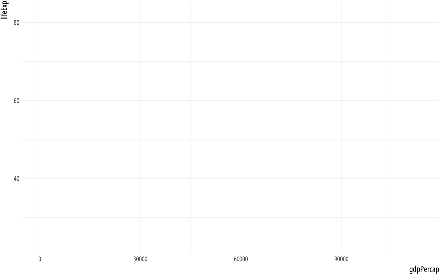 Figure 3.3: This empty plot has no geoms.
pThe p object has been created by the ggplot() function, and already has information in it about the mappings we want, together with a lot of other information added by default. (If you want to see just how much information is in the p object already, try asking for str(p).) However, we haven’t given it any instructions get about what sort of plot to draw. We need to add a layer to the plot. This means picking a geom_ function. We will use geom_point(). It knows how to take x and y values and plot them in a scatterplot.
p + geom_point() Figure 3.4: A scatterplot of Life Expectancy vs GDP
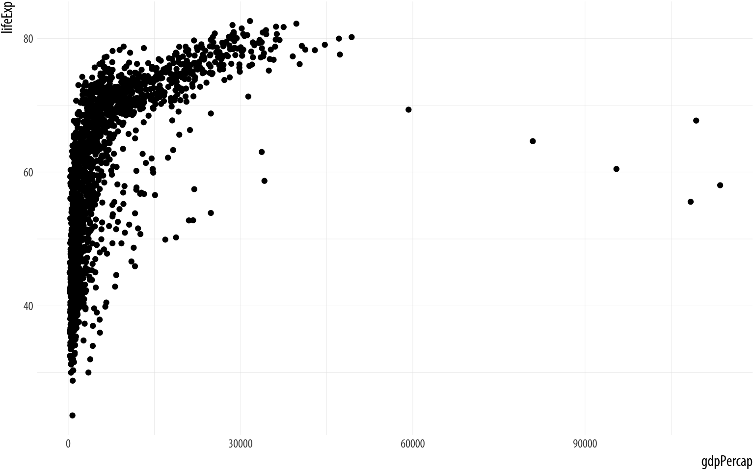
Success!
3.4 Build your plots layer by layer
Although we got a brief taste of ggplot at the end of Chapter 2, we spent more time in that Chaper preparing the ground to make this first proper graph. We set up our software IDE and made sure we could reproduce our work. We then learned the basics of how R works, and the sort of tidy data that ggplot expects. Just now we went through the logic of ggplot’s main idea, of building up plots a piece at a time in a systematic and predictable fashion, beginning with a mapping between a variable and an aesthetic element. We have done a lot of work and produced one plot.
The good news is that, from now on, not much will change conceptually about what we are doing. It will be more a question of learning in greater detail about how to tell ggplot what to do. We will learn more about the different geoms (or types of plot) available, and find out about the functions that control the coordinate system, scales, guiding elements (like labels and tick marks), and thematic features of plots. This will allow us to make much more sophisticated plots surprisingly fast. Conceptually, however, we will always be doing the same thing. We will start with a table of data that has been tidied, and then we will:
- Tell the
ggplot()function what our data is.Thedata = …step. - Tell
ggplot()what relationships we want to see.Themapping = aes(…)step. For convenience we will put the results of the first two steps in an object calledp. - Tell
ggplothow we want to see the relationships in our data.Choose a geom. - Layer on geoms as needed, by adding them to the
pobject one at a time. - UseThe
scale_,family,labs()andguides()functions. some additional functions to adjust scales, labels, tick marks, titles. We’ll learn more about some of these functions shortly.
To begin with we will let ggplot use its defaults for many of these
elements. The coordinate system used in plots is most often cartesian,
for example. It is a plane defined by an x axis and a y axis. This is
what ggplot assumes, unless you tell it otherwise. But we will quickly start making some adjustments.
Bear in mind once again that the process of adding layers to the plot really is additive.In effect we create one big object that is a nested list of instructions for how to draw each piece of the plot. Usually in R, functions cannot simply be added to objects. Rather, they take objects as inputs and produce objects as outputs.
But the objects created by ggplot() are special. This makes it easier to assemble plots one piece at a time, and to inspect how they look at every step. For example, let’s try a different geom_ function with our plot.
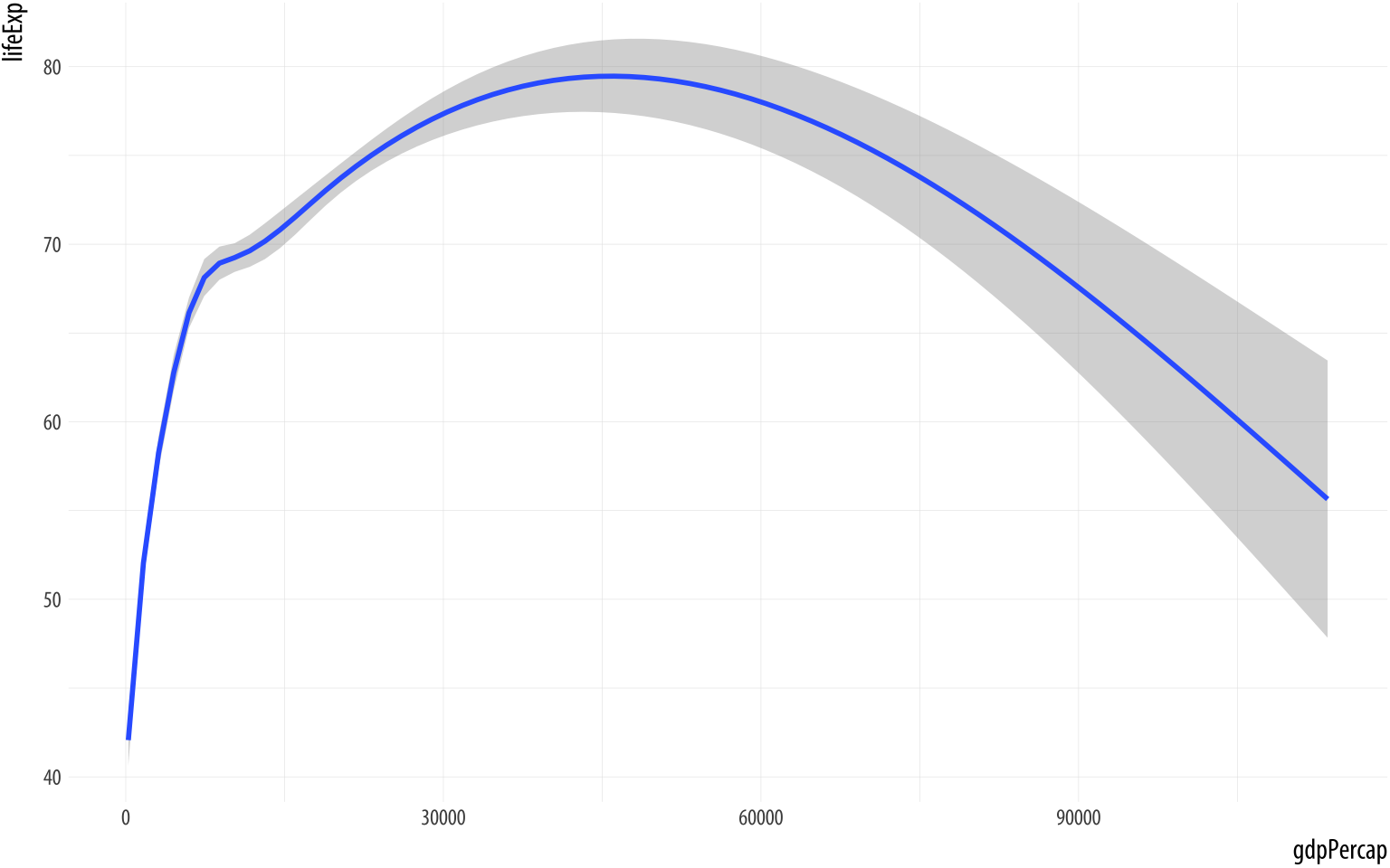 Figure 3.5: Life Expectancy vs GDP, using a smoother.
p <- ggplot(data = gapminder,
            mapping = aes(x = gdpPercap,
                          y=lifeExp))
p + geom_smooth()
You can see right away that some of these geoms do a lot more than simply put points on a grid. Here geom_smooth() has calculated a smoothed line for us and shaded in a ribbon showing the standard error for the line. If we want to see the data points and the line together, we simply add geom_point() back in:
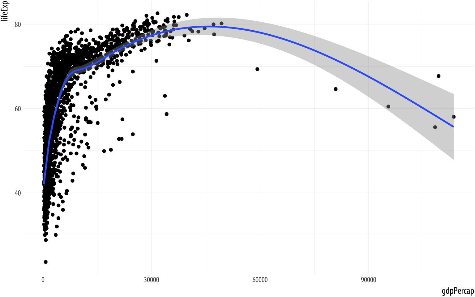 Figure 3.6: Life Expectancy vs GDP, showing both points and a GAM smoother.
p <- ggplot(data = gapminder,
            mapping = aes(x = gdpPercap,
                          y=lifeExp))
p + geom_point() + geom_smooth()
## `geom_smooth()` using method = 'gam' and formula 'y ~ s(x, bs = "cs")'The console message R tells you the geom_smooth() function is using a method called gam, which in this case means it has fit a generalized additive model. This suggests that maybe there are other methods that geom_smooth() understands, and which we might tell it to use instead. Instructions are given to functions via their arguments, so we can try adding method = "lm" (for “linear model”) as an argument to geom_smooth():
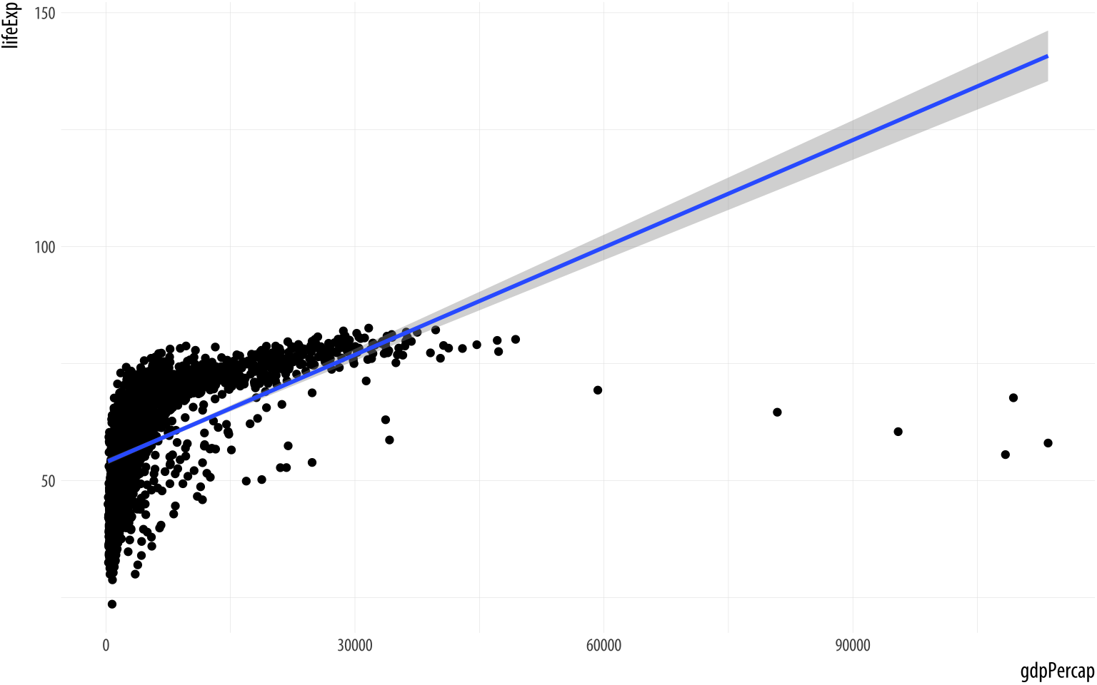 Figure 3.7: Life Expectancy vs GDP, points and an ill-advised linear fit.
p <- ggplot(data = gapminder,
            mapping = aes(x = gdpPercap,
                          y=lifeExp))
p + geom_point() + geom_smooth(method = "lm")
We did not have to tell geom_point() or geom_smooth()
where their data was coming from, or what mappings they should use.
They inherit this information from the original p object. As we’ll
see later, it’s possible to give geoms separate instructions that they
will follow instead. But in the absence of any other information, the
geoms will look for the instructions it needs in the ggplot()
function, or the object created by it.
In our plot, the data is quite bunched up against the left side. Gross Domestic Product per capita is not normally distributed across our country years. The x-axis scale would probably look better if it were transformed from a linear scale to a log scale. For this we can use a function called scale_x_log10(). As you might expect this function scales the x-axis of a plot to a log 10 basis. To use it we just add it to the plot:
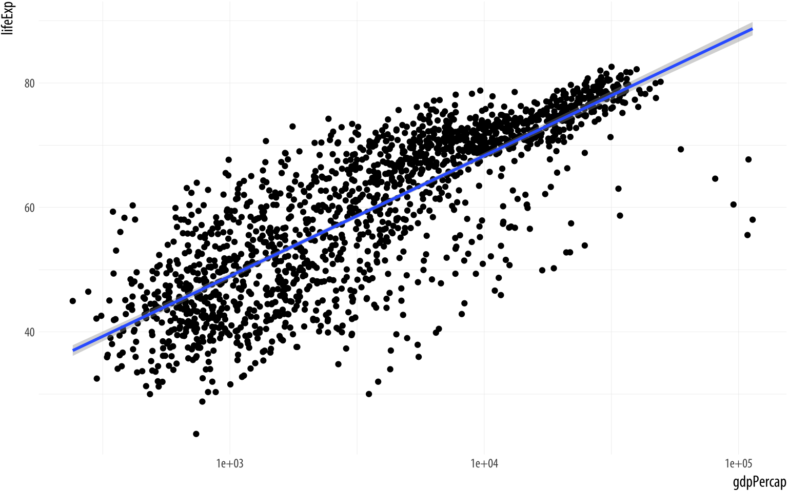 Figure 3.8: Life Expectancy vs GDP scatterplot, with a GAM smoother and a log scale on the x-axis.
p <- ggplot(data = gapminder,
            mapping = aes(x = gdpPercap,
                          y=lifeExp))
p + geom_point() +
    geom_smooth(method = "gam") +
    scale_x_log10()
The x-axis transformation repositions the points, and also changes the shape the smoothed line. (We switched back to gam from lm.) While ggplot() and its associated functions have not made any changes to our underlying data frame, the scale transformation is applied to the data before the smoother is layered on to the plot. There are a variety of scale transformations that you can use in just this way. Each is named for the transformation you want to apply, and the axis you want to applying it to. In this case we use scale_x_log10().
At this point, if our goal was just to show a plot of Life Expectancy vs GDP using sensible scales and adding a smoother, we would be thinking about polishing up the plot with nicer axis labels and a title. Perhaps we might also want to replace the scientific notation on the x-axis with the dollar value it actually represents. We can do both of these things quite easily. Let’s take care of the scale first. The labels on the tick-marks can be controlled through the scale_ functions. While it’s possible to roll your own function to label axes (or just supply your labels manually, as we will see later), there’s also a handy scales library that contains some useful pre-made formatting functions. We can either load the whole library with library(scales) or, more conveniently, just grab the specific formatter we want from that library. Here it’s the dollar() function. To grab a function directly from a library we have not loaded, we use the syntax thelibrary::thefunction. So, we can do this:
 Figure 3.9: Life Expectancy vs GDP scatterplot, with a GAM smoother and a log scale on the x-axis, with better labels on the tick marks.
p <- ggplot(data = gapminder, mapping = aes(x = gdpPercap, y=lifeExp))
p + geom_point() +
    geom_smooth(method = "gam") +
    scale_x_log10(labels = scales::dollar)
We will learn more about scale transformations later. For now,
just remember two things about them. First, you can directly transform
your x or y axis by adding something like scale_x_log10() or
scale_y_log10() to your plot. When you do so, the x or y axis will
be transformed and, by default, the tick marks on the axis will be
labeled using scientific notation. Second, you can give these scale_
functions a labels argument that reformats the text printed
underneath the tick marks on the axes. Inside the scale_x_log10()
function try labels=scales::comma, for example.
3.5 Mapping aesthetics vs setting them
An aesthetic mapping specifies that a variable will be expressed by one of the available visual elements, such as size, or color, or shape, and so on. As we’ve seen, we map variables to aesthetics like this:
p <-  ggplot(data = gapminder,
             mapping = aes(x = gdpPercap,
                            y = lifeExp,
                            color = continent))
This code does not give a direct instruction like “color the points purple”. Instead it says, “the property ‘color’ will represent the variable continent”, or “color will map continent”. If we want to turn all the points in the figure purple, we do not do it through the mapping function. Look at what happens when we try:
p <- ggplot(data = gapminder,
            mapping = aes(x = gdpPercap,
                          y = lifeExp,
                          color = "purple"))
p + geom_point() +
    geom_smooth(method = "loess") +
    scale_x_log10()
Figure 3.10: What has gone wrong here?
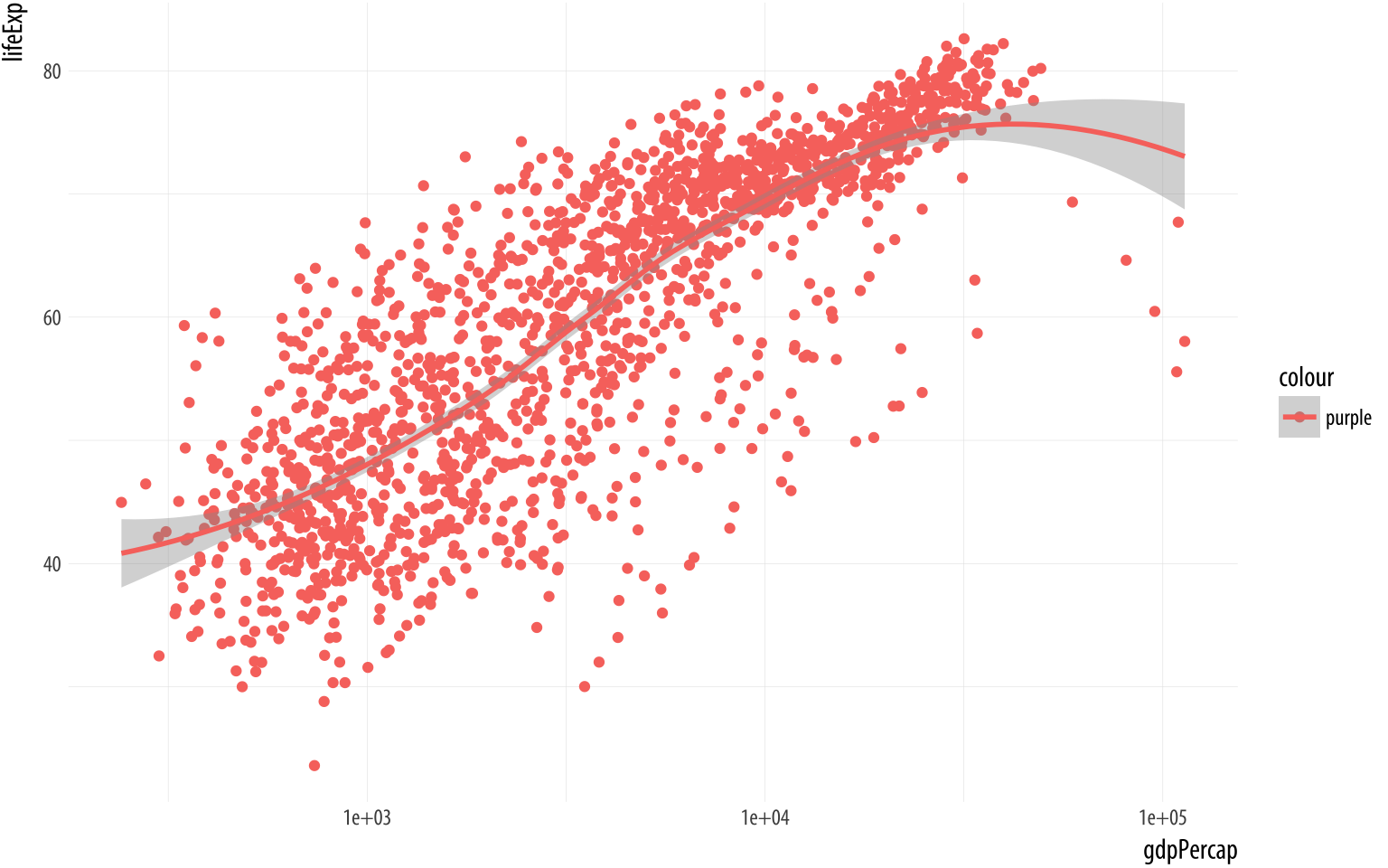
What has happened here? Why is there a legend saying “purple”? And why have the points all turned pinkish-red instead of purple? Remember, an aesthetic is a mapping of variables in your data to properties you can see on the graph. The aes() function is where that mapping is specified, and the function is trying to do its job. It wants to map a variable to the color aesthetic, so it assumes you are giving it a variable.Just as in Chapter 1, when we were able to write ‘my_numbers + 1’ to add one to each element of the vector. We have only given it one word, though—“purple”. Still, aes() will do its best to treat that word as though it were a variable. A variable should have as many observations as there are rows in the data, so aes() falls back on R’s recycling rules for making vectors of different lengths match up.
In effect, this creates a new categorical variable for your data. The string “purple” is recycled for every row of your data. Now you have a new column. Every element in it has the same value, “purple”. Then ggplot plots the results on the graph as you’ve asked it to, by mapping it to the color aesthetic. It dutifully makes a legend for this new variable. By default, ggplot displays the points falling into the category “purple” (which is all of them) using its default first-category hue … which is red.
The aes() function is for mappings only. Do not use it to change properties to a particular value. If we want to set a property, we do it in the geom_ we are using, and outside the mapping = aes(...) step. Try this:
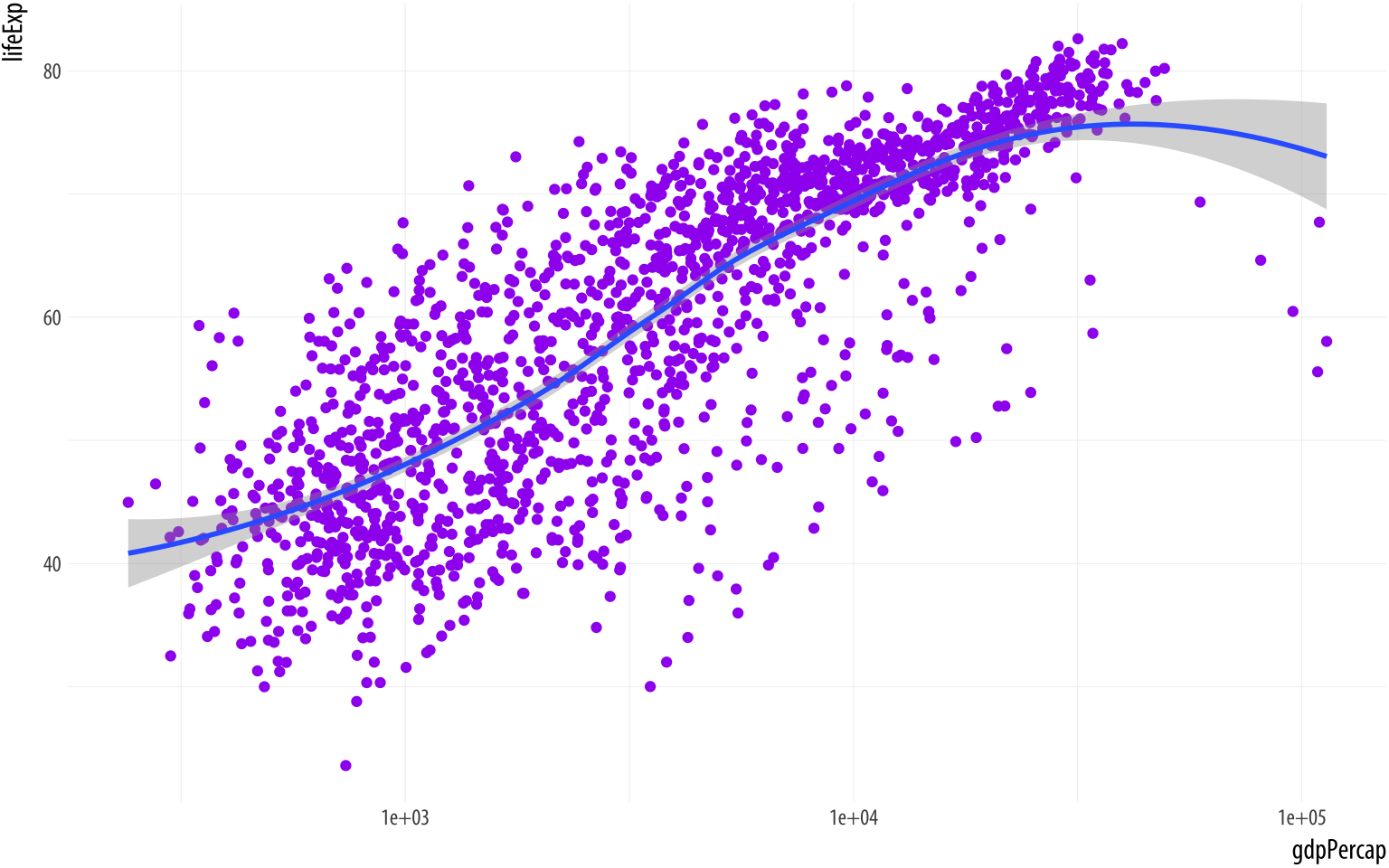 Figure 3.11: Setting the color attribute of the points directly.
p <- ggplot(data = gapminder,
            mapping = aes(x = gdpPercap,
                          y = lifeExp))
p + geom_point(color = "purple") +
    geom_smooth(method = "loess") +
    scale_x_log10()
The geom_point() function can take a color argument directly, and R knows what color “purple” is. This is not part of the aesthetic mapping that defines the basic structure of the graphic. From the point of view of the grammar or logic of the graph, the fact that the points are colored purple has no significance. The color purple is not representing or mapping a variable or feature of the data in the relevant way.
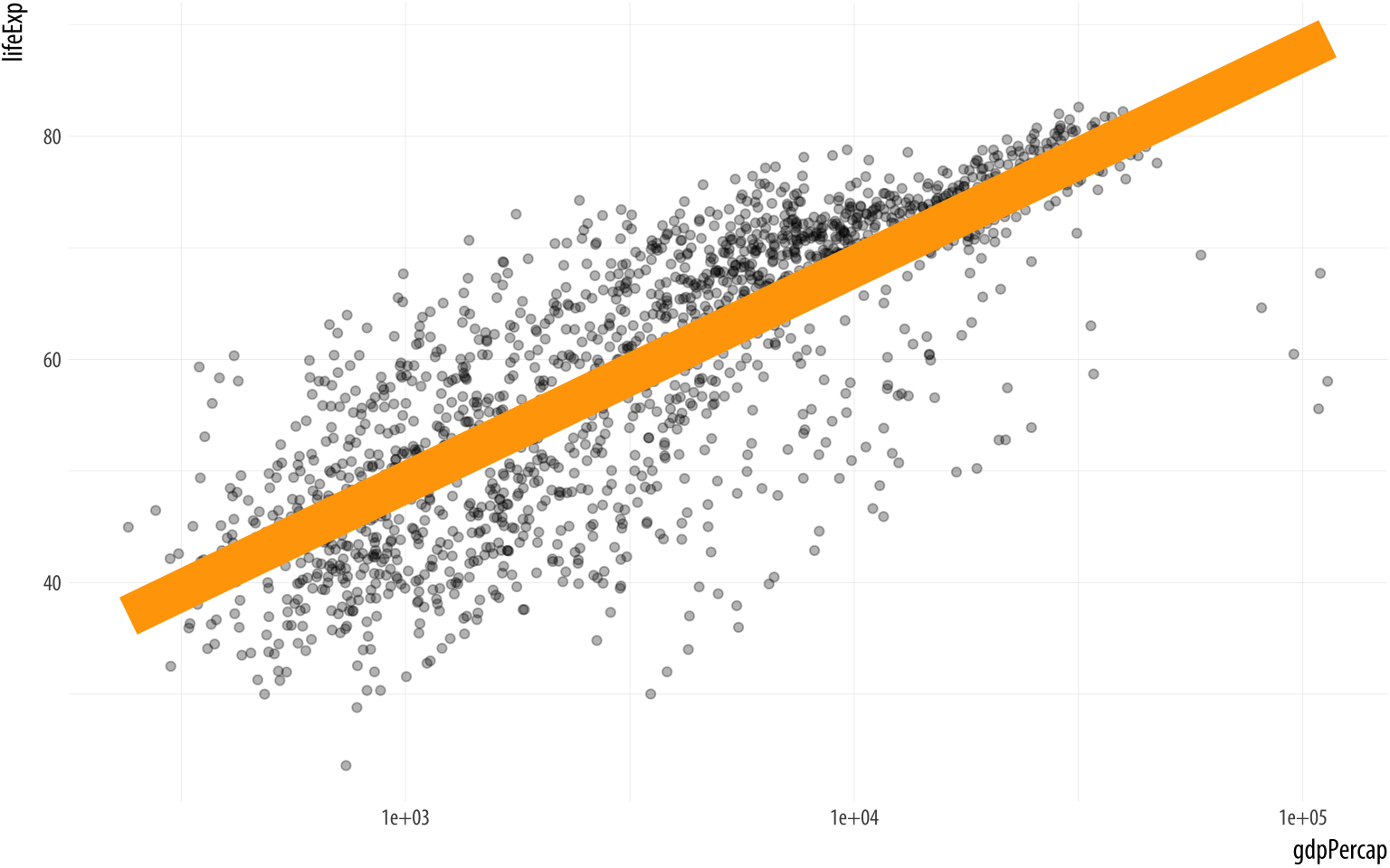 Figure 3.12: Setting some other arguments.
p <- ggplot(data = gapminder,
            mapping = aes(x = gdpPercap,
                          y = lifeExp))
p + geom_point(alpha = 0.3) +
    geom_smooth(color = "orange", se = FALSE, size = 8, method = "lm") +
    scale_x_log10()
The various geom_ functions can take many other arguments that will affect how the plot looks, but that do not involve mapping variables to aesthetic elements. Thus, those arguments will never go inside the aes() function. Some of the things we will want to set, like color or size, have the same name as mappable elements. Others, like the method or se arguments in geom_smooth() affect other aspects of the plot. In the code for Figure 3.12, the geom_smooth() call sets the line color to orange and sets its size (i.e., thickness) to 8, an unreasonably large value. We also turn off the se option by switching it from its default value of TRUE to FALSE. The result is that the standard error ribbon is not shown.
MeanwhileIt’s also possible to map a continuous variable directly to the alpha property, much like one might map a continuous variable to a single-color gradient. However, this is generally not an effective way of precisely conveying variation in quantity. in the geom_smooth() call we set the alpha argument to 0.3. Like color, size, and shape, “alpha” is an aesthetic property that points (and some other plot elements) have, and to which variables can be mapped. It controls how transparent the object will appear when drawn. It’s measured on a scale of zero to one. An object with an alpha of zero will be completely transparent. Setting it to zero will make any other mappings the object might have, such as color or size, invisible as well. An object with an alpha of one will be completely opaque. Choosing an intermediate value can be useful when there is a lot of overlapping data to plot, as it makes it easier to see where the bulk of the observations are located.
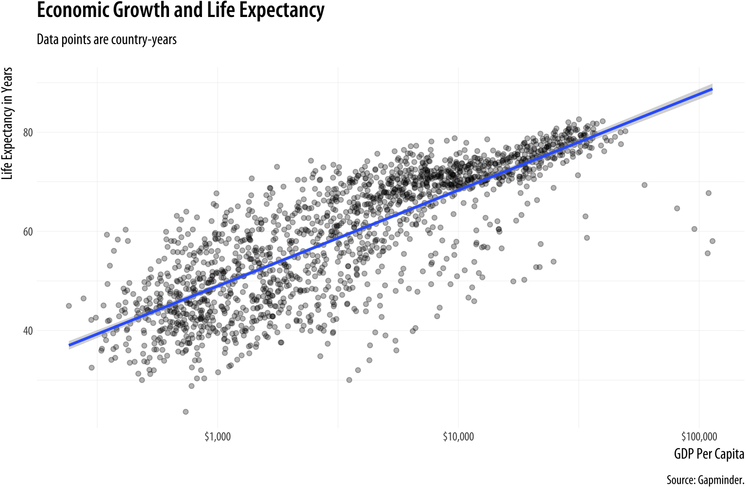
Figure 3.13: A more polished plot of Life Expectancy vs GDP.
p <- ggplot(data = gapminder, mapping = aes(x = gdpPercap, y=lifeExp))
p + geom_point(alpha = 0.3) +
    geom_smooth(method = "gam") +
    scale_x_log10(labels = scales::dollar) +
    labs(x = "GDP Per Capita", y = "Life Expectancy in Years",
         title = "Economic Growth and Life Expectancy",
         subtitle = "Data points are country-years",
         caption = "Source: Gapminder.")
We can now make a reasonably polished plot. We set the alpha of the points to a low value, make nicer x- and y-axis labels, and add a title, subtitle, and caption. As you can see in the code above, in addition to x, y, and any other aesthetic mappings in your plot (such as size, fill, or color), the labs() function can also set the text for title, subtitle, and caption. It controls the main labels of scales. The appearance of things like axis tick marks are the responsibility of various scale_ functions, such as the scale_x_log10() function used here. We will learn more about what can be done with scale_ functions soon.
Are there any variables in our data that can sensibly be mapped to the color aesthetic? Consider continent. In Figure 3.14 the individual data points have been colored by continent, and a legend with a key to the colors has automatically been added to the plot. In addition, instead of one smoothing line we now have five. There is one for each unique value of the continent variable. This is a consequence of the way aesthetic mappings are inherited. Along with x and y, the color aesthetic mapping is set in the call to ggplot() that we used to creat the p object. Unless told otherwise, all geoms layered on top of the original plot object will inherit that object’s mappings. In this case we get both our points and smoothers colored by continent.
p <- ggplot(data = gapminder,
            mapping = aes(x = gdpPercap,
                          y = lifeExp,
                          color = continent))
p + geom_point() +
    geom_smooth(method = "loess") +
    scale_x_log10()
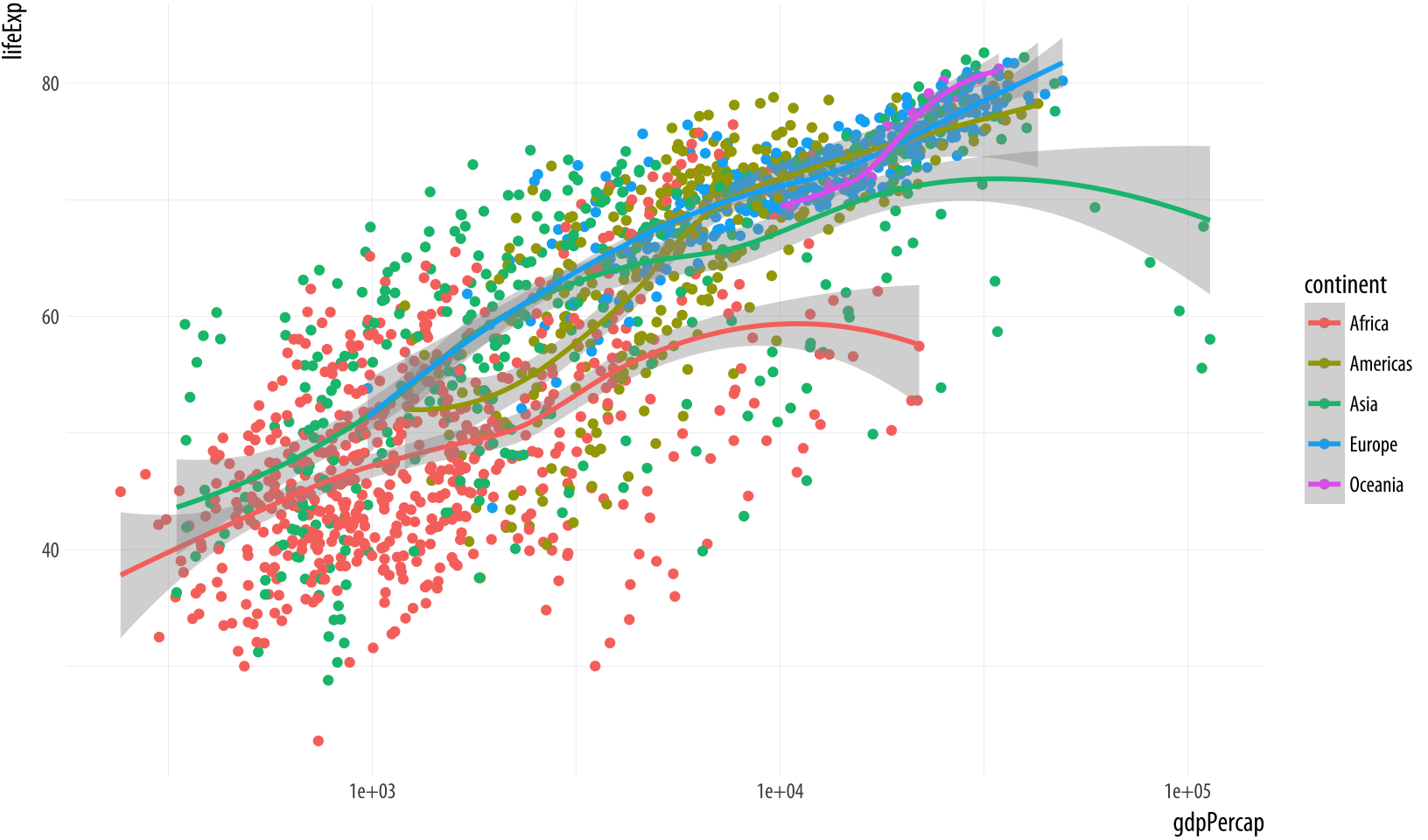 Figure 3.14: Mapping the continent variable to the color aesthetic.
If it is what we want, then we might also consider shading the standard error ribbon of each line to match its dominant color. The color of the standard error ribbon is controlled by the fill aesthetic. Whereas the color aesthetic affects the appearance of lines and points, fill is for the filled areas of bars, polygons and, in this case, the interior of the smoother’s standard error ribbon.
p <- ggplot(data = gapminder,
            mapping = aes(x = gdpPercap,
                          y = lifeExp,
                          color = continent,
                          fill = continent))
p + geom_point() +
    geom_smooth(method = "loess") +
    scale_x_log10()
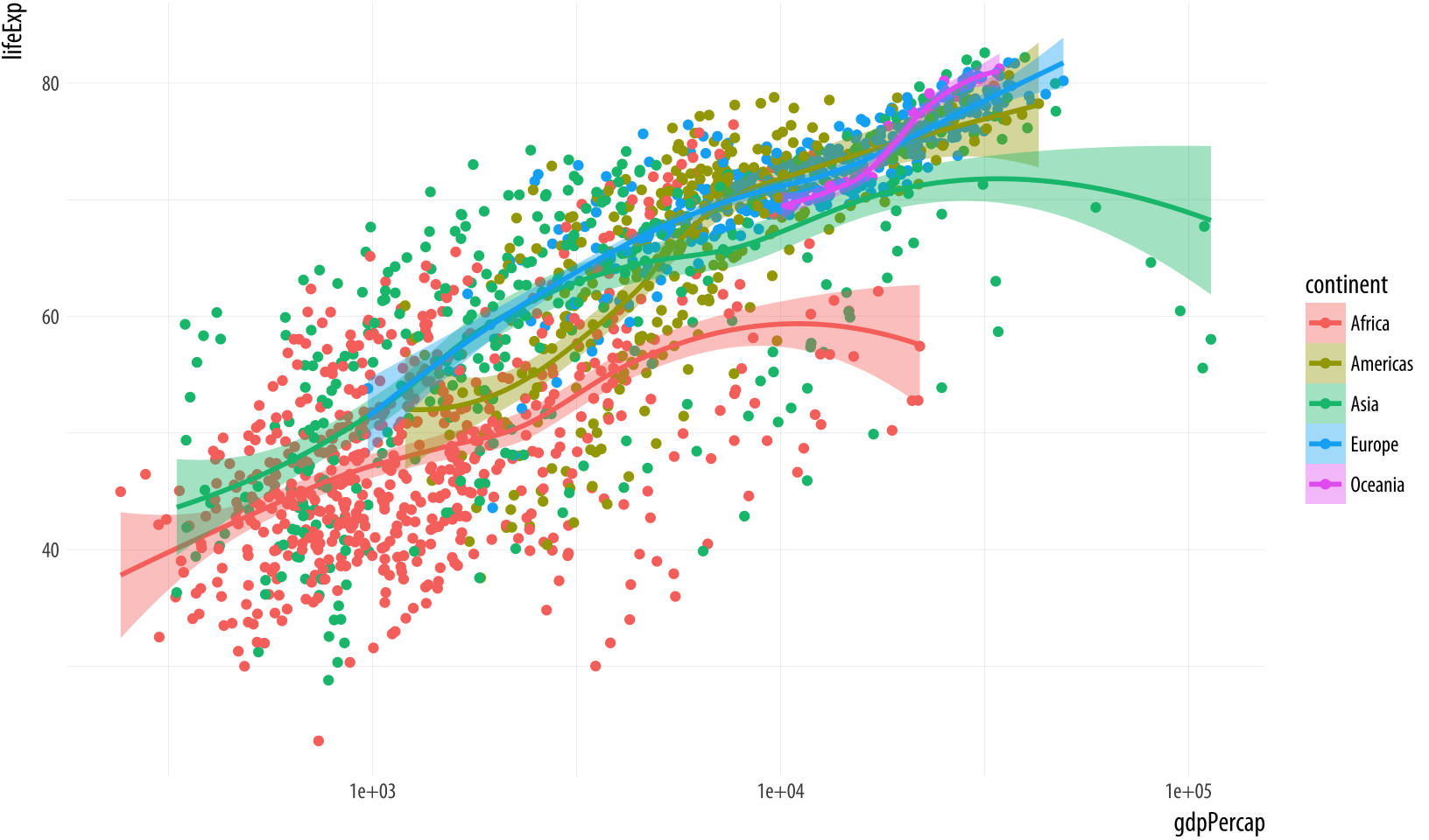 Figure 3.15: Mapping the continent variable to the color aesthetic, and correcting the error bars using the fill aesthetic.
Making sure that color and fill aesthetics match up consistently in this way improves the overall look of the plot. In order to make it happen we just need to specify that the mappings are to the same variable in each case.
3.6 Aesthetics can be mapped per geom
Perhaps five separate smoothers is too many, and we just want one line. But we still would like to have the points color-coded by continent. By default, geoms inherit their mappings from the ggplot() function. We can change this by mapping the aesthetics we want only the geom_ functions that we want them to apply to. We use the same mapping = aes(...) expression as in the initial call to ggplot(), but now use it in the geom_ functions as well, specifying only the mappings we want to apply to each one. Mappings specified only in the initial ggplot() function—here, x and y—will carry through to all subsequent geoms.
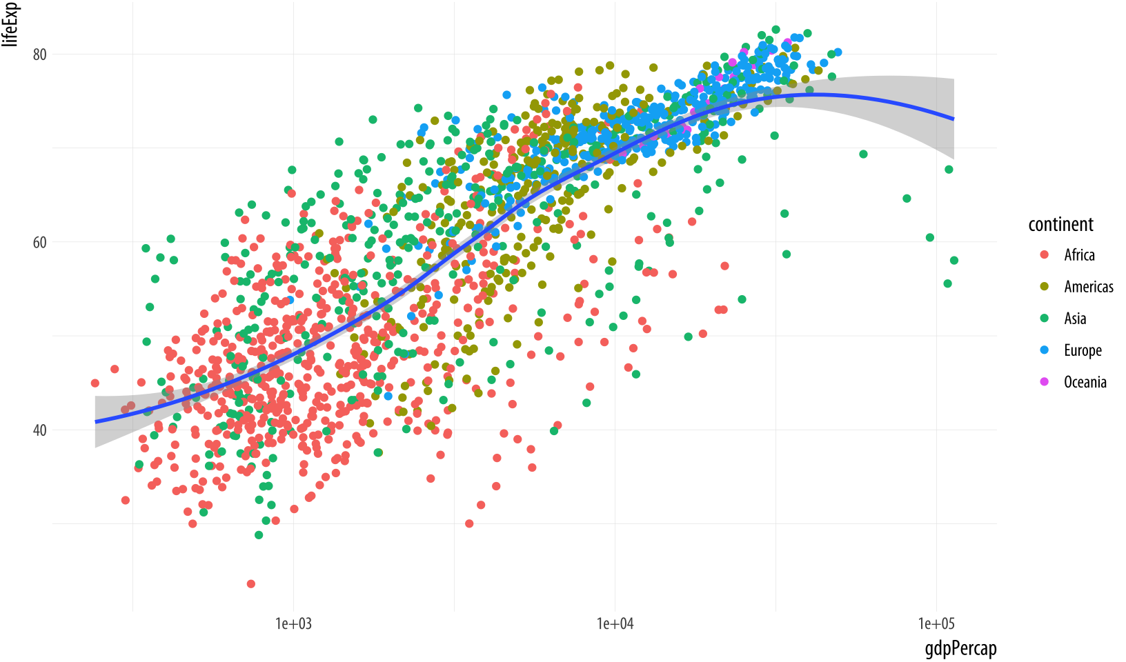 Figure 3.16: Mapping aesthetics on a per-geom basis. Here color is mapped to continent for the points but not the smoother.
p <- ggplot(data = gapminder, mapping = aes(x = gdpPercap, y = lifeExp))
p + geom_point(mapping = aes(color = continent)) +
    geom_smooth(method = "loess") +
    scale_x_log10()
It’s possible to map continuous variables to the color aesthetic, too. For example, we can map the log of each country-year’s population (pop) to color. (We can take the log of population right in the aes() statement, using the log() function. R will evaluate this for us quite happily.) When we do this, ggplot produces a gradient scale. It is continuous, but marked at intervals in the legend. Depending on the circumstances, mapping quantities like population to a continuous color gradient may be more or less effective than cutting the variable into categorical bins running, e.g., from low to high. In general it is always worth looking at the data in its continuous form first rather than cutting or binning it into categories.
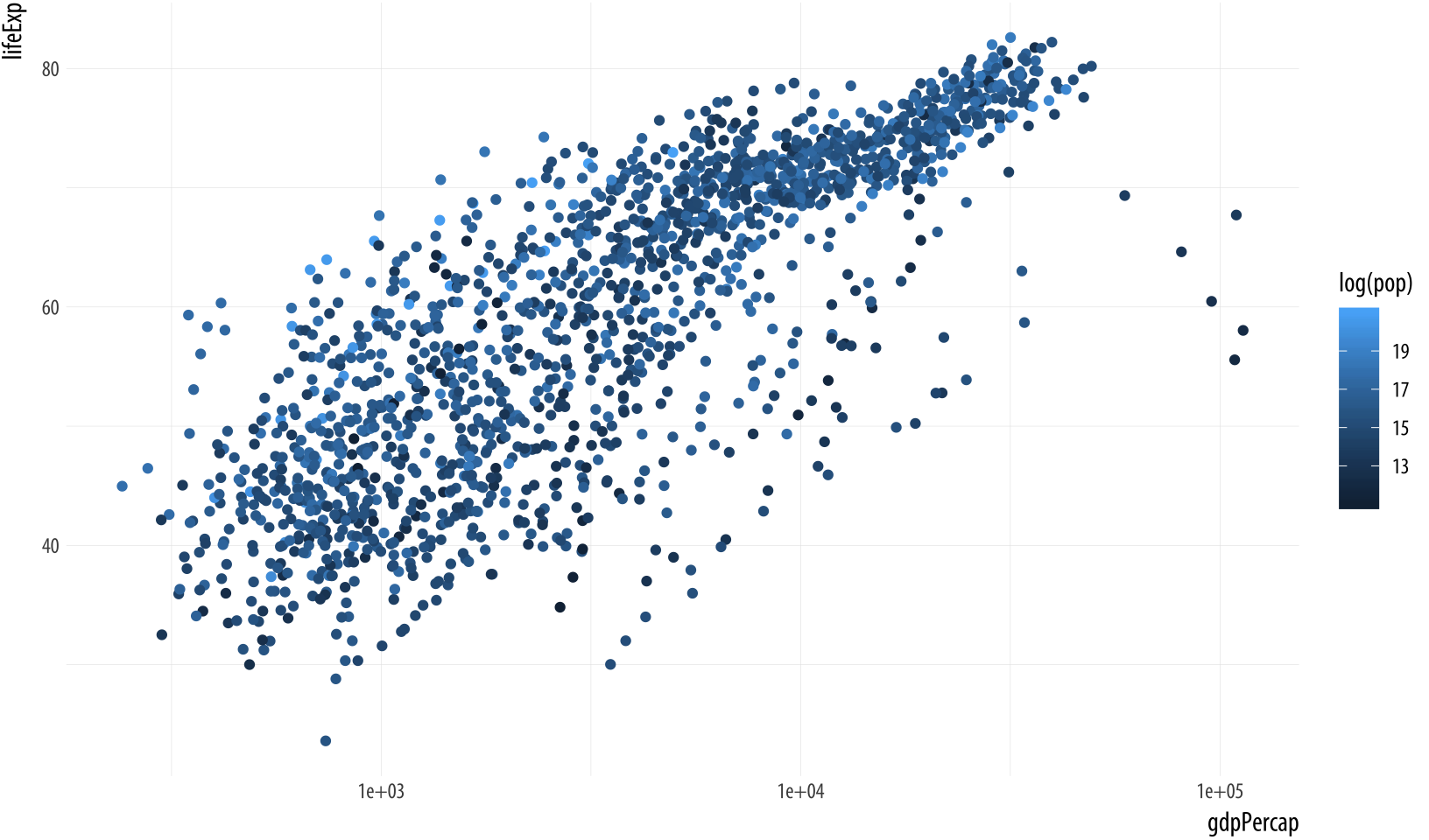 Figure 3.17: Mapping a continuous variable to color.
p <- ggplot(data = gapminder,
            mapping = aes(x = gdpPercap,
                          y = lifeExp))
p + geom_point(mapping = aes(color = log(pop))) +
    scale_x_log10()
Finally, it is worth paying a little more attention to the way that ggplot draws its scales. Because every mapped variable has a scale, we can learn a lot about how a plot has been constructed, and what mappings it contains, by seeing what the legends look like. For example, take a closer look at the legends produced in Figures 3.15 and 3.16.
Figure 3.18: Guides and legends faithfully reflect the mappings they represent.
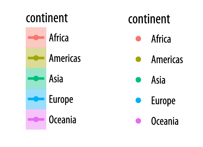
In the legend for the first figure, shown here on the left, we see several visual elements. The key for each continent shows a dot, a line, and a shaded background. The key for the second figure, shown on the right, has only a dot for each continent, with no shaded background or line. If you look again at the code for Figures 3.15 and 3.16, you will see that in the first case we mapped the continent variable to both color and fill. We then drew the figure with geom_point() and fitted a line for each continent with geom_smooth(). Points have color but the smoother understands both color (for the line itself) and fill (for the shaded standard error ribbon). Each of these elements is represented in the legend: the point color, the line color, and the ribbon fill. In the second figure, we decided to simplify things by having only the points be colored by continent. Then we drew just a single smoother for the whole graph. Thus, in the legend for that figure, the colored line and the shaded box are both absent. We only see a legend for the mapping of color to continent in geom_point(). Meanwhile on the graph itself the line drawn by geom_smooth() is set by default to a bright blue, different from anything on the scale, and its shaded error ribbon is set by default to gray. Small details like this are not accidents. They are a direct consequence of ggplot’s grammatical way of thinking about the relationship between the data behind the plot and the visual elements that represent it.
3.7 Save your work
Now that you have started to make your own plots, you may be wondering how to save them, and perhaps also how to control their size and format. If you are working in an RMarkdown document then the plots you make will be embedded in it, as we have already seen. You can set the default size of plots within your .Rmd document by setting an option in your first code chunk. This one tells R to make 8x5 figures:
knitr::opts_chunk$set(fig.width=8, fig.height=5) Because you will be making plots of different sizes and shapes, sometimes you will want to control the size of particular plots, without changing the default. To do this, you can add the same options to any particular chunk inside the curly braces at the beginning. Remember, each chunk opens with three backticks and then a pair of braces containing the language name (for us always r) and an optional label:
```{r example}
p + geom_point()
```
You can follow the label with a comma and provide a series of options if needed. They will apply only to that chunk. To make a figure twelve inches wide and nine inches high we say e.g. {r example, fig.width = 12, fig.height = 9} in the braces section.
You will often need to save your figures individually, as they will
end up being dropped into slides or published in papers that are not
produced using RMarkdown. Saving a figure to a file can be done in
several different ways. When working with ggplot, the easiest way is
to use the ggsave() function. To save the most recently displayed
figure, we provide the name we want to save it under:
ggsave(filename = "my_figure.png")ThisSeveral other file formats are available as well. See the function’s help page for details. will save the figure as a PNG file, a format suitable for displaying on web pages. If you want a PDF instead, change the extension of the file:
ggsave(filename = "my_figure.pdf")Remember that, for convenience, you do not need to write filename = as long as the name of the file is the first argument you give ggsave(). You can also pass plot objects to ggsave(). For example, we can put our recent plot into an object called p_out and then tell ggave() that we want to save that object.
p_out <- p + geom_point() +
    geom_smooth(method = "loess") +
    scale_x_log10()

ggsave("my_figure.pdf", plot = p_out)
When saving your work, it is sensible to have a subfolder (or more
than one, depending on the project) where you save only figures. You
should also take care to name your saved figures in a sensible way.
fig_1.pdf or my_figure.pdf are not good names. Figure names should
be compact but descriptive, and consistent between figures within a
project. In addition, although it really shouldn’t be the case in this
day and age, it is also wise to play it safe and avoid file names
containing characters likely to make your code choke in future. These
include apostrophes, backticks, spaces, forward and back slashes, and
quotes.
The Appendix contains a short discussion of how to organize your files within your project folder. Treat the project folder as the home base of your work for the paper or work you are doing, and put your data and figures in subfolders within the project folder. To begin with, using your file manager, create a folder named “figures” inside your project folder. When saving figures, you can use Kirill Müller’s handy here library to make it easier to work with files and subfolders while not having to type in full file paths. Load the library in the setup chunk of your RMarkdown document. When you do, it tells you where “here” is for the current project. You will see a message saying something like this, with your file path and user name instead of mine:
# here() starts at /Users/kjhealy/projects/socvizYou can then use the here() function to make loading and saving your
work more straightforward and safer. Assuming a folder named “figures” exists in your project folder, you can do this:
ggsave(here("figures", "lifexp_vs_gdp_gradient.pdf"), plot = p_out)This saves p_out as a file called lifeexp_vs_gdp_gradient.pdf in the figures directory here, i.e. in your current project folder.
You can save your figure in a variety of different formats, depending on your needs (and also, to a lesser extent, on your particular computer system). The most important distinction to bear in mind is between vector formats and raster formats. A file with a vector format, like PDF or SVG, is stored as a set of instructions about lines, shapes, colors, and their relationships. The viewing software (such as Adobe Acrobat or Apple’s Preview application for PDFs) then interprets those instructions and displays the figure. Representing the figure this way allows it to be easily resized without becoming distorted. The underlying language of the PDF format is Postscript, which is also the language of modern typesetting and printing. This makes a vector-based format like PDF the best choice for submission to journals.
A raster based format, on the other hand, stores images essentially as a grid of pixels of a pre-defined size with information about the location, color, brightness, and so on of each pixel in the grid. This makes for more efficient storage, especially when used in conjunction with compression methods that take advantage of redundancy in images in order to save space. Formats like JPG are compressed raster formats. A PNG file is a raster image format that supports lossless compression. For graphs containing an awful lot of data, PNG files will tend to be much smaller than the corresponding PDF. However, raster formats cannot be easily resized. In particular they cannot be expanded in size without becoming pixelated or grainy. Formats like JPG and PNG are the standard way that images are displayed on the web. The more recent SVG format is vector-based format but also nevertheless supported by many web browsers.
In general you should save your work in several different formats.
When you save in different formats and in different sizes you may need
to experiment with the scaling of the plot and the size of the fonts
in order to get a good result. The scale argument to ggsave() can
help you here (you can try out different values, like scale=1.3,
scale=5, and so on). You can also use ggave() to explicitly set
the height and width of your plot in the units that you choose.
ggsave(here("figures", "lifexp_vs_gdp_gradient.pdf"),
       plot = p_out, height = 8, width = 10, units = "in")
Now that you know how to do that, let’s get back to making more graphs.
3.8 Where to go next
Start by playing around with the gapminder data a little more. You can try each of these explorations with geom_point() and then with geom_smooth(), or both together.
- What happens when you put the
geom_smooth()function beforegeom_point()instead of after it? What does this tell you about how the plot is drawn? Think about how this might be useful when drawing plots. - Change the mappings in the
aes()function so that you plot Life Expectancy against population (pop) rather than per capita GDP. What does that look like? What does it tell you about the unit of observation in the dataset? - Try some alternative scale mappings. Besides
scale_x_log10()you can tryscale_x_sqrt()andscale_x_reverse(). There are corresponding functions for y-axis transformations. Just writeyinstead ofx. Experiment with them to see what sort of effect they have on the plot, and whether they make any sense to use. - What happens if you map
colortoyearinstead ofcontinent? Is the result what you expected? Think about what class of objectyearis. Remember you can get a quick look at the top of the data, which includes some shorthand information on the class of each variable, by typinggapminder. - Instead of mapping
color = year, what happens if you trycolor = factor(year)? - As you look at these different scatterplots, think about Figure 3.13 a little more critically. We worked it up to the point where it was reasonably polished, but is it really the best way to display this country-year data? What are we gaining and losing by ignoring the temporal and country-level structure of the data? How could we do better? Sketch out what an alternative visualization might look like.
As you begin to experiment, remember two things. First, it’s always worth trying something, even if you’re not sure what’s going to happen. Don’t be afraid of the console.This license does not extend to, for example, overwriting or deleting your data by mistake. You should still manage your project responsibly, at a minimum keeping good backups. But within R and at the level of experimenting with graphs at the console, you have a lot of freedom. The nice thing about making your graphics through code is that you won’t break anything you can’t reproduce. If something doesn’t work, you can figure out what happened, fix things, and re-run the code to make the graph again.
Second, remember that the main flow of action in ggplot is always the same. You start with a table of data, you map the variables you want to display to aesthetics like position, color, or shape, and you choose one or more geoms to draw the graph. In your code this gets accomplished by making an object with the basic information about data and mappings, and then adding or layering additional information as needed. Once you get used to this way of thinking about your plots, especially the aesthetic mapping part, then drawing them becomes easier. Instead of having to think about how to draw particular shapes or colors on the screen, the many geom_ functions take care of that for you. In the same way, learning new geoms is easier once you think of them as ways to display aesthetic mappings that you specify. Most of the learning curve with ggplot involves getting used to this way of thinking about your data and its representation in a plot. In the next chapter, we will flesh out these ideas a little more, cover some common ways plots go “wrong” (i.e., when they end up looking strange), and learn how to recognize and avoid those problems.