1 Look at data
Some data visualizations are better than others. This chapter discusses why that is. While it is tempting to simply start laying down the law about what works and what doesn’t, the process of making a really good or really useful graph cannot be boiled down to a list of simple rules to be followed without exception in all circumstances. The graphs you make are meant to be looked at by someone. The effectiveness of any particular graph is not just a matter of how it looks in the abstract, but also a question of who is looking at it, and why. An image intended for an audience of experts reading a professional journal may not be readily interpretable by the general public. A quick visualization of a dataset you are currently exploring might not be of much use to your peers or your students.
Some graphs work well because they depend in part on some strong aesthetic judgments about what will be effective. That sort of good judgment is hard to systematize. However, data visualization is not simply a matter of competing standards of good taste. Some approaches work better for reasons that have less to do with one’s sense of what looks good and more to do with how human visual perception works. When starting out, it is easier to grasp these perceptual aspects of data visualization than it is to get a reliable, taste-based feel for what works. For this reason, it is better to begin by thinking about the relationship between the structure of your data and the perceptual features of your graphics. Getting into that habit will carry you a long way towards developing the ability to make good taste-based judgments, too.
As we shall see later on, when working with data in R and ggplot, we get many visualization virtues for free. In general, the default layout and look of ggplot’s graphics is well-chosen. This makes it easier to do the right thing. It also means that, if you really just want to learn how to make some plots right this minute, you could skip this chapter altogether and go straight to the next one. But although we will not be writing any code for the next few pages, we will be discussing aspects of graph construction, perception, and interpretation that matter for code you will choose to write. So I urge you to stick around and follow the argument of this chapter. When making graphs there is only so much that your software can do to keep you on the right track. It cannot force you to be honest with yourself, your data, and your audience. The tools you use can help you live up to the right standards. But they cannot make you do the right thing. This means it makes sense to begin cultivating your own good sense about graphs right away.
We will begin by asking why we should bother to look at pictures of data in the first place, instead of relying on tables or numerical summaries. Then we will discuss a few examples, first of bad visualization practice, and then more positively of work that looks (and is) much better. We will examine the usefulness and limits of general rules of thumb in visualization, and show how even tasteful, well-constructed graphics can mislead us. From there we will briefly examine some of what we know about the perception of shapes, colors, and relationships between objects. The core point here is that we are quite literally able to see some things much more easily than others. These cognitive aspects of data visualization make some kinds of graphs reliably harder for people to interpret. Cognition and perception are relevant in other ways, too. We tend to make inferences about relationships between the objects that we see in ways that bear on our interpretation of graphical data, for example. Arrangements of points and lines on a page can encourage us—sometimes quite unconsciously—to make inferences about similarities, clustering, distinctions, and causal relationships that might or might not be there in the numbers. Sometimes these perceptual tendencies can be honestly harnessed to make our graphics more effective. At other times, they will tend to lead us astray, and must take care not to lean on them too much.
In short, good visualization methods offer extremely valuable tools that we should use in the process of exploring, understanding, and explaining data. But they are not some sort of magical means of seeing the world as it really is. They will not stop you from trying to fool other people if that is what you want to do; and they may not stop you from fooling yourself, either.
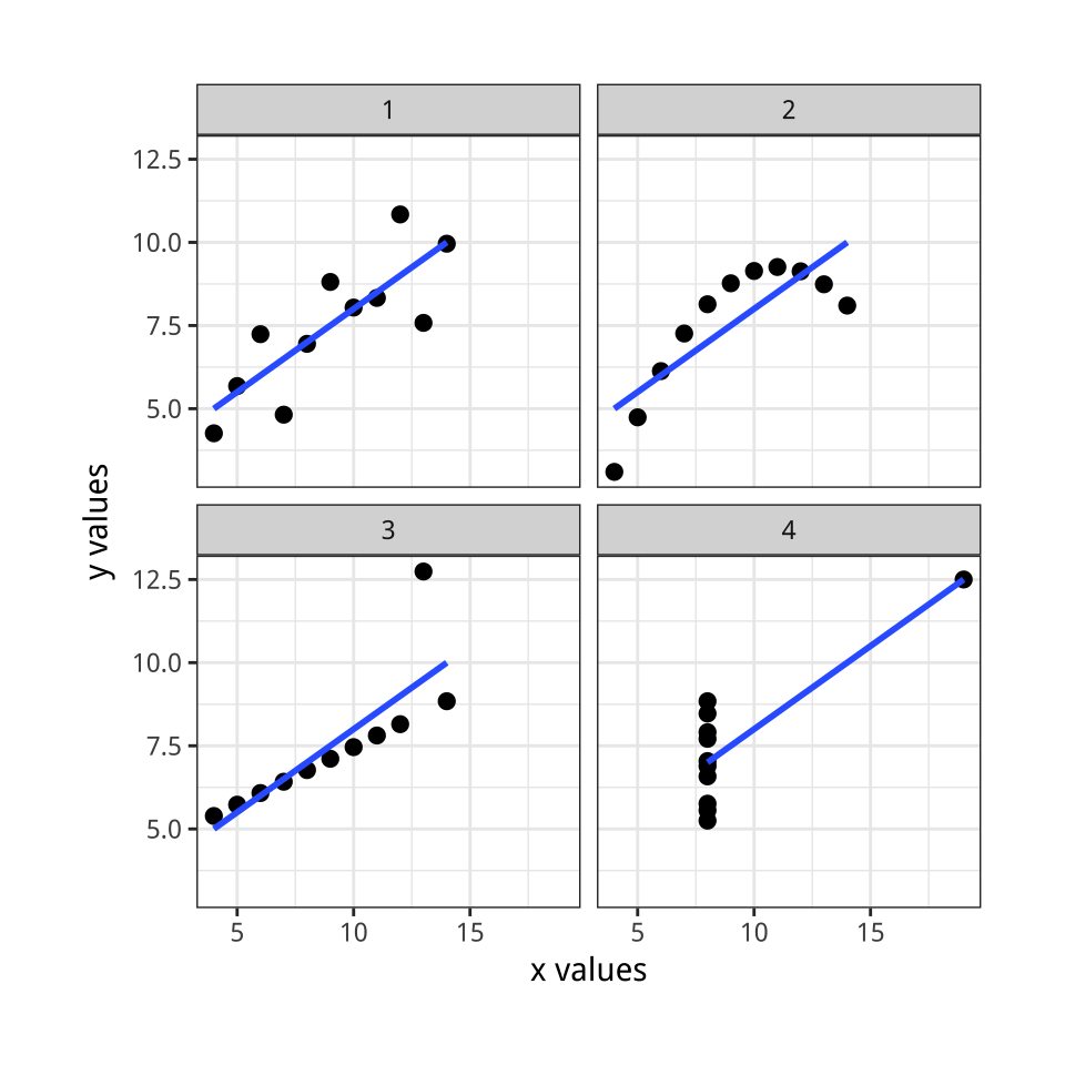 Figure 1.1: Plots of Anscombe’s Quartet.
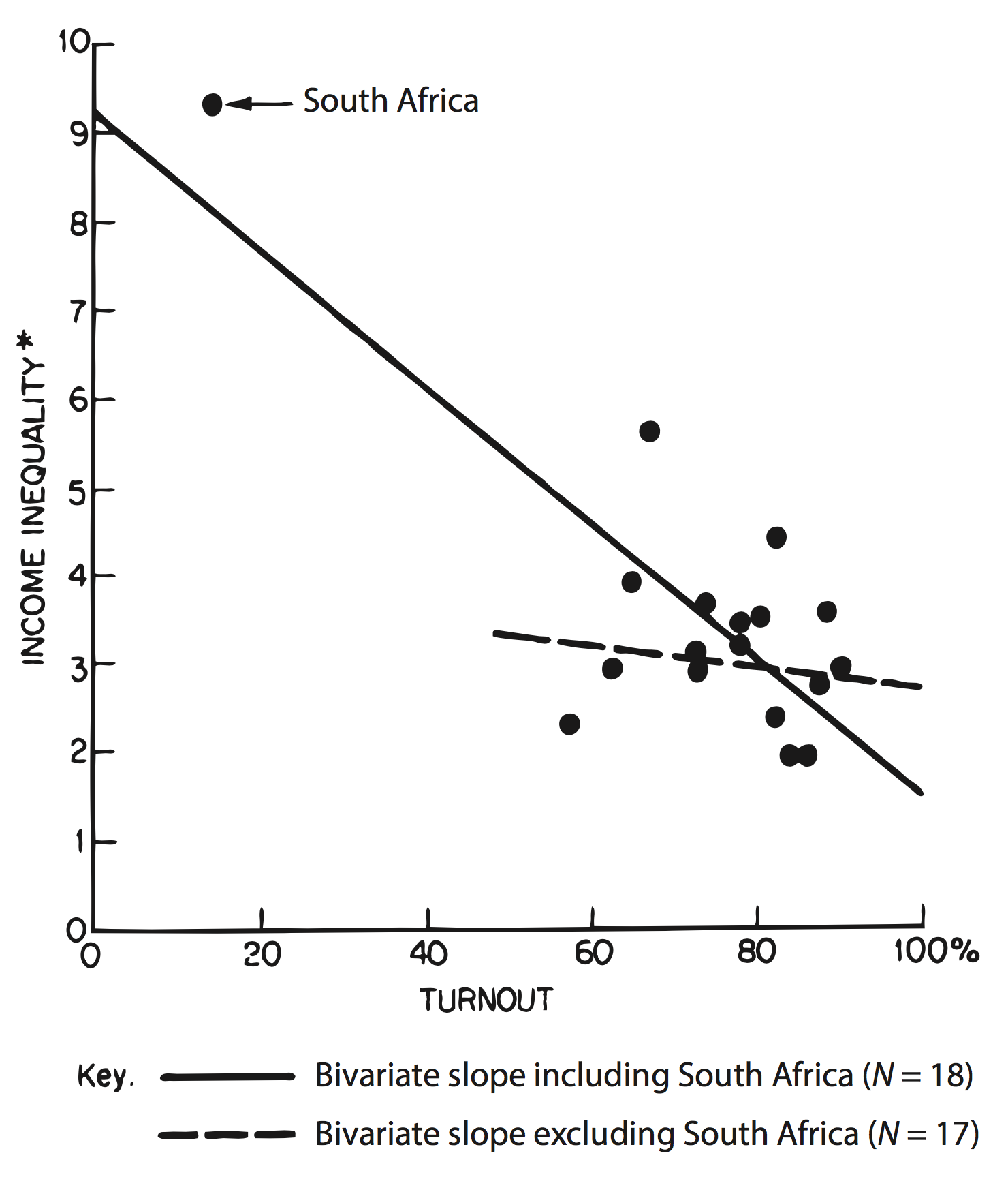 Figure 1.2: Seeing the effect of an outlier on a regression line.
1.1 Why look at data?
Anscombe’s quartet (Anscombe, 1973; Chatterjee & Firat, 2007), shown in Figure
1.1, presents its argument for looking at data in visual form. It uses a series of four scatterplots. A scatterplot shows the relationship between two quantities, such as height and weight, age and income, or time and unemployment. Scatterplots are the workhorse of data visualization in social science, and we will be looking at a lot of them. The data for Anscombe’s plots comes bundled with R. You can look at it by typing anscombe at the command prompt. Each of the four made-up “datasets” contains eleven observations of two variables, x and y. By construction, the numerical properties of each pair of x and y variables, such as their means, are almost identical. Moreover, the standard measures of the association between each x and y pair also match. The correlationCorrelations can run from -1 to 1, with zero meaning there is no association. A score or -1 means a perfect negative association and a score of 1 a perfect positive asssociation between the two variables. So, 0.81 counts as a strong positive correlation. coefficient is a strong 0.81 in every case. But when visualized as a scatterplot, plotting the x variables on the horizontal axis and the y variable on the vertical, the differences between them are readily apparent.
Anscombe’s quartet is an extreme, manufactured example. But the benefits of visualizing one’s data can be shown in real cases. Figure 1.2 shows a graph from Jackman (1980), a short comment on Hewitt (1977). The original paper had argued for a significant association between voter turnout and income inequality based on a quantitative analysis of eighteen countries. WhenA more careful quantitative approach could have found this issue as well, for example with a proper sensitivity analysis. But the graphic makes the case directly. this relationship is graphed as a scatterplot, however, it immediately became clear that the quantitative association depended entirely on the inclusion of South Africa in the sample.
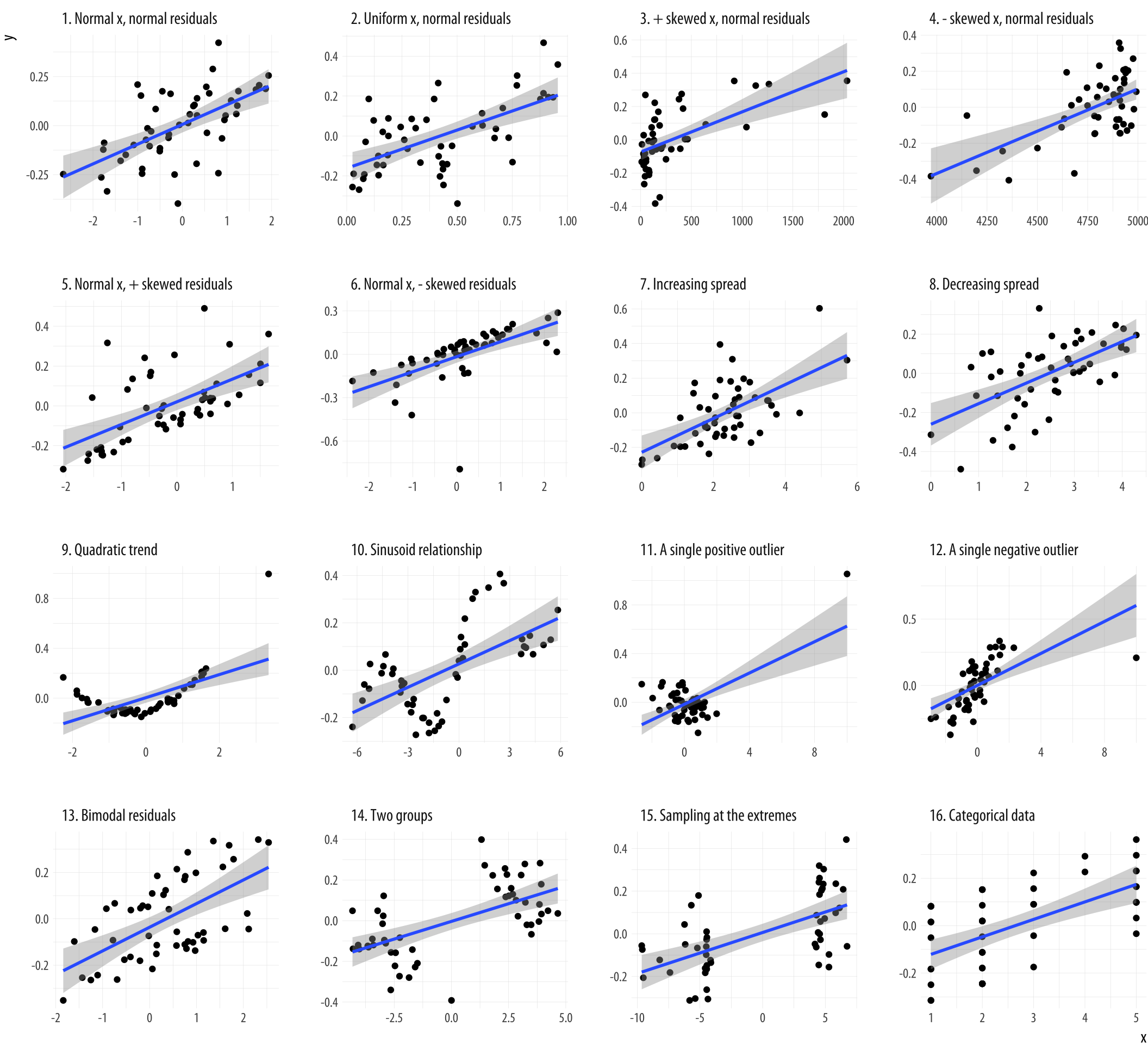
Figure 1.3: What data patterns can lie behind a correlation? The correlation coefficient in all these plots is 0.6. Figure adapted from code by Jan Vanhove.
An exercise by Jan Vanhove (2016) demonstrates the usefulness of looking at model fits and data at the same time. Figure 1.3 presents an array of scatterplots. As with Anscombe’s quartet, each panel shows the association between two variables. Within each panel, the correlation between the x and y variables is set to be 0.6, a pretty good degree of association. But the actual distribution of points is created by a different process in each case. In the top left panel each variable is “normally” distributed around its mean value. In other panels there is a single outlying point far off in one direction or another. Others are produced by more subtle rules. But each gives rise to the same basic linear association.
Illustrations like this demonstrate why it is worth looking at data. But that does not mean that looking at data is all one needs to do. Real datasets are messy, and while displaying them graphically is very useful, doing so presents problems of its own. As we will see below, there is considerable debate about what sort of visual work is most effective, when it can be superfluous, and how it can at times be misleading to researchers and audiences alike. Just like seemingly sober and authoritative tables of numbers, data visualizations have their own rhetoric of plausibility. Anscombe’s quartet notwithstanding, and especially for large volumes of data, summary statistics and model estimates should be thought of as tools that we use to deliberately simplify things in a way that lets us see past a cloud of data points shown in a figure. We will not automatically get the right answer to our questions just by looking.
1.2 What makes bad figures bad?
It is traditional to begin discussions of data visualization with a “parade of horribles”, in an effort to motivate good behavior later. However, these negative examples often combine several kinds of badness that are better kept separate. For convenience, we can say that our problems tend to come in three varieties. Some are strictly aesthetic. The graph we are looking at is in some way tacky, tasteless, or a hodgepodge of ugly or inconsistent design choices. Some are substantive. Here, our graph has problems that are due to the data being presented. Good taste might make things look better, but what we really need is to make better use of the data we have, or get new information and plot that instead. And some problems are perceptual. In these cases, even with good aesthetic qualities and good data, the graph will be confusing or misleading because of how people perceive and process what they are looking at. It is important to understand that these elements, while often found together, are distinct from one another.
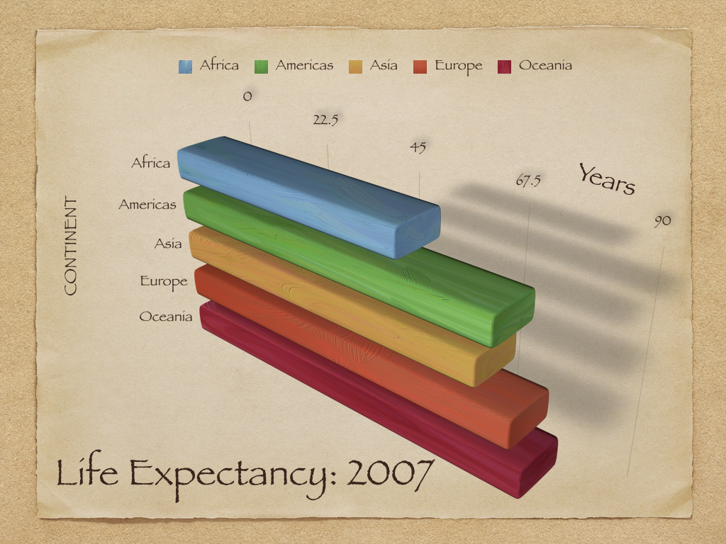
Figure 1.4: A chart with a considerable amount of junk in it.
1.2.1 Bad taste
Let’s start with the bad taste. Figure 1.4 shows a chart that is both quite tasteless and has far too much going on in it, given the modest amount of information it displays. The bars are hard to read and compare. It needlessly duplicates labels and makes pointless use of three-dimensional effects, drop shadows, and other unnecessary design features.
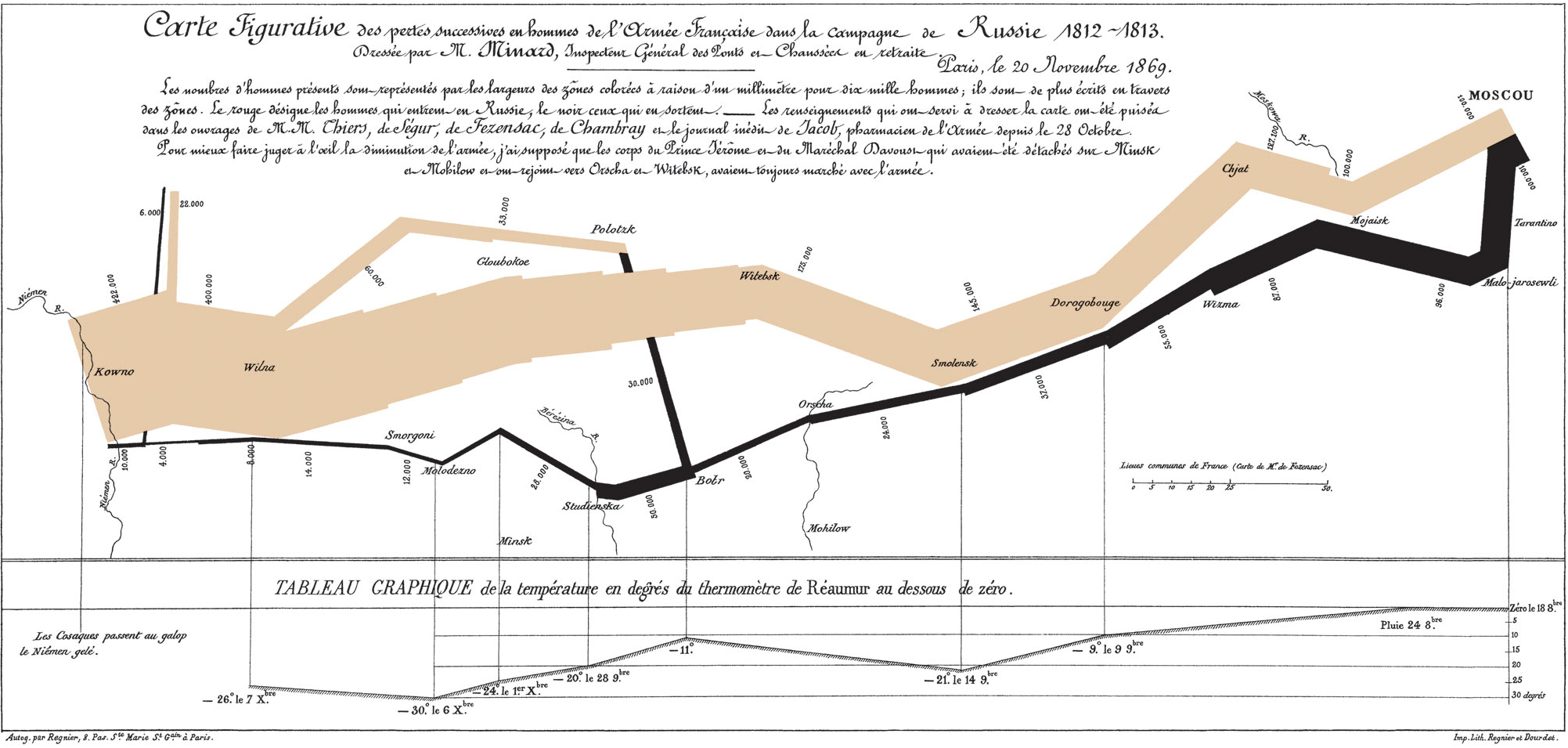 Figure 1.5: Minard’s visualization of Napoleon’s retreat from Moscow. Justifiably cited as a classic, it is also atypical and hard to emulate in its specifics.
The best-known critic by far of this style of visualization, and the best-known taste-maker in the field, is Edward R. Tufte. His book The Visual Display of Quantitative Information (1983) is a classic, and its sequels are also widely read (Tufte, 1990, 1997). The bulk of this work is a series of examples of good and bad visualization, along with some articulation of more general principles (or rules of thumb) extracted from them. It is more like a reference book about completed dishes than a cookbook for daily use in the kitchen. At the same time, Tufte’s early academic work in political science shows that he effectively applied his own ideas to research questions. His Political Control of the Economy (1978) combines tables, figures, and text in a manner that remains remarkably fresh almost forty years later.
Tufte’s message is sometimes frustrating, but it is consistent:
Graphical excellence is the well-designed presentation of interesting data—a matter of substance, of statistics, and of design … [It] consists of complex ideas communicated with clarity, precision, and efficiency. … [It] is that which gives to the viewer the greatest number of ideas in the shortest time with the least ink in the smallest space … [It] is nearly always multivariate … And graphical excellence requires telling the truth about the data. (Tufte, 1983, p. 51).
Tufte illustrates the point with Charles Joseph Minard’s famous visualization of Napoleon’s march on Moscow, shown here in Figure 1.5. He remarks that this image “may well be the best statistical graphic ever drawn,” and argues that it “tells a rich, coherent story with its multivariate data, far more enlightening than just a single number bouncing along over time. Six variables are plotted: the size of the army, its location on a two-dimensional surface, direction of the army’s movement, and temperature on various dates during the retreat from Moscow”.
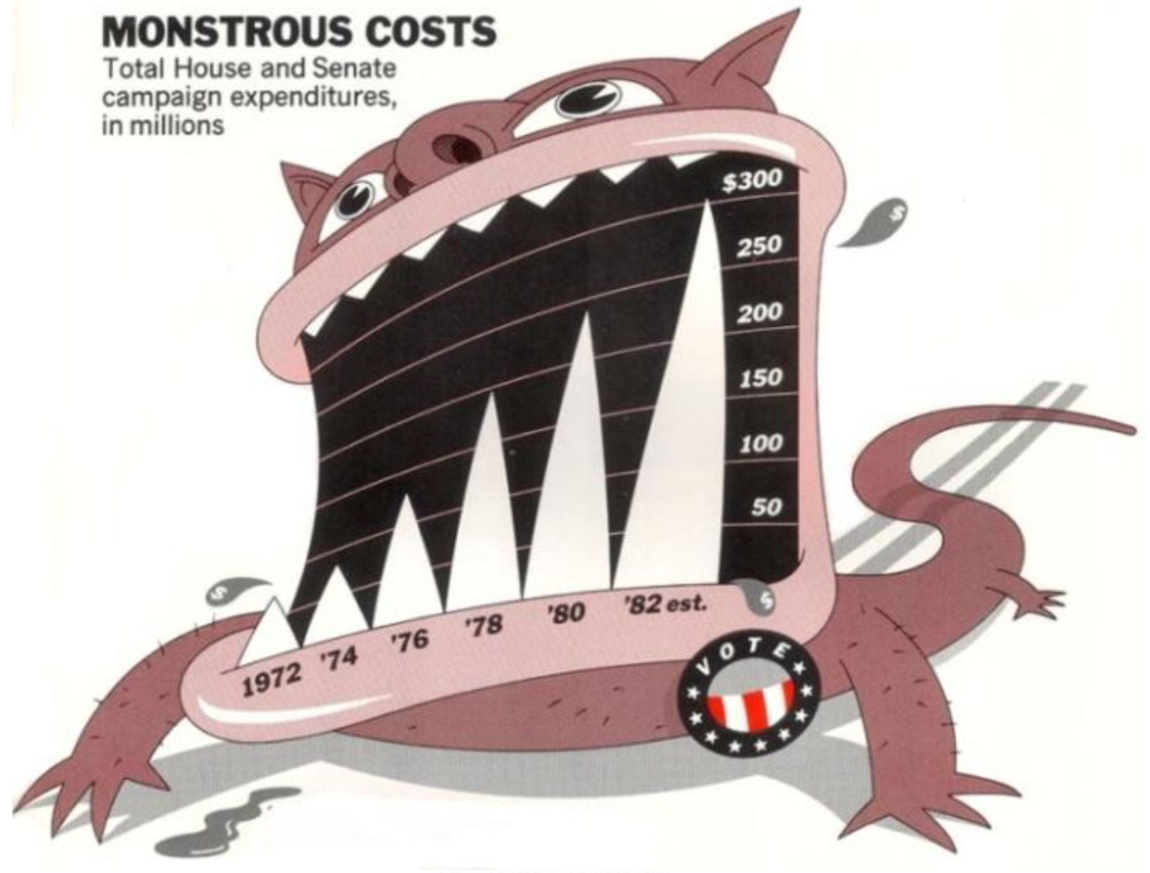 Figure 1.6: `Monstrous Costs’ by Nigel Holmes. Also a classic of its kind.
It is worth noting how far removed Minard’s image is from most contemporary statistical graphics. At least until recently, these have tended to be applications or generalizations of scatterplots and barplots, either in the direction of seeing more raw data, or seeing the output derived from a statistical model. The former looks for ways to increase the volume of data visible, or the number of variables displayed within a panel, or the number of panels displayed within a plot. The latter looks for ways to see results such as point estimates, confidence intervals, and predicted probabilities in an easily-comprehensible way. Tufte acknowledges that a tour de force such as Minard’s “can be described and admired, but there are no compositional principles on how to create that one wonderful graphic in a million”. The best one can do for “more routine, workaday designs” is to suggest some guidelines such as “have a properly chosen format and design,” “use words, numbers, and drawing together,” “display an accessible complexity of detail” and “avoid content-free decoration, including chartjunk” (Tufte, 1983, p. 177).
In practice those compositional principles have amounted to an encouragement to maximize the “data-to-ink” ratio. This is practical advice. It is not hard to jettison tasteless junk, and if we look a little harder we may find that the chart can do without other visual scaffolding as well. We can often clean up the typeface, remove extraneous colors and backgrounds, and simplify, mute, or delete gridlines, superfluous axis marks, or needless keys and legends. Given all that, we might think that a solid rule of “simpify, simplify” is almost all of what we need to make sure that our charts remain junk-free, and thus effective. But unfortunately this is not the case. For one thing, somewhat annoyingly, there is evidence that highly embellished charts like Nigel Holmes’s “Monstrous Costs” are often more easily recalled than their plainer alternatives (Bateman et al., 2010). Viewers do not find them more easily interpretable, but they do remember them more easily and also seem to find them more enjoyable to look at. They also associate them more directly with value judgments, as opposed to just trying to get information across. Borkin et al. (2013) also found that visually unique, “Infographic” style graphs were more memorable than more standard statistical visualizations. (“It appears that novel and unexpected visualizations can be better remembered than the visualizations with limited variability that we are exposed to since elementary school”, they remark.)
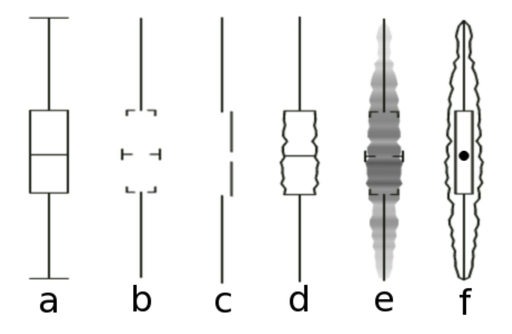 Figure 1.7: Six kinds of summary boxplots. Type (c) is from Tufte.
Even worse, it may be the case that graphics that really do maximize the data-to-ink ratio are harder to interpret than those that are a little more relaxed about it. Anderson et al. (2011) found that, of the four kinds of boxplot shown in Figure 1.7, the minimalist version from Tufte’s own work (option C) proved to be the most cognitively difficult for viewers to interpret. Cues like labels and gridlines, together with some strictly superfluous embellishment of data points or other design elements, may often be an aid rather than an impediment to interpretation.
While chartjunk is not entirely devoid of merit, bear in mind that ease of recall is only one virtue amongst many for graphics. It is also the case that, almost by definition, it is no easier to systematize the construction of a chart like “Monstrous Costs” than it is to replicate the impact of Minard’s graph of Napoleon’s retreat. Indeed, the literature on chartjunk suggests that the two may have some qualities in common. To be sure, Minard’s figure is admirably rich in data while Holmes’s is not. But both are visually distinctive in a way that makes them memorable, both show a very substantial amount of bespoke design, and both are quite unlike most of the statistical graphs you will see, or make.
1.2.2 Bad data
In your everyday work you will be in little danger of producing either a “Monstrous Costs” or a “Napoleon’s Retreat”. You are much more likely to make a good-looking, well-designed figure that misleads people because you have used it to display some bad data. Well-designed figures with little or no junk in their component parts are not by themselves a defence against cherry-picking your data, or presenting information in a misleading way. Indeed, it is even possible that, in a world where people are on guard against junky infographics, the “halo effect” accompanying a well-produced figure might make it easier to mislead some audiences. Or, perhaps more common, good aesthetics does not make it much harder for you to mislead yourself as you look at your data.
In November of 2016, the New York Times reported on some research on people’s confidence in the institutions of democracy. It had been published in an academic journal by the political scientist Yasha Mounk. The headline in the Times ran, “How Stable Are Democracies? ‘Warning Signs Are Flashing Red’” (Taub, 2016). The graph accompanying the article, reproduced in Figure 1.8, certainly seemed to show an alarming decline.
Figure 1.8: A crisis of faith in democracy? (New York Times.)
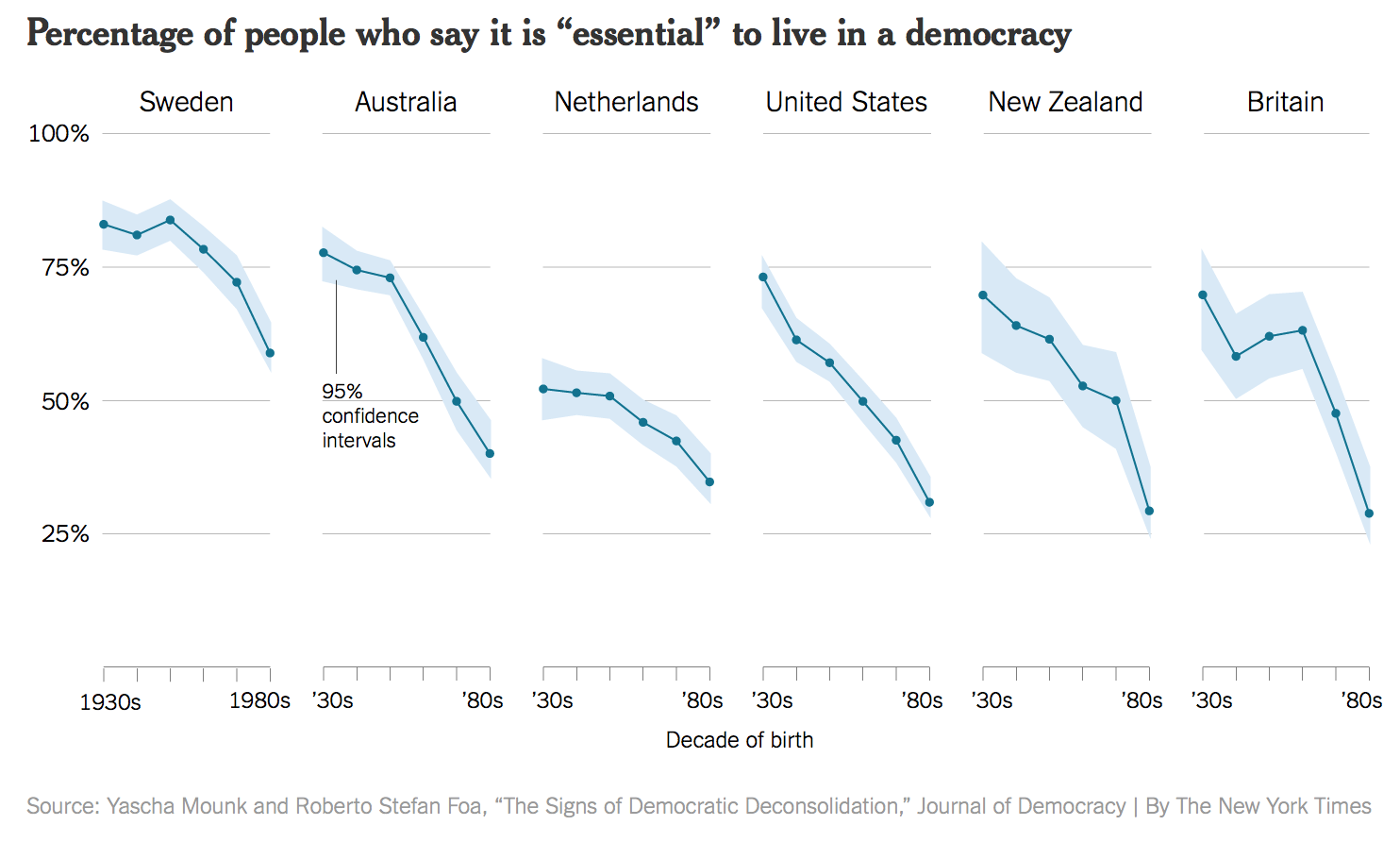
The graph was widely circulated on social media. It is impressively well-produced. It’s an elegant small-multiple that, in addition to the point ranges it identifies, also shows an error range (labeled as such for people who might not know what it is), and the story told across the panels for each country is pretty consistent.
The figure is a little tricky to interpret. As the x-axis label says, the underlying data are from a cross-sectional survey of people of different ages rather than a longitudinal study measuring everyone at different times. Thus, the lines do not show a trend measured each decade from the 1930s, but rather differences in the answers given by people born in different decades, all of whom were asked the question at the same time. Given that, a bar graph might have been a more appropriate to display the results.
MoreOne reason I chose this example is that, at the time of writing, it is not unreasonable to be concerned about the stability of people’s commitment to democratic government in some Western countries. Perhaps Mounk’s argument is correct. But in such cases, the question is how much we are letting the data speak to us, as opposed to arranging it to say what we already think for other reasons. importantly, as the story circulated, helped by the compelling graphic, scholars who knew the World Values Survey data underlying the graph noticed something else. The graph reads as though people were asked to say whether they thought it was essential to live in a democracy, and the results plotted show the percentage of respondents who said “Yes”, presumably in contrast to those who said “No”. But in fact the survey question asked respondents to rate the importance of living in a democracy on a ten point scale, with 1 being “Not at all Important” and 10 being “Absolutely Important”. The graph showed the difference across ages of people who had given a score of “10” only, not changes in the average score on the question. As it turns out, while there is some variation by year of birth, most people in these countries tend to rate the importance of living in a democracy very highly, even if they do not all score it as “Absolutely Important”. The political scientist Erik Voeten redrew the figure based using the average response. The results are shown in Figure 1.9.
Figure 1.9: Perhaps the crisis has been overblown. (Erik Voeten.)
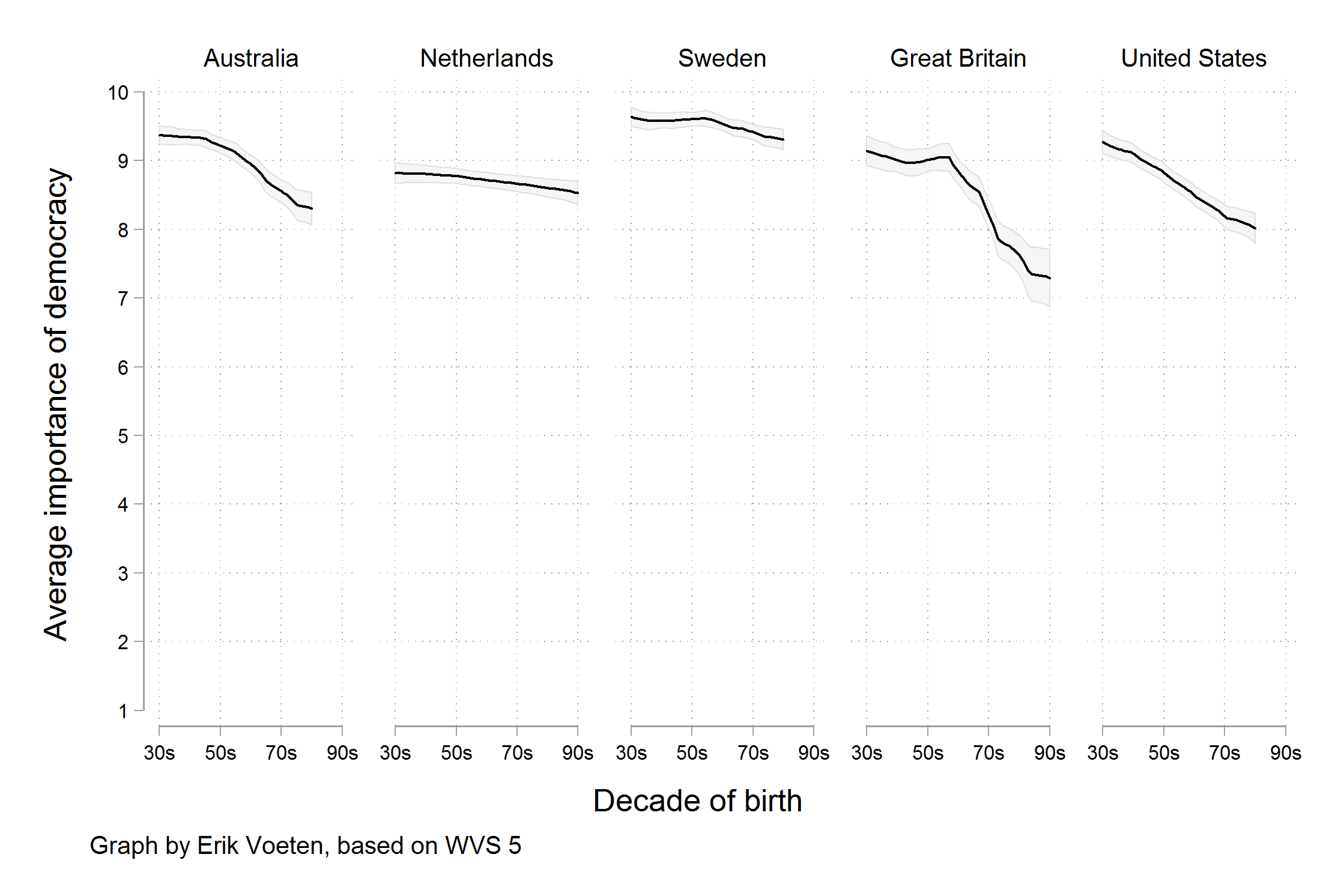
The change here is not due to a difference in how the y-axis is drawn. That is a common issue with graphs, and one we will discuss below. In this case both the New York Times graph and Voeten’s alternative have scales that cover the full range of possible values (from zero to 100% in the former case and from 1 to 10 in the latter). Rather, a different measure is being shown. We are now looking at the trend in the average score, rather than the trend for the highest possible answer. Substantively, there does still seem to be a decline in the average score by age cohort, on the order of between half a point to one and a half points on a ten point scale. It could be an early warning sign of a collapse of belief in democracy, or it could be explained by something else. It might even be reasonable (as we will see for a different example shortly) to present the data in Voeten’s verion with the y-axis covering just the range of the decline, rather than the full zero to ten scale. But it seems fair to say that the story not have made the New York Times if the original research article had presented Voeten’s version of the data, rather than the one that appeared in the newspaper.
1.2.3 Bad perception
Our third category of badness lives in the gap between data and aesthetics. Visualizations encode numbers in lines, shapes, and colors. That means that our interpretation of these encodings is partly conditional on how we perceive geometric shapes and relationships generally. We have known for a long time that poorly-encoded data can be misleading. Tufte (1983) contains many examples, as does Wainer (1984). Many of the instances they cite revolve around needlessly multiplying the number of dimensions shown in a plot. Using an area to represent a length, for example, can make differences between observations look larger than they are.
Figure 1.10: A 3-D Column Chart created in Microsoft Excel for Mac. Although it may seem hard to believe, the values shown in the bars are 1, 2, 3, and 4.
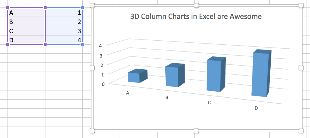
Although the most egregious abuses are less common than they once were, adding additional dimensions to plots remains a common temptation. Figure 1.10, for instance, is a 3-D bar chart made using a recent version of Microsoft Excel. Charts like this are common in business presentations and popular journalism, and are also seen in academic journal articles from time to time. Here we seek to avoid too much junk by using Excel’s default settings.To be fair, the 3-D format is not Excel’s default type of bar chart. As you can see from the cells shown to the left of the chart, the data we are trying to plot is not very complex. The chart even tries to help us by drawing and labeling grid lines on the y (and z) axis. And yet, the 3-D columns in combination with the default angle of view for the chart make the values as displayed differ substantially from the ones actually in the cell. Each column appears to be somewhat below its actual value. It is possible to see, if you squint with your mind’s eye, how the columns would line up with the axis guidelines if your angle of view moved so that the bars head-on. But as it stands, anyone asked what values the chart shows would give the wrong answer.
By now, many regular users of statistical graphics know enough to avoid excessive decorative embellishments of charts. They are also usually put on their guard by overly-elaborate presentation of simple trends, as when a three-dimensional ribbon is used to display a simple trend line. Moreover, the default settings of most current graphical software tend to make the user work a little harder to add these features to plots.
Figure 1.11: A junk-free plot that remains hard to interpret. While a stacked bar chart makes the overall trend clear, it can make it harder to see the trends for the categories within the bar. This is partly due to the nature of the trends. But if the additional data is hard to understand, perhaps it should not be included to begin with.
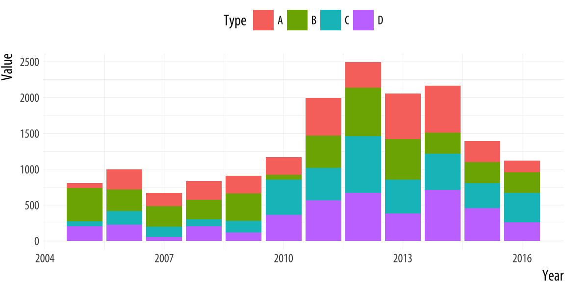
Even when the underlying numbers are sensible, the default settings of software are good, and the presentation of charts is mostly junk-free, some charts remain more difficult to interpret than others. They encode data in ways that are hard for viewers to understand. Figure 1.11 presents a stacked bar chart with time in years on the x-axis and some value on the y-axis. The bars show the total value, with subdivisions by the relative contribution of different categories to each year’s observation. Charts like this are common when showing the absolute contribution of various products to total sales over time, for example, or the number of different groups of people in a changing population. Equivalently, stacked line-graphs showing similar kinds of trends are also common for data with many observation points on the x-axis, such as quarterly observations over a decade.
In a chart like this, the overall trend is readily interpretable, and it is also possible to easily follow the over-time pattern of the category that is closest to the x-axis baseline (in this case, Type D, colored in purple). But the fortunes of the other categories are not so easily grasped. Comparisons of both the absolute and the relative share of Type B or C are much more difficult, whether one wants to compare trends within type, or between them. Relative comparisons need a stable baseline. In this case, that’s the x-axis, which is why the overall trend and the Type D trend are much easier to see than any other trend.
Figure 1.12: Aspect ratios affect our perception of rates of change. (After an example by William S. Cleveland.)
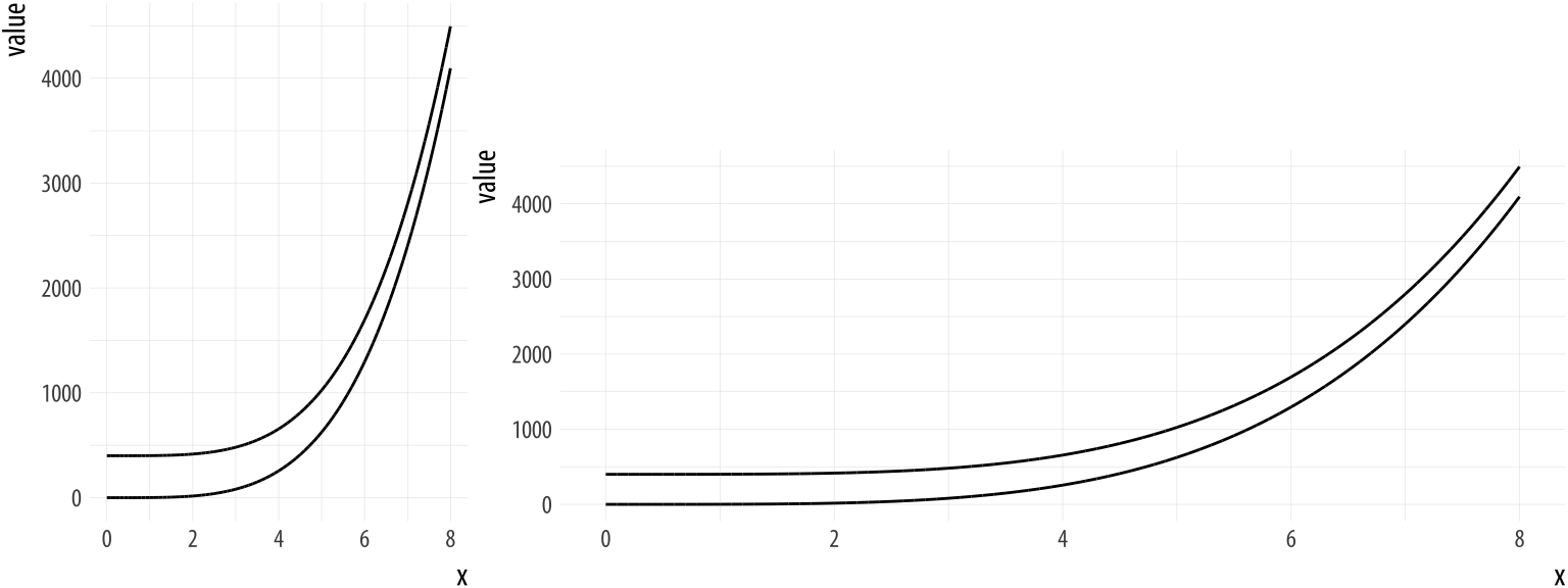
A different sort of problem is shown in Figure 1.12. In the left-side panel, the lines appear at first glance to be converging as the value of x increases. It seems like they might even intersect if we extended the graph out further. In the right-side panel, the curves are clearly equidistant from the beginning. The data plotted in each panel are the same, however. The apparent convergence in the left panel is just a result of the aspect ratio of the figure.
These problems are not easily solved by the application of good taste, or by following a general rule to maximize the data-to-ink ratio, even though that is a good rule to follow. Instead, we need to know a little more about the role of perception in the interpretation of graphs. Fortunately for us, this is an area that has produced a substantial amount of research over the past twenty five years.
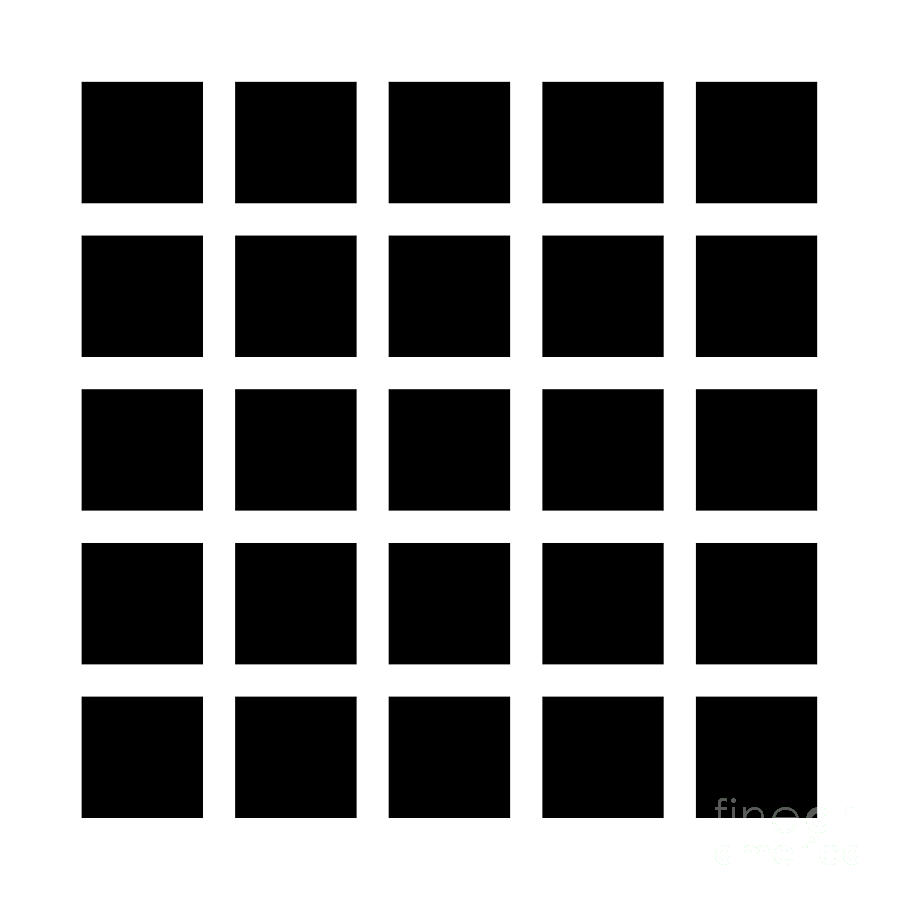 Figure 1.13: Hermann Grid Effect.
1.3 Perception and data visualization
While a detailed discussion of visual perception is well beyond the scope of this book, even a very simple sense of how we see things we will help us understand why some figures work and others do not. For a much more thorough treatment of these topics, Colin Ware’s books on information design are excellent overviews of research on visual perception, written from the perspective of people designing graphs, figures, and systems for representing data (Ware, 2008, 2013).
1.3.1 Edges, contrasts and colors
Looking at pictures of data means looking at lines, shapes, and colors. Our visual system works in a way that makes some things easier for us to see than others. I am speaking in slightly vague terms here because the underlying details are the remit of vision science, and the exact mechanisms responsible are often the subject of ongoing research. I will not pretend to summarize or evaluate this material. In any case, independent of detailed explanation, the existence of the perceptual phenomena themselves can often be directly demonstrated through visual effects or “optical illusions” of various kinds. These effects demonstrate that, perception is not a simple matter of direct visual inputs producing straightforward mental representations of their content. Rather, our visual system is tuned to accomplish some tasks very well, and this comes at a cost in other ways.
Figure 1.14: Mach bands. On the left side, five grey bars are ordered from dark to light, with gaps between them. On the right side, the bars have no gap between them. The brightness or luminance of the corresponding bars is the same. However, when the bars touch, the dark areas seem darker and the light areas lighter.
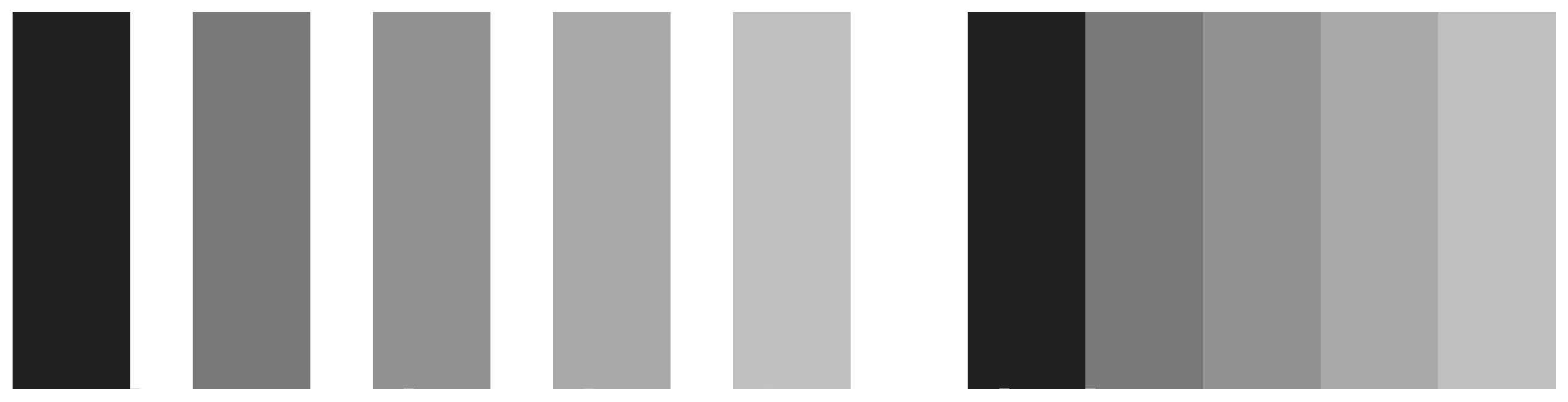
The active nature of perception has long been recognized. The Hermann grid effect, shown in Figure 1.13, was discovered in 1870. Ghostly blobs seem to appear at the intersections in the grid but only as long as one is not looking at them directly. A related effect is shown in Figure 1.14. These are Mach bands. When the gray bars share a boundary, the apparent contrast between them appears to increase. Speaking loosely, we can say that our visual system is trying to construct a representation of what it is looking at based more on relative differences in the luminance (or brightness) of the bars, rather than their absolute value. Similarly, the ghostly blobs in the Hermann grid effect can be thought of as a side-effect of the visual system being tuned for a different task.
These sorts of effects extend to the role of background contrasts. The same shade of gray will be perceived very differently depending on whether it is against a darker background our a lighter one. Our ability to distinguish shades of brightness is not uniform, either. We are better at distinguishing darker shades than we are at distinguishing lighter ones. And the effects interact, too. We will do better at distinguishing very light shades of gray when they are set against a light background. When set against a dark background, differences in the middle-range of the light-to-dark spectrum are easier to distinguish.
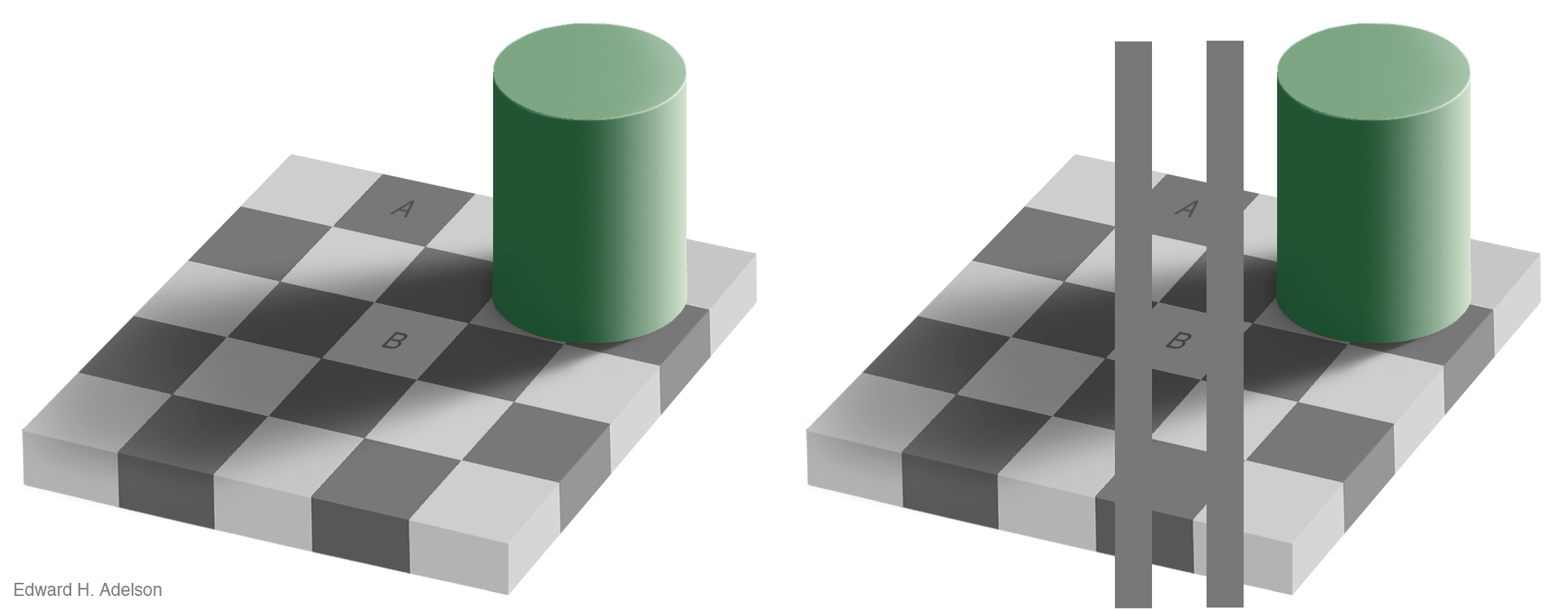
Figure 1.15: The checkershadow illusion (Edward H. Adelson).
Our visual system is attracted to edges, and we assess contrast and brightness in terms of relative rather than absolute values. Some of the more spectacular visual effects exploit our mostly successful efforts to construct representations of surfaces, shapes, and objects based on what we are seeing. Edward Adelson’s checkershadow illusion, shown in Figure 1.15, is a good example.
To figure out the shade of the squares on the floor, we compare it to the nearby squares, and we also discount the shadows cast by other objects. Even though a light-colored surface in shadow might reflect less light than a dark surface in direct light, it would generally be an error to infer that the surface in the shade really was a darker color. The checkerboard image is carefully constructed to exploit these visual inferences made based on local contrasts in brightness and the information provided by shadows. As Adeslon notes, “The visual system is not very good at being a physical light meter, but that is not its purpose”. Because it has evolved to be good at perceiving real objects in its environment, we need to be aware of how it works in settings where we are using it to do other things, such as keying variables to some spectrum of grayscale values.
An important point about visual effects of this kind is that they are not illusions in the way that a magic trick is an illusion. If a magician takes you through an illusion step by step and shows you how it is accomplished, then the next time you watch the trick performed you will see through it, and notice the various bits of misdirection and sleight of hand that are used to achieve the effect. But the most interesting visual illusions are not like this. Even after they have been explained to you, you cannot stop seeing them, because the perceptual processes they exploit are not under your conscious control. This makes it easy to be misled by them, as when (for example) we overestimate the size of a contrast between two adjacent shaded areas on a map or grid simply because they share a boundary.

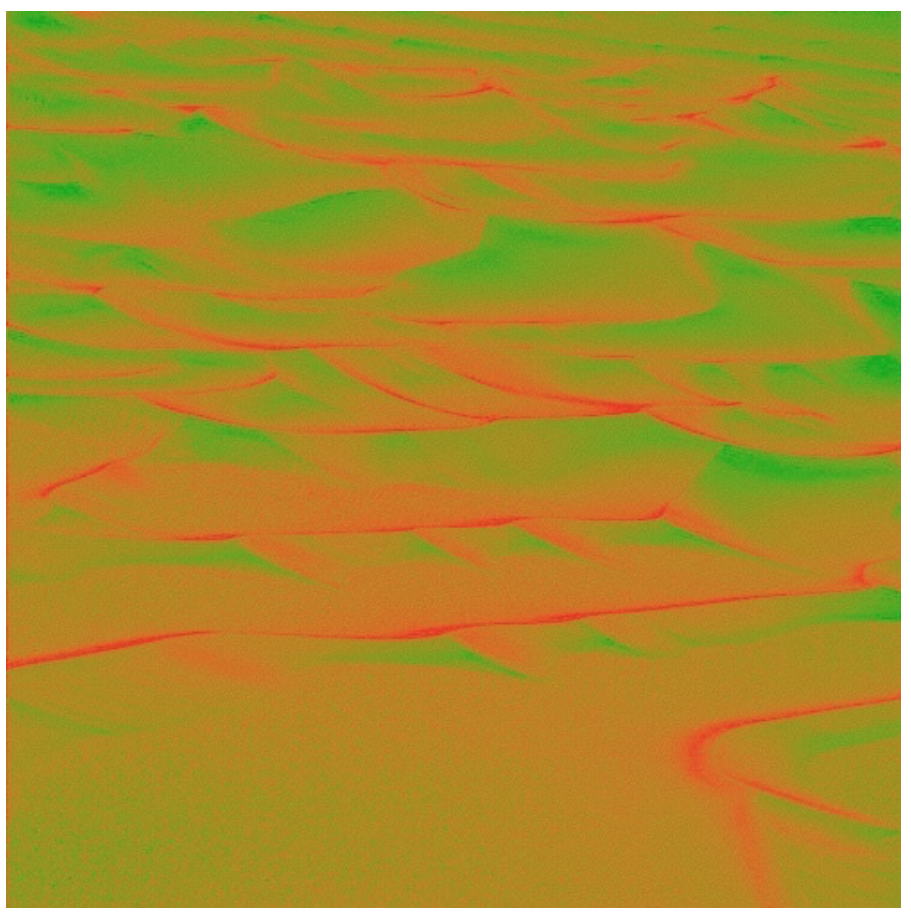 Figure 1.16: Edge contrasts in monochrome and color, after Ware (2008).
Our ability to see edge contrasts is stronger for monochrome images than for color. Figure 1.16, from Ware (2008, p. 71), shows an image of sand dunes. In the red-green version, the structure of the landscape is hard to perceive. In the grayscale version, the dunes and ridges are much more easily visible.
Using color in data visualization introduces a number of other complications (Zeileis & Hornik, 2006). The central one is related to the relativity of luminance perception. As we have been discussing, our perception of how bright something looks is largely a matter of relative rather than absolute judgments. How bright a surface looks depends partly on the brightness of objects near it. In addition to luminance, the color of an object can be thought of has having two other components. First, an object’s hue is what we conventionally mean when we use the word “color”: red, blue, green, purple, and so on. In physical terms it can be thought of as the dominant wavelength of the light reflected from the object’s surface. The second component is chrominance or chroma. This is the intensity or vividness of the color.
To produce color output on screens or in print we use various color models that mix together color components to get specific outputs. Using the RGB model, a computer might represent color in terms of mixtures of red, green, and blue components, each of which can take a range of values from 0 to 255. When using colors in a graph, we are mapping some quantity or category in our data to a color that people see. We want that mapping to be “accurate” in some sense, with respect to the data. This is partly a matter of the mapping being correct in strictly numerical terms. For instance, we want the gap between two numerical values in the data to be meaningfully preserved in the numerical values used to define the colors shown. But it is also partly a matter of how that mapping will be perceived when we look at the graph.

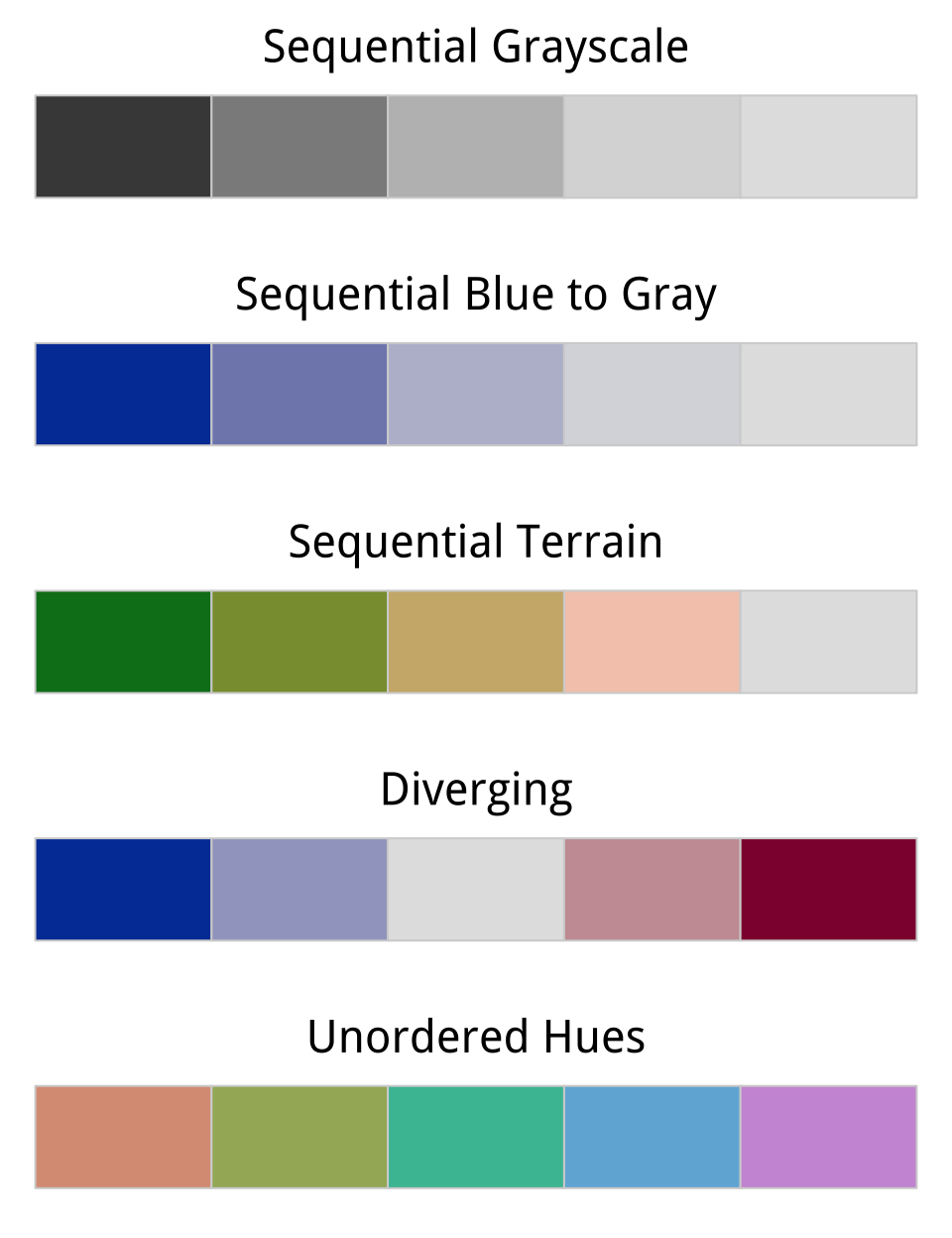 Figure 1.17: Five palettes generated from R’s colorspace library. From top to bottom, the sequential grayscale palette varies only in luminance, or brightness. The sequential blue palette varies in both luminance and chrominance (or intensity). The third sequential palette varies in luminance, chrominance, and hue. The fourth palette is diverging, with a neutral midpoint. The fifth features balanced hues, suitable for unordered categories.
For example, imagine we had a variable that could take values from 0 to 5 in increments of 1, with zero being the lowest value. It is straightforward to map this variable to a set of RGB colors that are equally distant from one another in purely numerical terms in our color space. The wrinkle is that many points that are equidistant from each other in this sense will not be perceived as equally distant by people looking at the graph. This is because our perception is not uniform across the space of possible colors. For instance, the range of chroma we are able to see depends strongly on luminance. If we pick the wrong color palette to represent our data, for any particular gradient the same sized jump between one value and another (e.g. from 0 to 1, as compared to from 3 to 4) might be perceived differently by the viewer. This also varies across colors, in that numerically equal gaps between a sequences of reds (say), are perceived differently from the same gaps mapped to blues.
When choosing color schemes, we will want mappings from data to color that are not just numerically but also perceptually uniform. R provides color models and color spaces that try to achieve this. Figure 1.17 shows a series of sequential gradients using the HCL (or Hue-Chroma-Luminance) color model. The grayscale gradient at the top varies by luminance only. The blue palette varies by luminance and chrominance, as the brightness and the intensity of the color varies across the spectrum. The remaining three palettes vary by luminance, chrominance, and hue. The goal in each case is to generate a perceptually uniform scheme, where hops from one level to the next are seen as having the same magnitude.
Gradients or sequential scales from low to high are one of three sorts of color palettes. When we are representing a scale with a neutral mid-point (as when we are showing temperatures, for instance, or variance in either direction from a zero point or a mean value), we want a diverging scale, where the steps away from the midpoint are perceptually even in both directions. The blue-to-red palette in Figure 1.17 displays an example. Finally, perceptual uniformity matters for unordered categorical variables as well. We often use color to represent data for different countries, or political parties, or types of people, and so on. In those cases we want the colors in our qualitative palette to be easily distinguishable, but also have the same valence for the viewer. Unless we are doing it deliberately, we do not want one color to perceptually dominate the others. The bottom palette in Figure 1.17 shows an example of a qualitative palette that is perceptually uniform in this way.
The upshot is that we should generally not pick colors in an ad hoc way. It is too easy to go astray. In addition to the considerations we have been discussing, we might also want to avoid producing plots that confuse people who are color blind, for example. Fortunately, almost all of the work has been done for us already. Different color spaces have been defined and standardized in ways that account for these uneven or nonlinear aspects of human color perception.The body responsible for this is the appropriately authoritative-sounding Commission Internationale de l’Eclairage, or International Commission on Illumination. R and ggplot make these features available to us for free. The default palettes we will be using in ggplot are perceptually uniform in the right way. If we want to get more adventurous later the tools are available to produce custom palettes that still have desirable perceptual qualities. Our decisions about color will focus more on when and how it should be used. As we are about to see, color is a powerful channel for picking out visual elements of interest.
1.3.2 Preattentive search and what “pops”
Some objects in our visual field are easier to see than others. They “pop out” at us from whatever they are surrounded by. For some kinds of object, or through particular channels, this can happen very quickly. Indeed, from our point of view it happens before or almost before the conscious act of looking at or for something. The general term for this is “preattentive pop-out” and there is an extensive experimental and theoretical literature on it in psychology and vision science. As with the other perceptual processes we have been discussing, the explanation for what is happening is or has been a matter of debate, up to and including the degree to which the phenomenon really is “pre-attentive”, as discussed for example by Treisman & Gormican (1988) or Nakayama & Joseph (1998). But it is the existence of pop-out that is relevant to us, rather than its explanation. Pop-out makes some things on a data graphic easier to see or find than others.
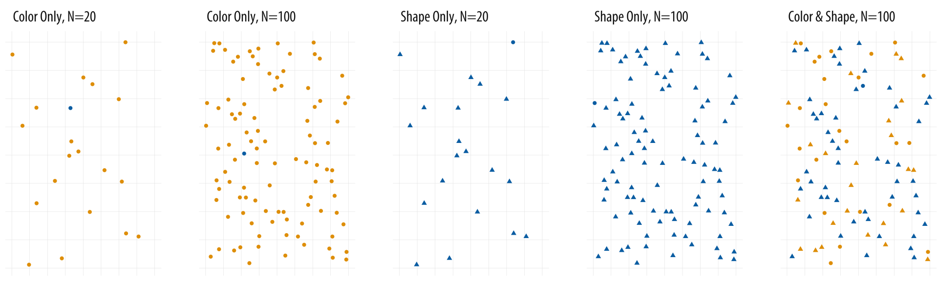
Figure 1.18: Searching for the blue circle becomes progressively harder.
Consider the panels in 1.18. Each one of them contains a single blue circle. Think of it as an observation of interest. Reading left to right, the first panel contains twenty circles, nineteen of which are yellow and one blue. The blue circle is easy to find, as there is a relatively small number of observations to scan, and their color is the only thing that varies. The viewer barely has to search consciously at all before seeing the dot of interest.
In the second panel, the search is harder, but not that much harder. There are a hundred dots now, five times as many, but again the blue dot is easily found. The third panel again has only twenty observations. But this time there is no variation on color. Instead nineteen observations are triangles and one is a circle. On average, looking for the blue dot is noticeably harder than searching for it in the first panel, and may even be more difficult than the second panel despite there being many fewer observations.
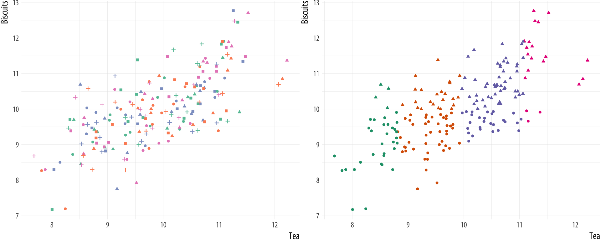
Figure 1.19: Multiple channels become uninterpretable very fast (left), unless your data has a great deal of structure (right).
Think of shape and color as two distinct channels that can be used to encode information visually. It seems that pop-out on the color channel is stronger than it is on the shape channel. In the fourth panel, the number of observations is again upped to one hundred. Finding the single blue dot may take noticeably longer. If you don’t see it on the first or second pass, it may require a conscious effort to systematically scan the area in order to find it. It seems that search performance on the shape channel degrades much faster than on the color channel.
Finally the fifth panel mixes color and shape for a large number of observations. Again there is only one blue dot on the graph, but annoyingly there are many blue triangles and yellow dots that make it harder to find what we are looking for. Dual- or multiple-channel searches for large numbers of observations can be very slow.
Similar kinds of effects can be demonstrated for search across other channels (for instance, with size, angle, elongation, and movement) and for particular kinds of searches within channels. For example some kinds of angle contrasts are easier to see than others, as are some kinds of color contrasts. Ware (2008, pp. 27–33) has more discussion and examples. The consequences for data visualization are clear enough. As shown in Figure 1.19, adding multiple channels to a graph is likely to overtax the capacity of the viewer very quickly. Even if our software allows us to, we should think carefully before representing different variables and their values by shape, color, and position all at once. It is possible for there to be exceptions. In particular (as shown in the second panel of Figure 1.19) if the data show a great deal of structure to begin with. But even here, in all but the most straightforward cases a different visualization strategy is likely to do better.
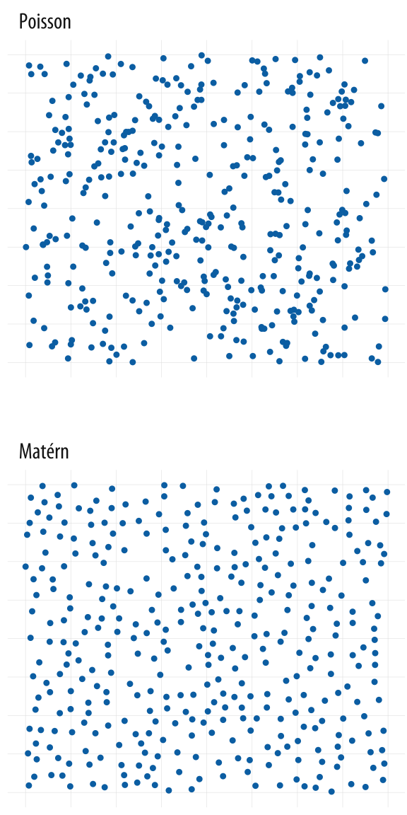 Figure 1.20: Each panel shows simulated data. The upper panel shows a random point pattern generated by a Poisson process. The lower panel is from a Matérn model, where new points are randomly placed but cannot be too near already-existing ones. Most people see the Poisson-generated pattern as having more structure, or less ‘randomness’, than the Matérn, whereas the reverse is true.
1.3.3 Gestalt rules
At first glance, the points in the “pop-out” examples in Figure 1.18 might seem randomly distributed within each panel. In fact, they are not quite randomly located. Instead, I wrote a little code to lay them out in a way that spread them around the plotting area, but prevented any two points from completely or partially overlapping one another. I did this because I wanted the scatter plots to be programmatically generated but did not want to take the risk that the blue dot would end up plotted underneath one of the other dots or triangles. It’s worth taking a closer look at this case, as there is a lesson here for how we perceive patterns.
Each panel in Figure 1.20 shows a field of points. There are clearly differences in structure between them. The first panel was produced by a two-dimensional Poisson point process, and is “properly” random. (Defining randomness, or ensuring that a process really is random, turns out to be a lot harder than you might think. But we gloss over those difficulties here.) The second panel was produced from a Matérn model, a specification often found in spatial statistics and ecology. In a model like this points are again randomly distributed, but subject to some local constraints. In this case, after randomly generating a number of candidate points in order, the field is pruned to eliminate any point that appears too close to a point that was generated before it. We can tune the model to decide how close is “too close”. The result is a set of points that are evenly spread across the available space.
If you ask people which of these panels has more structure in it, they will tend to say the Poisson field. We associate randomness with a relatively even distribution across a space. But in fact, a random process like this is substantially more “clumpy” than we tend to think. I first saw a picture of this contrast in an essay by Stephen Jay Gould (1991). There the Matérn-like model was used as a representation of glow-worms on the wall of a cave in New Zealand. It’s a good model for that case because if one glow-worm gets too close to another, it’s liable to get eaten. Hence the relatively even—but not random—distribution that results.
Figure 1.21: Gestalt inferences: Proximity, Similarity, Connection, Common Fate. The layout of the figure employs some of these principles, in addition to displaying them
We look for structure all the time. We are so good at it that we will find it in random data, given time. (This is one of the reasons that data visualization can hardly be a replacement for statistical modeling.) The strong inferences we make about relationships between visual elements from relatively sparse visual information are called “gestalt rules”. They are not pure perceptual effects, like the checkerboard illusions. Rather, they describe our tendency to infer relationships between the objects we are looking at in a way that goes beyond what is strictly visible. Figure 1.21 provides some examples.
What sorts of relationships are inferred, and under what circumstances? In general we want to identify groupings, classifications, or entities than can be treated as the same thing or part of the same thing:
- Proximity: Things that are spatially near to one another seem to be related.
- Similarity: Things that look alike seem to be related.
- Connection: Things that are visually tied to one another seem to be related.
- Continuity: Partially hidden objects are completed into familiar shapes.
- Closure: Incomplete shapes are perceived as complete.
- Figure and Ground: Visual elements are taken to be either in the foreground or the background.
- Common Fate: Elements sharing a direction of movement are perceived as a unit.
Some kinds of visual cues trump others. For example, in the upper left of Figure 1.21, the circles are aligned horizontally into rows, but their proximity by column takes priority, and we see three groups of circles. In the upper right, the three groups are still salient but the row of blue circles is now seen as a grouped entity. In the middle row of the Figure, the left side shows mixed grouping by shape, size, and color. Meanwhile the right side of the row shows that direct connection trumps shape. Finally the two schematic plots in the bottom row illustrate both connection and common fate, in that the lines joining the shapes tend to be read left-to-right as part of a series. Note also the points in the lower right plot where the lines cross. There are gaps in the line segments joining the circles, but we perceive this as them “passing underneath” the lines joining the triangles.
1.4 Visual tasks and decoding graphs
The workings of our visual system and our tendency to make inferences about relationships between visible elements form the basis of our ability to interpret graphs of data. There is more involved besides that, however. Beyond core matters of perception lies the question of interpreting and understanding particular kinds of graphs. The proportion of people who can read and correctly interpret a scatterplot is lower than you might think. At the intersection of perception and interpretation there are specific visual tasks that people need to perform in order to properly see the graph in front of them. To understand a scatterplot, for example, the viewer needs to know a lot of general information, such as what a variable is, what an x-y coordinate plane looks like, why we might want to compare two variables on one, and the convention of putting the supposed cause or “independent” variable on the x-axis. Even if the viewer understands all these things, they must still perform the visual task of interpreting the graph. A scatterplot is a visual representation of data, not way to magically transmit pure understanding. Even well-informed viewers may do worse than we think when connecting the picture to the underlying data (Doherty, Anderson, Angott, & Klopfer, 2007; Rensink & Baldridge, 2010).
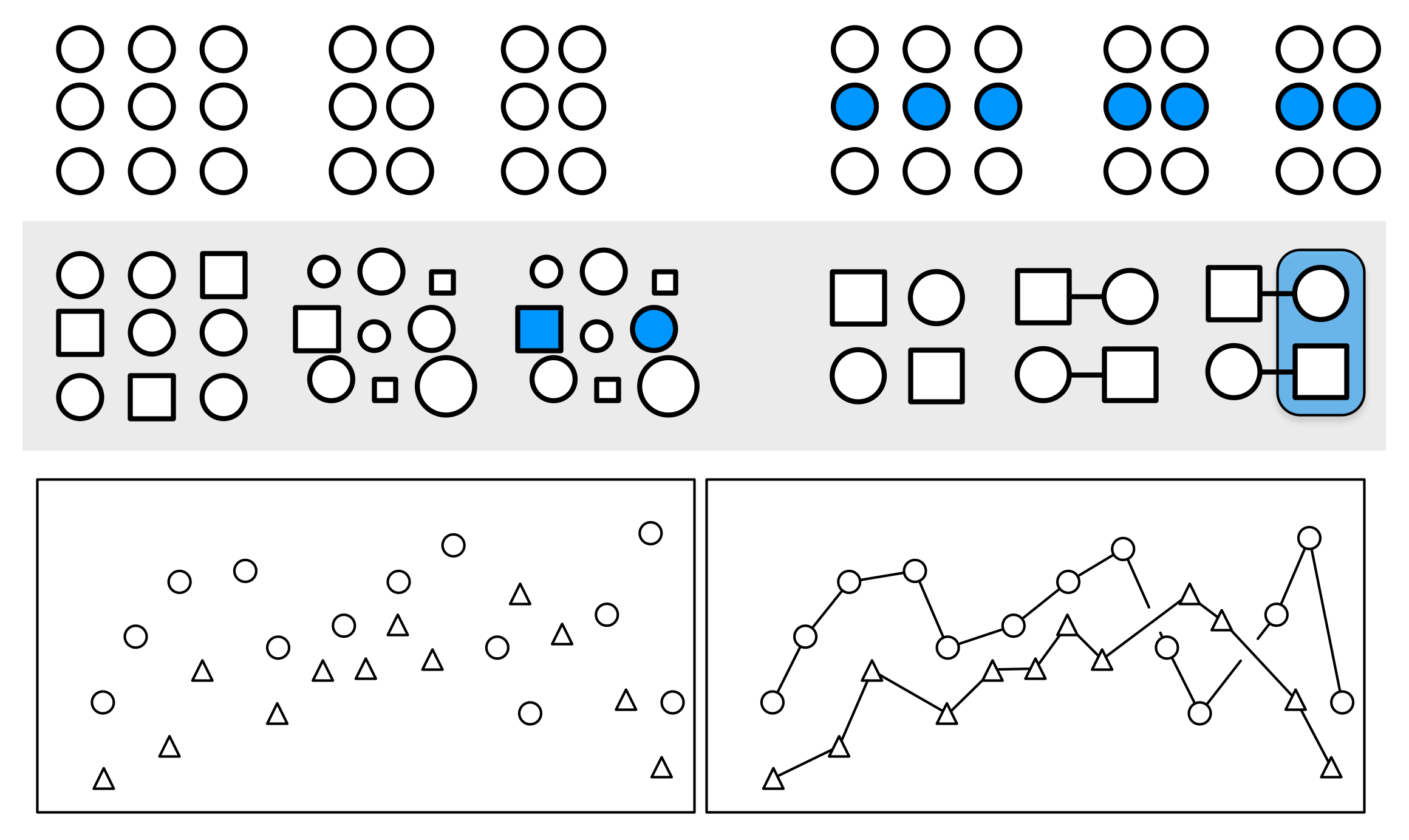
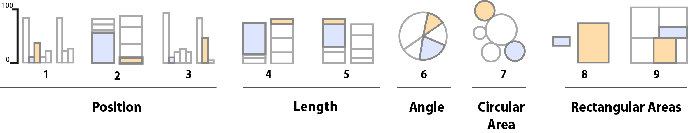
Figure 1.22: Schematic representation of basic perceptual tasks for nine chart types, by Heer and Bostock, following Cleveland and McGill. In both studies, participants were asked to make comparisons of highlighted portions of each chart type, and say which was smaller.
In the 1980s, William S. Cleveland and Robert McGill conducted some experiments identifying and ranking theses tasks for different types of graphics (Cleveland & McGill, 1984, 1987). Most often, research subjects were asked to estimate two values within a chart (e.g., two bars in a bar chart, or two slices of a pie chart), or compare values between charts (e.g. two areas in adjacent stacked bar charts). Cleveland went on to apply the results of this work, developing the trellis display system for data visualization in S, the statistical programming language developed at Bell Labs. (R is a later implementation of S.) He also wrote two excellent books that describe and apply these principles (Cleveland, 1993, 1994).
In 2010, Heer & Bostock (2010) replicated Cleveland’s earlier experiments and added a few additional assessments, including evaluations of rectangular-area graphs, which have become more popular in recent years. These include treemaps, where a square or rectangle is subdivided into further rectangular areas representing some proportion or percentage of the total. It looks a little like a stacked bar chart with more than one column. The comparisons and graph types made by their research subjects are shown schematically in Figure 1.22. For each graph type, subjects were asked to identify the smaller of two marked segments on the chart, and then to “make a quick visual judgment” estimating what percentage the smaller one was of the larger. As can be seen from the figure, the charts tested encoded data in different ways. Types 1-3 use position encoding along a common scale while Type 4 and 5 use length encoding. The pie chart encodes values as angles, and the remaining charts as areas, either using circular, separate rectangles (as in a cartogram) or sub-rectangles (as in a treemap).
Figure 1.23: Cleveland and McGill’s original results (top) and Heer and Bostock’s replication with additions (bottom) for nine chart types.
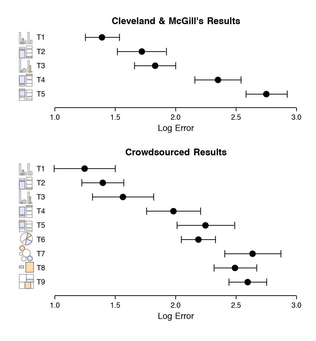
Their results are shown in Figure 1.23, along with Cleveland and McGill’s original results for comparison. The replication was quite good. The overall pattern of results seems clear, with performance worsening substantially as we move away from comparison on a common scale to length-based comparisons to angles and finally areas. Area comparisons perform even worse than the (justifiably) much-maligned pie chart.
These findings, and other work in this tradition, strongly suggest that there are better and worse ways of visually representing data when the task the user must perform involves estimating and comparing values within the graph. Think of this as a “decoding” operation that the viewer must perform in order to understand the content. The data values were encoded or mapped in to the graph, and now we have to get them back out again. When doing this, we do best judging the relative position of elements aligned on a common scale, as for example when we compare the heights of bars on a bar chart, or the position of dots with reference to a fixed x or y axis. When elements are not aligned but still share a scale, comparison is a little harder but still pretty good. It is more difficult again to compare the lengths of lines without a common baseline.
Outside of position and length encodings, things generally become harder and the decoding process is more error-prone. We tend to misjudge quantities encoded as angles. The size of acute angles tends to be underestimated, and the size of obtuse angles overestimated. This is one reason pie charts are usually a bad idea. We also misjudge areas poorly. We have known for a long time that area-based comparisons of quantities are easily misinterpreted or exaggerated. For example, values in the data might be encoded as lengths which are then squared to make the shape on the graph. The result is that the difference in size between the squares or rectangles area will be much larger than the difference between the two numbers they represent.
Comparing the areas of circles is prone to more error again, for the same reason. It is possible to offset these problems somewhat by choosing a more sophisticated method for encoding the data as an area. Instead of letting the data value be the length of the side of a square or the radius of the circle, for example, we could map the value directly to area and back-calculate the side length or radius. Still, comparisons will generally not be as good as alternatives. These problems are further compounded for “three-dimensional” shapes like blocks, cylinders, or spheres, which appear to represent volumes. And as saw with the 3-D barchart in Figure 1.10, the perspective or implied viewing angle that accompanies these kinds of charts creates other problems when it comes to reading the scale on a y-axis.
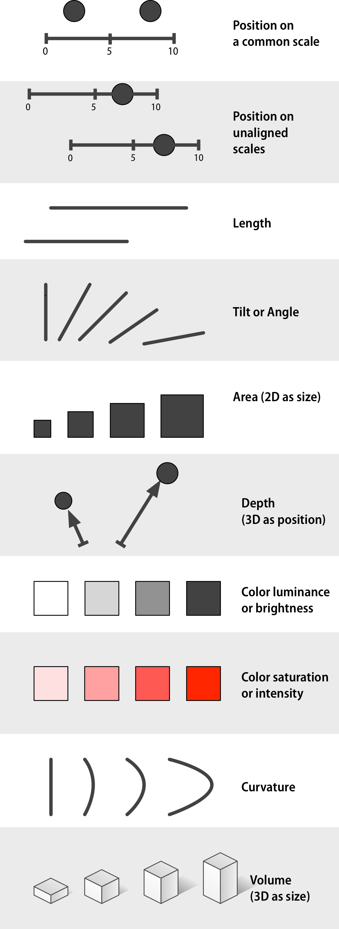 Figure 1.24: Channels for mapping ordered data (continuous or other quantitative measures), arranged top-to-bottom from more to less effective, after Munzer (2014, 102).
Finally, we find it hard to judge changes in slope. The estimation of rates of change in lines or trends is strongly conditioned by the aspect ratio of the graph, as we saw in Figure 1.12. Our relatively weak judgment of slopes also interacts badly with three-dimensional representations of data. Our ability to scan the “away” dimension of depth (along the z-axis) is weaker than our ability to scan the x and y axes. For this reason, it can be disproportionately difficult to interpret data displays of point clouds or surfaces displayed with three axes. They can look impressive, but they are also harder to grasp.
1.5 Channels for representing data
Graphical elements represent our data in ways that we can see. Different sorts of variables attributes can be represented more or less well by different kinds of visual marks or representations, such as points, lines, shapes, colors, and so on. Our task is to come up with methods that encode or map variables in the right way. As we do this, we face several constraints. First, the channel or mapping that we choose needs to be capable of representing the kind of data that we have. If we want to pick out unordered categories, for example, choosing a continuous gradient to represent them will not make much sense. If our variable is continuous, it will not be helpful to represent it as a series of shapes.
Second, given that the data can be comprehensibly represented by the visual element we choose, we will want to know how effective that representation is. This was the goal of Cleveand’s research. Following Munzer (2014, pp. 101–103), Figures 1.24 and 1.25 present an approximate ranking of the effectiveness of different channels for ordered and unordered data, respectively. If we have ordered data and we want the viewer to efficiently make comparisons, then we should try to encode it as a position on a common scale. Encoding numbers as lengths (absent a scale) works too, but not as effectively. Encoding them as areas will make comparisons less accurate again, and so on.
 Figure 1.25: Channels for mapping unordered categorical data, arranged top-to-bottom from more to less effective, after Munzer (2014, 102).
Third, the effectiveness of our graphics will depend not just on the channel that we choose, but on the perceptual details of how we implement it. So, if we have a measure with four categories ordered from lowest to highest, we might correctly decide to represent it using a sequential gradient. But if we pick the wrong sequence of colors for the gradient, the data will still be hard to interpret, or actively misleading. In a similar way, if we pick a bad set of hues for an unordered categorical variable, the result might not just be unpleasant to look at, but actively misleading.
Finally, bear in mind that these different channels or mappings for data are not in themselves kinds of graphs. They are just the elements or building blocks for graphs. When we choose how to encode a variable as a position, a length, an area, a shade of grey, or a color, we have made an important decision that narrows down what the resulting plot can look like. But this is not the same as deciding what type of plot it will be, in the sense of choosing whether to make a dot plot or a bar chart, a histogram or a frequency polygon, and so on.
1.6 Problems of honesty and good judgment
Figure 1.26 shows two ways of redrawing our Life Expectancy figure. Each of these plots is far less noisy than the junk-filled monstrosity we began with. But they also have design features that could be argued over, and might even matter substantively depending on the circumstances. For example, consider the scales on the x-axis in each case. The left-hand panel in Figure 1.26 is a bar chart, and the length of the bar represents the value of the variable “average life expectancy in 2007” for each continent. The scale starts at zero and extends to just beyond the level of the largest value. Meanwhile the right-hand panel is a Cleveland dot plot. Each observation is represented by a point, and the scale is restricted to the range of the data as shown.
Figure 1.26: Two simpler versions of our junk chart. The scale on the bar chart version goes to zero, while the scale on the dot plot version is confined to the range of values taken by the observations.
It is tempting to lay down inflexible rules about what to do in terms of producing your graphs, and to dismiss people who don’t follow them as producing junk charts or lying with statistics. But being honest with your data is a bigger problem than can be solved by rules of thumb about making graphs. In this case there is a moderate level of agreement that bar charts should generally include a zero baseline (or equivalent) given that bars encode their variables as lengths. But it would be a mistake to think that a dot plot was by the same token deliberately misleading, just because it kept itself to the range of the data instead.
Which one is to be preferred? It is tricky to give an unequivocal answer, because the reasons for preferring one type of scaling over another depend in part on how often people actively try to mislead others by preferring one sort of representation over another. On the one hand, there is a lot of be said in favor of showing the data over the range we observe it, rather than forcing every scale to encompass its lowest and highest theoretical value. Many otherwise informative visualizations would become useless if it was mandatory to include a zero point on the x- or y-axis. On the other hand, it’s also true that people sometimes go out of their way to restrict the scales they display in a way that makes their argument look better. Sometimes this is done out of active malice, other times out of passive bias, or even just a hopeful desire to see what you want to see in the data. (Remember, often the main audience for your visualizations is yourself.) In those cases, the resulting graphic will indeed be misleading.
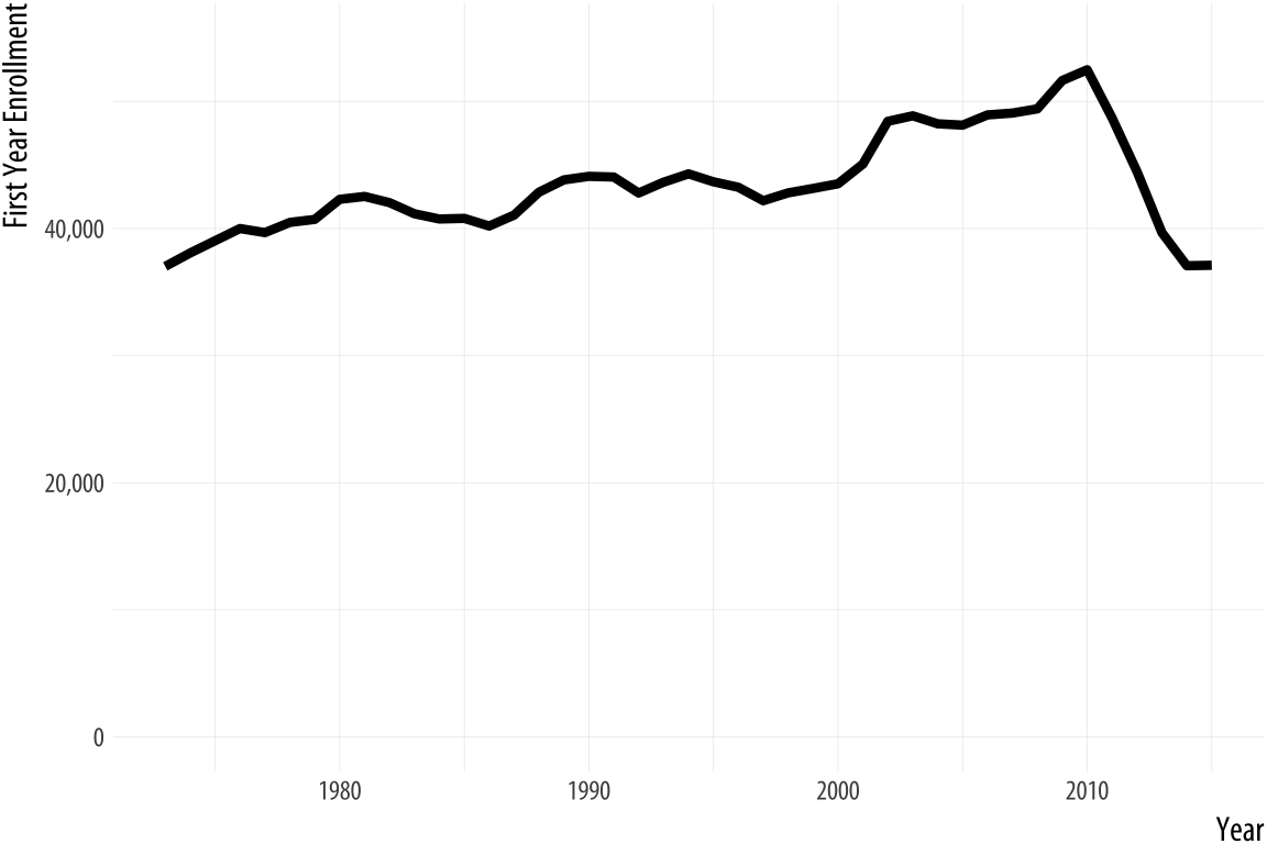
Figure 1.27: Two views of the rapid decline in law school enrollments in the mid-2010s.
Rushed, garish, and deliberately inflammatory or misleading graphics are a staple of social media sharing and the cable news cycle. But the problem comes up in everyday practice as well, and the two can intersect if your work ends up in front of a public audience. For example, let’s take a look at some historical data on law school enrollments. A decline in enrollments led to some reporting on trends since the early 1970s. The results are shown in Figure 1.27.
The first panel shows the trend in the number of students beginning law school each year since 1973. The y-axis starts from just below the lowest value in the series. The second panel shows the same data, but with the y-axis minimum set to zero instead. The columnist and writer Justin Fox saw the first version and remarked on how amazing it was. He was then quite surprised at the strong reactions he got from people who insisted the y-axis should have included zero. The original chart was “possibly … one of the worst represented charts I’ve ever seen” said one interlocutor. Another remarked that “graphs that don’t go to zero are a thought crime” (Fox, 2014).
My own view is that the chart without the zero baseline shows you that, after almost forty years of mostly rising enrollments, law school enrollments dropped suddenly and precipitously around 2011 to levels not seen since the early 1970s. The levels are clearly labeled and the decline does look substantively surprising and significant. In a well-constructed chart the axis labels are a necessary guide to the reader, and we should expect readers to pay attention to them. The chart with the zero baseline, meanwhile, does not add much additional information beyond reminding you, at the cost of wasting some space, that 35,000 is a number quite a lot larger than zero.
That said, I am sympathetic to people who got upset at the first chart. At a minimum, it shows they know to read the axis labels on a graph. That is less common than you might think. It likely also shows they know interfering with the axes is one way to make a chart misleading, and that it is not unusual for that sort of thing to be done deliberately.
1.7 Think clearly about graphs
I am going to assume that your goal is to draw effective graphs in an honest and reproducible way. Default settings and general rules of good practice have limited powers to stop you from doing the wrong thing. But one thing they can do is provide not just tools for making graphs, but also a framework or set of concepts that helps you think more clearly about the good work you want to produce. When learning a graphing system or toolkit, people often start thinking about specific ways they want their graph to look. They very quickly start formulating requests. They want to know how to make a particular kind of chart, or how to change the typeface for the whole graph, or how to adjust the scales, or how to move the title, how to customize the labels, or change the colors of the points.
These requests involve different features of the graph. Some have to do with very basic features of the figure’s structure, with which bits of data are encoded as or mapped to elements such as shape, line or color. Some have to do with the details of how those elements are represented. If a variable is mapped to shape, which shapes will be chosen, exactly? If another variable is represented by color, which colors in particular will be used? Some have to do with the framing or guiding features of the graph. If there are tick marks on the x-axis, can I decide where they should be drawn? If the chart has a legend, will it appear to the right of the graph or on top? If data points have information encoded in both shape and color, do we need a separate legend for each encoding, or can we combine them into a single unified legend? And some have to do with thematic features of the graph that may greatly affect how the final result looks, but that are not logically connected to the structure of the data being represented. Can I change the title font from Times New Roman to Helvetica? Can I have a light blue background in all my graphs?
A real strength of ggplot is that it implements a grammar of
graphics to organize and make sense of these different elements
(Wilkinson, 2005). Instead of a huge, conceptually flat list
of options for setting every aspect of a plot’s appearance at once,
ggplot breaks up the task of making a graph into a series of distinct
tasks, each bearing a well-defined relationship to the structure of
the plot. When you write your code, you carry out each task using a
function that controls that part of the job. At the beginning, ggplot
will do most of the work for you. Only two steps are required.
First, you must give some information to the ggplot() function.
This establishes the core of the plot by saying what data you are using
and what variables will be linked or mapped to features of the plot.
Second, you must choose a geom_ function. This decides what sort
plot will be drawn, such as a scatterplot, a bar chart, or a boxplot.
As you progress, you will gradually use other functions to gain more fine-grained control over other features of the plot, such as scales, legends, and thematic elements. This also means that, as you learn ggplot, it is very important to grasp the core steps first, before worrying about adjustments and polishing. And so that is how we’ll proceed. In the next chapter we will learn how to get up and running in R and make our first graphs. From there, we will work through examples that introduce each element of ggplot’s way of doing things. We will be producing sophisticated plots quite quickly, and we will keep working on them until we are in full control of what we are doing. As we go, we will learn about some ideas and associated techniques and tricks to make R do what we want.
1.8 Where to go next
For an entertaining and informative overview of various visual effects
and optical “illusions”, take a look at Michael Bach’s website at
michaelbach.de. If you would like to learn more about the
relationship between perception and data visualization, follow up on
some of the references in this Chapter. Munzer (2014),
Ware (2008), and Few (2009) are good places to
start. William Cleveland’s books are models of clarity and good advice
(Cleveland, 1993, 1994). As we shall see beginning in the next
Chapter, the ideas developed in Wilkinson (2005) are at the
heart of ggplot’s approach to visualization. Finally, foundational
work by Bertin (2010) lies behind a lot of thinking on the
relationship between data and visual elements.