7 Draw maps
Choropleth maps show geographical regions colored, shaded, or graded according to some variable. They are visually striking, especially when the spatial units of the map are familiar entities, like the countries of the European Union, or states in the US. But maps like this can also sometimes be misleading. Although it is not a dedicated Geographical Information System (GIS), R can work with geographical data, and ggplot can make choropleth maps. But we’ll also consider some other ways of representing data like this.
Figure 7.1 shows a series of maps of the 2012 US general election results. Reading from the top left, From top left we see, first, a state-level, two-color map where the margin of victory can be high (a darker blue or red) or low (a lighter blue or red). The color scheme has no midpoint. Second, we see a two-color, county-level maps colored red or blue depending on the winner. Third is a county-level map where the color of red and blue counties is graded by the size of the vote share. Again, the color scale has no midpoint. Fourth is a county-level map with a continuous color gradient from blue to red, but that passes through a purple midpoint for areas where the balance of the vote is close to even. The map in the bottom left distorts the geographical boundaries by squeezing or inflating them to reflect the population of the county shown. Finally in the bottom right we see a cartogram, where states are drawn using square tiles, and the number of tiles each state gets is proportional to the number of electoral college votes it has (which in turn is proportional to that state’s population).
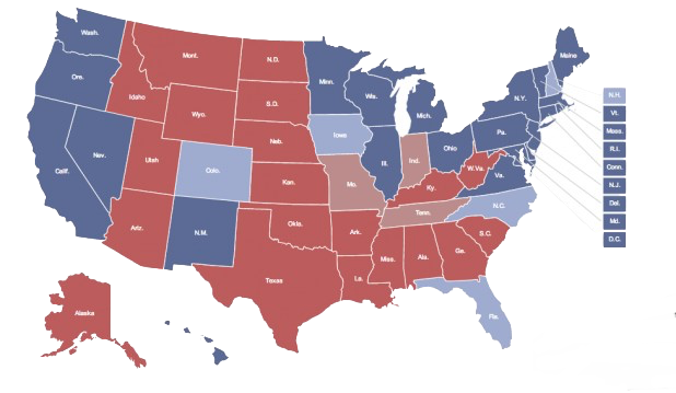
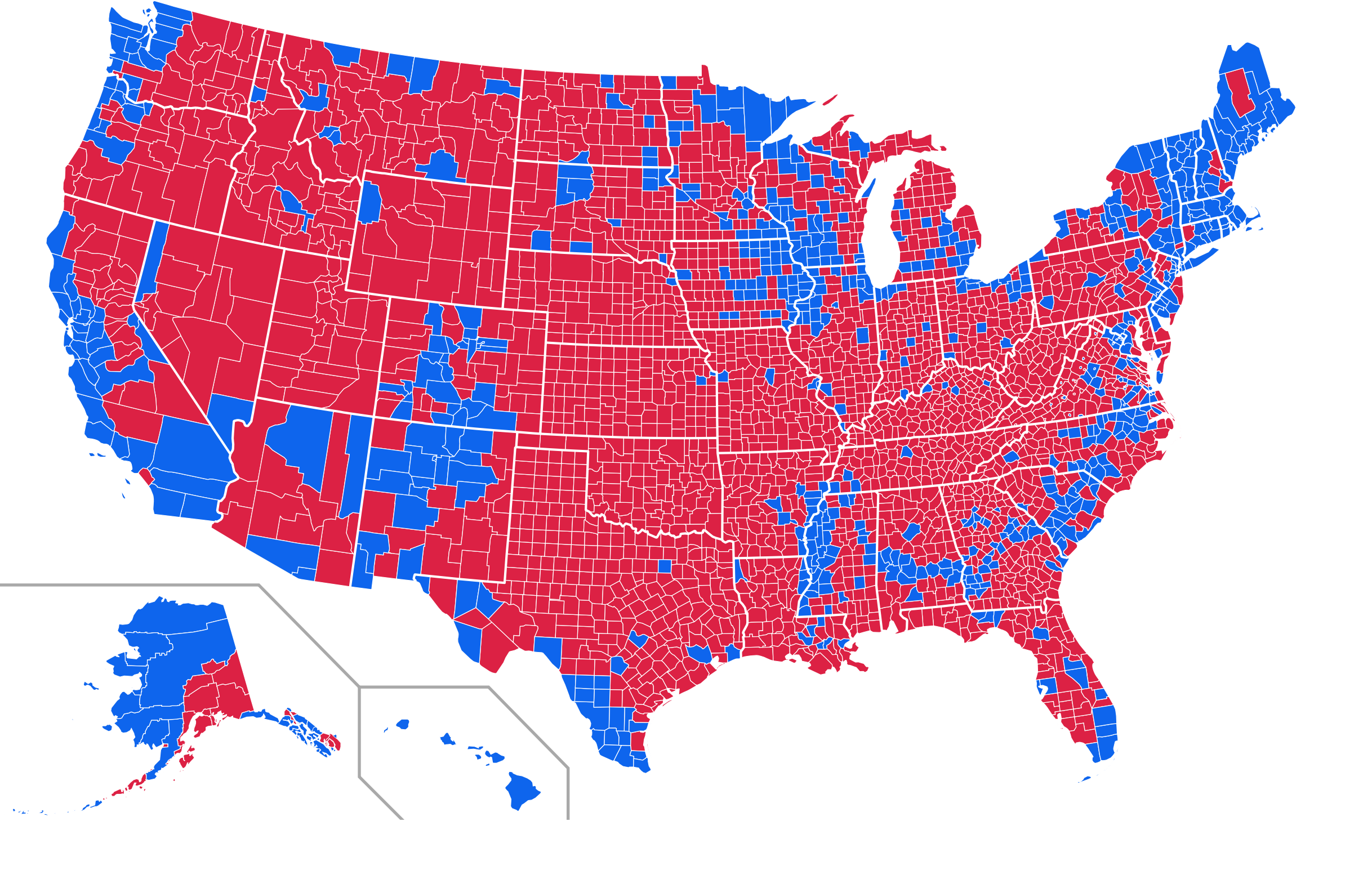
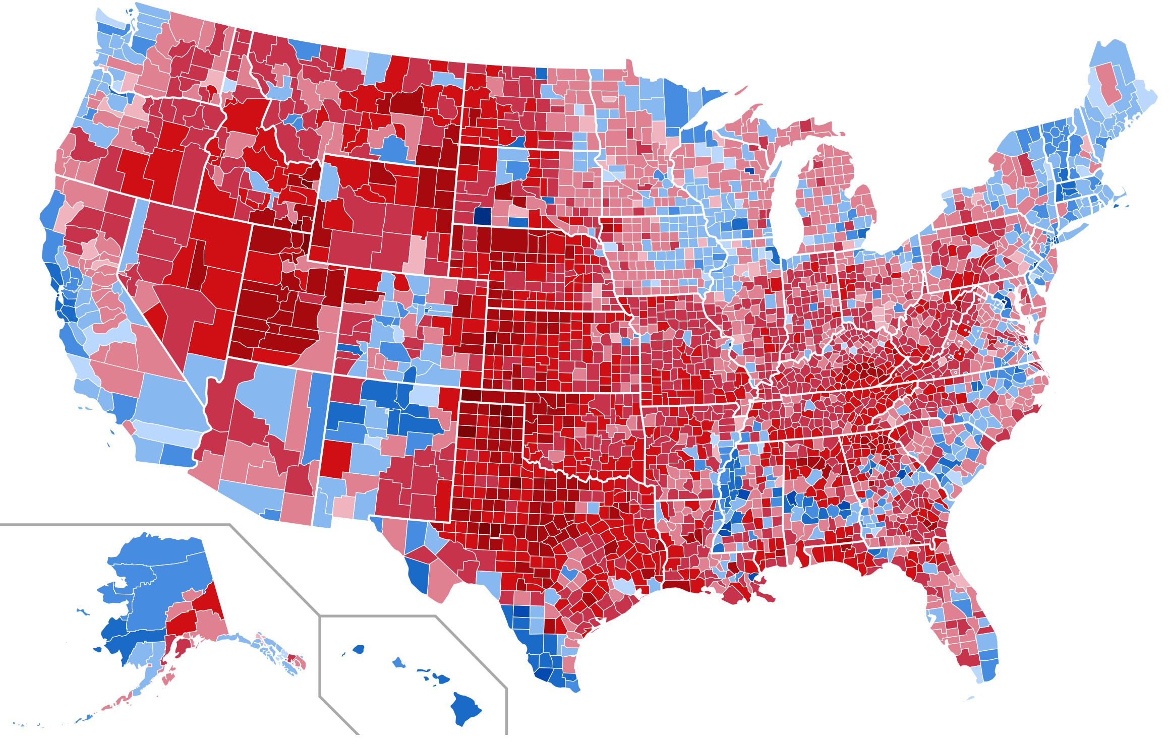
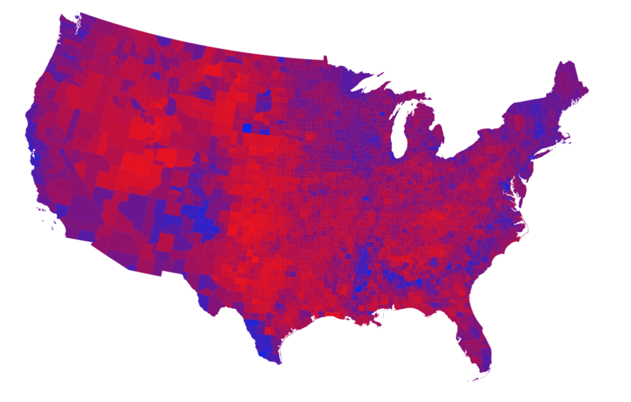
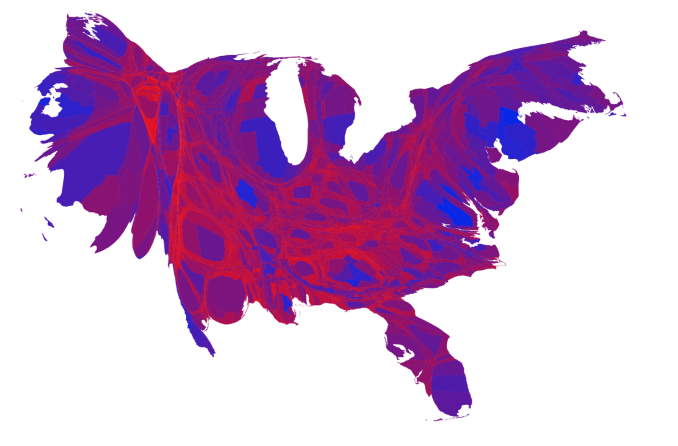
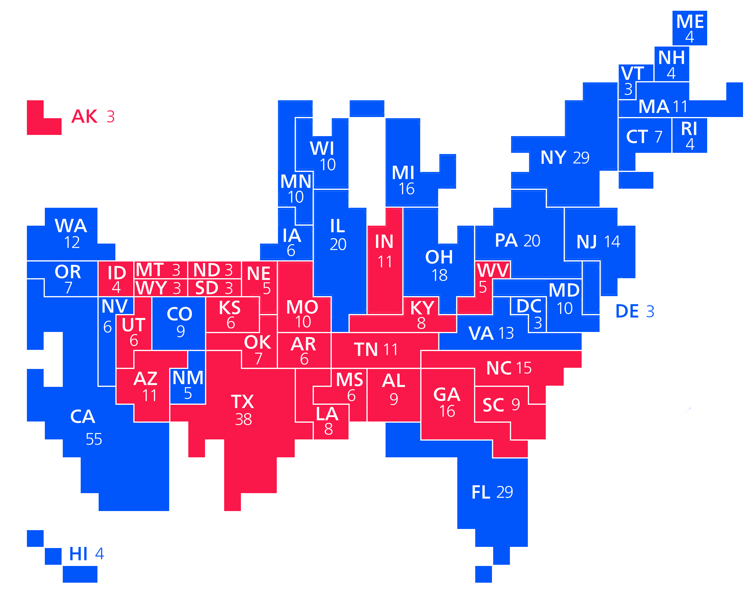
Figure 7.1: 2012 US election results maps of different kinds.
Each of these maps shows data for the same event, but the impressions they convey are very different. Each faces two main problems. First, the underlying quantities of interest are only partly spatial. The number of electoral college votes won and the share of votes cast within a state or county are expressed in spatial terms, but ultimately it is the numbers of people within those regions that matter. Second, the regions themselves are of wildly differing sizes, and they differ in a way that is not well-correlated with the magnitudes of the underlying votes. The map makers also face choices that would arise in many other representations of the data. Do we want to just show who won each state in absolute terms (this is all that matters for the actual result, in the end) or do we want to indicate how close the race was? Do we want to display the results at some finer level of resolution than is relevant to the outcome, such as county rather than state counts? How can we convey that different data points can carry very different weights, because they represent vastly larger or smaller numbers of people? It is tricky enough to convey these choices honestly with different colors and shape sizes on a simple scatterplot. Often, a map is like a weird grid that you are forced to conform to even though you know it systematically misrepresents what you want to show.
This is not always the case, of course. Sometimes our data really is purely spatial, and we can observe it at a fine enough level of detail that we can represent spatial distributions honestly and in a very compelling way. But the spatial features of much social science are collected through entities such as precincts, neighborhoods, metro areas, census tracts, counties, states, and nations. These may themselves be socially contingent. A great deal of cartographic work with social-scientific variables involves working both with and against that arbitrariness.
7.1 Map U.S. state-level data
Let’s take a look at some data for the 2016 U.S. presidential election
and see how we might plot it in R. The election dataset has various
measures of the vote and vote shares by state. Here we pick some
columns and sample a few rows at random.
election %>% select(state, total_vote,
                    r_points, pct_trump, party, census) %>%
    sample_n(5)
## # A tibble: 5 x 6
## state total_vote r_points pct_trump party census
## <chr> <dbl> <dbl> <dbl> <chr> <chr>
## 1 Kentucky 1924149 29.8 62.5 Republican South
## 2 Vermont 315067 -26.4 30.3 Democrat Northeast
## 3 South Carolina 2103027 14.3 54.9 Republican South
## 4 Wyoming 255849 46.3 68.2 Republican West
## 5 Kansas 1194755 20.4 56.2 Republican Midwest
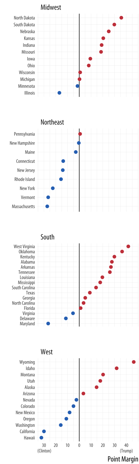 Figure 7.2: 2016 Election Results. Would a two-color choropleth map be more informative than this, or less?
The FIPS code is a federal code that numbers states and territories of the US. It extends to the county level with an additional four digits, so every county in the US has a unique six-digit identifier, where the first two digits represent the state. This dataset also contains the census region of each state.
# Hex color codes for Dem Blue and Rep Red
party_colors <- c("#2E74C0", "#CB454A")

p0 <- ggplot(data = subset(election, st %nin% "DC"),
             mapping = aes(x = r_points,
                           y = reorder(state, r_points),
                           color = party))

p1 <- p0 + geom_vline(xintercept = 0, color = "gray30") +
    geom_point(size = 2)

p2 <- p1 + scale_color_manual(values = party_colors)

p3 <- p2 + scale_x_continuous(breaks = c(-30, -20, -10, 0, 10, 20, 30, 40),
                              labels = c("30\n (Clinton)", "20", "10", "0",
                                         "10", "20", "30", "40\n(Trump)"))

p3 + facet_wrap(~ census, ncol=1, scales="free_y") +
    guides(color=FALSE) + labs(x = "Point Margin", y = "") +
    theme(axis.text=element_text(size=8))
The first thing you should remember about spatial data is that you
don’t have to represent it spatially. We’ve been working with
country-level data throughout, and have yet to make a map of it. Of
course, spatial representations can be very useful, and sometimes
absolutely necesssary. But we can start with a state-level dotplot,
faceted by region. This plot brings together many aspects of plot
construction that we have worked on so far, including subsetting data,
reordering results by a second variable, and using a scale formatter.
It also introduces some new options, like allowing free scales on an
axis, and manually setting the color of an aesthetic. We break up the
construction process into several steps by creating intermediate
objects (p0, p1, p2) along the way. It makes the code a little
more readable. Bear in mind also that, as always, you can try plotting
each of these intermediate objects as well (just type their name at
the console and hit return) to see what they look like. What happens
if you remove the scales="free_y" argument to facet_wrap()? What
happens if you delete the call to scale_color_manual()?
As always, the first task in drawing a map is to get a data frame with
the right information in it, and in the right order. First we load R’s
maps package, which provides us with some pre-drawn map data.
library(maps)
us_states <- map_data("state")
head(us_states)
## long lat group order region subregion
## 1 -87.4620 30.3897 1 1 alabama <NA>
## 2 -87.4849 30.3725 1 2 alabama <NA>
## 3 -87.5250 30.3725 1 3 alabama <NA>
## 4 -87.5308 30.3324 1 4 alabama <NA>
## 5 -87.5709 30.3267 1 5 alabama <NA>
## 6 -87.5881 30.3267 1 6 alabama <NA>dim(us_states)## [1] 15537 6This just a data frame. It has more than 15,000 rows because you need
a lot of lines to draw a good-looking map. We can make a blank state
map right away with this data, using geom_polygon().
p <- ggplot(data = us_states,
            mapping = aes(x = long, y = lat,
                          group = group))

p + geom_polygon(fill = "white", color = "black")
The map is plotted with latitude and longitude points, which are there as scale elements mapped to the x and y axes. A map is, after all, just a set of lines drawn in the right order on a grid.
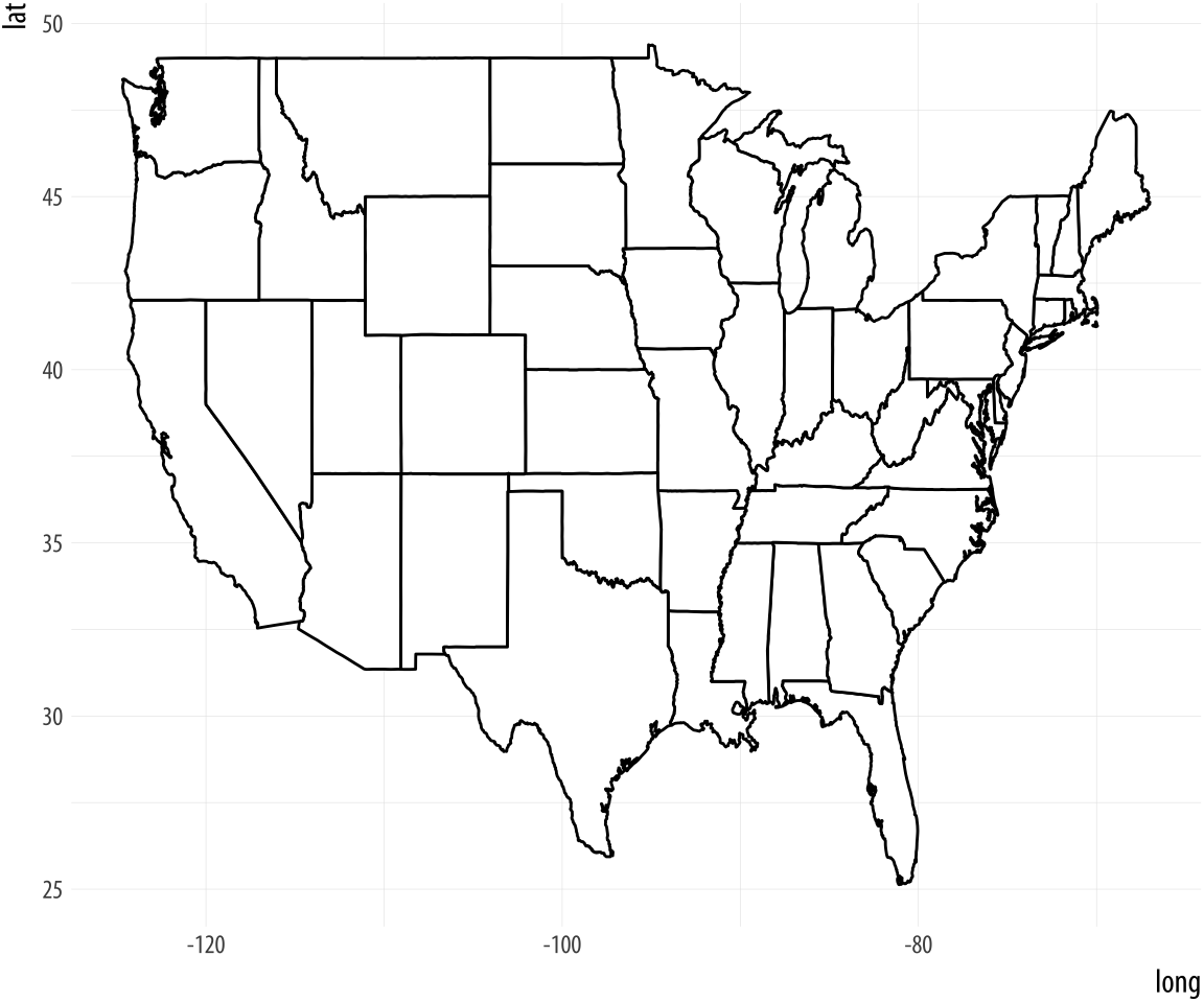 Figure 7.3: A first US map
We can map the fill aesthetic to region and change the color
mapping to a light gray and thin the lines to make the state borders a
little nicer. We’ll also tell R not to plot a legend.
 Figure 7.4: Coloring the states
p <- ggplot(data = us_states,
            aes(x = long, y = lat,
                group = group, fill = region))

p + geom_polygon(color = "gray90", size = 0.1) + guides(fill = FALSE)
Next, let’s deal with the projection. By default the map is plotted
using the venerable Mercator projection. It doesn’t look that good.
Assuming we are not planning on sailing across the Atlantic, the
practical virtues of this projection are not much use to us, either.
If you glance again at the maps in Figure 7.1, you’ll
notice they look nicer. This is because they are using an Albers
projection. (Look, for example, at the way that the US-Canadian border
is a little curved along the 49th parallel from Washington state to
Minnesota, rather than not a straight line.) Techniques for map
projection are a fascinating world of their own, but for now just
remember we can transform the default projection used by
geom_polygon(), via the coord_map() function. You’ll remember that
we said that projection onto a coordinate system is a necessary part
of the plotting process for any data. Normally it is left implicit. We
have not usually had to specify a coord_ function because most of
the time we have drawn our plots on a simple Cartesian plane. Maps are
more complex. Our locations and borders are defined on a more or less
spherical object, which means must have a method for transforming or
projecting our points and lines from a round to a flat surface. The
many ways of doing this gives us a menu of cartographic options.
The Albers projection requires two latitude parameters, lat0 and
lat1. We give them their conventional values for a US map here. (Try
messing around with their values and see what happens when you redraw
the map.)
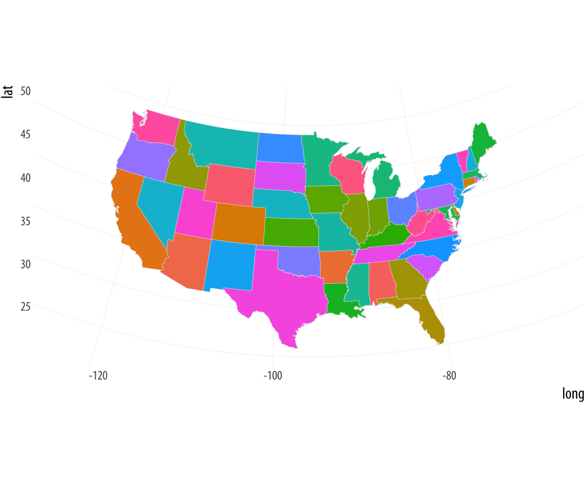 Figure 7.5: Improving the projection
p <- ggplot(data = us_states,
            mapping = aes(x = long, y = lat,
                          group = group, fill = region))

p + geom_polygon(color = "gray90", size = 0.1) +
    coord_map(projection = "albers", lat0 = 39, lat1 = 45) +
    guides(fill = FALSE)
Now we need to get our own data on to the map. Remember, underneath
that map is just a big data frame specifying a large number of lines
that need to be drawn. We have to merge our data with that data frame.
Somewhat annoyingly, in the map data the state names (in a variable
named region) are in lower case. We can create a variable in our own
data frame to correspond to this, using the tolower() function to
convert the state names. We then use left_join to merge but you
could also use merge(..., sort = FALSE). This merge step is
important! You need to take care that the values of the key variables
you are matching on really do exactly correspond to one another. If
they do not, missing values (NA codes) will be introduced into your
merge, and the lines on your map will not join up. This will result in
a weirdly “sharded” appearance to your map when R tries to fill the
polygons. Here, the region variable is the only column with the same
name in both the data sets we are joining, and so the left_join()
function uses it used by default. If the keys have different names in
each data set you can specify that, if needed.
To reiterate, it is important to know your data and variables well
enough to check that they have merged properly. Do not do it blindly.
For example, if rows corresponding to Washington DC were named
“washington dc” in the region variable of your election data
frame, but “district of columbia” in the corresponding region
variable of your map data, then merging on region would mean no rows
in the election data frame would match “washington dc” in the map
data, and the resulting merged variables for those rows would all be
coded as missing. Maps that look broken when you draw them are usually
caused by merge errors. But errors can also be subtle. For example,
perhaps one of your state names inadvertently has a leading (or,
worse, a trailing) space as a result of the data originally being
imported from elsewhere and not fully cleaned. That would mean, for
example, that california and california␣ are different strings,
and the match would fail. In ordinary use you might not easily see the
extra space (designated here by ␣). So, be careful.
election$region <- tolower(election$state)
us_states_elec <- left_join(us_states, election)
We have now merged the data. Take a look at the object with
head(us_states_elec). Now that everything is in one big data frame,
we can plot it in a map.
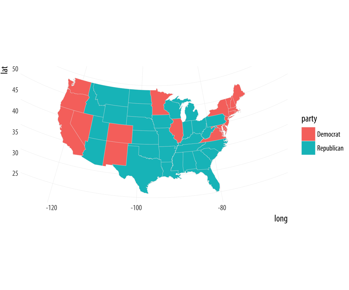 Figure 7.6: Mapping the results
p <- ggplot(data = us_states_elec,
            aes(x = long, y = lat,
                group = group, fill = party))

p + geom_polygon(color = "gray90", size = 0.1) +
    coord_map(projection = "albers", lat0 = 39, lat1 = 45)
To complete the map, we will use our party colors for the fill, move the legend to the bottom, and add a title. Finally we will remove the grid lines and axis labels, which aren’t really needed, by defining a special theme for maps that removes most of the elements we don’t need. (We’ll learn more about themes in Chapter 8. You can also see the code for the map theme in the Appendix.)
p0 <- ggplot(data = us_states_elec,
             mapping = aes(x = long, y = lat,
                           group = group, fill = party))
p1 <- p0 + geom_polygon(color = "gray90", size = 0.1) +
    coord_map(projection = "albers", lat0 = 39, lat1 = 45)
p2 <- p1 + scale_fill_manual(values = party_colors) +
    labs(title = "Election Results 2016", fill = NULL)
p2 + theme_map() 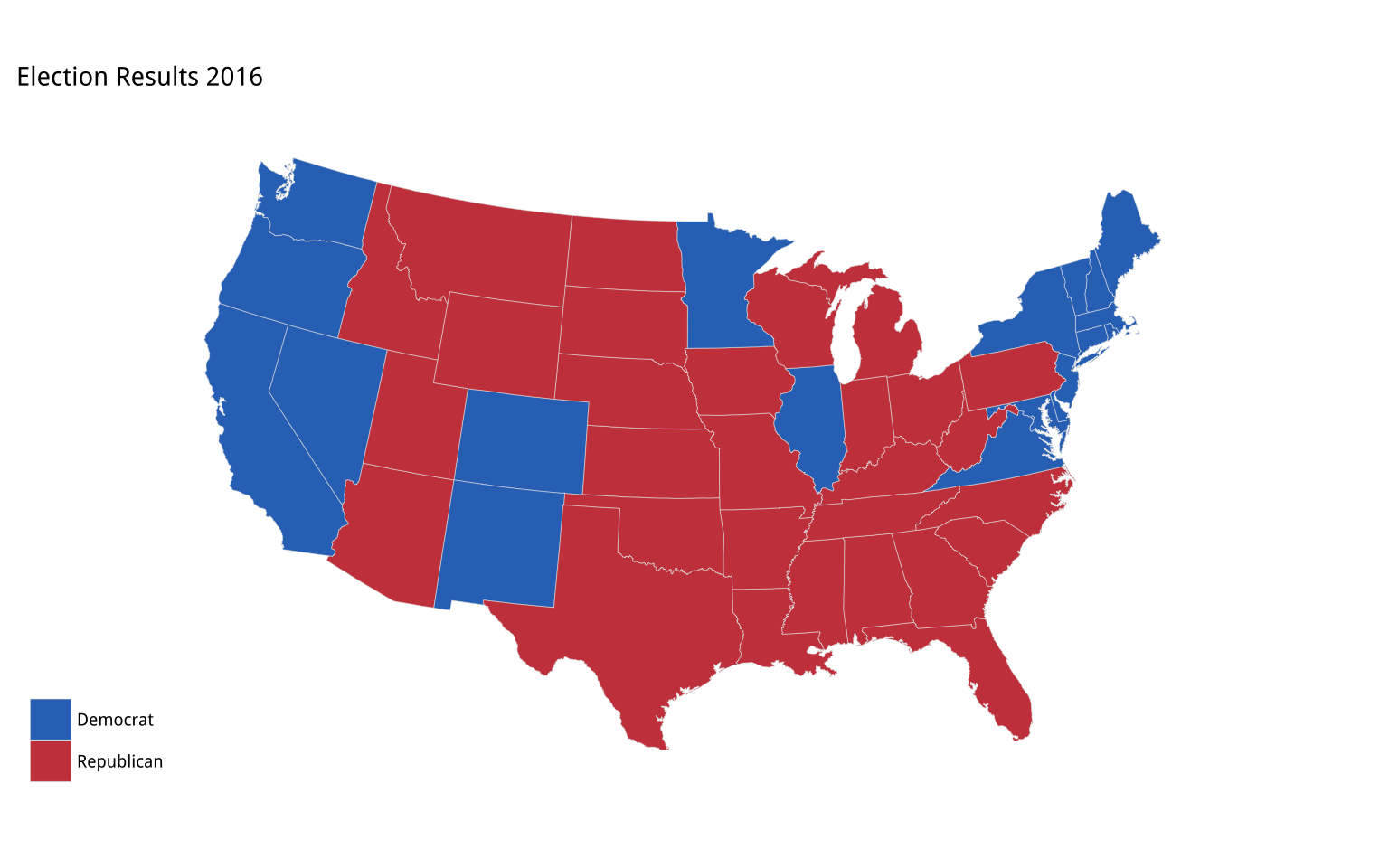
Figure 7.7: Election 2016 by State
With the map data frame in place, we can map other variables if we
like. Let’s try a continuous measure, such as the percentage of the vote
received by Donald Trump. To begin with, we just map the variable we
want (pct_trump) to the fill aesthetic, and see what geom_polygon()
does by default.
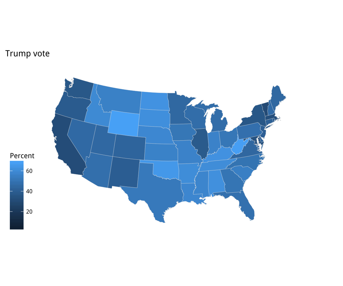
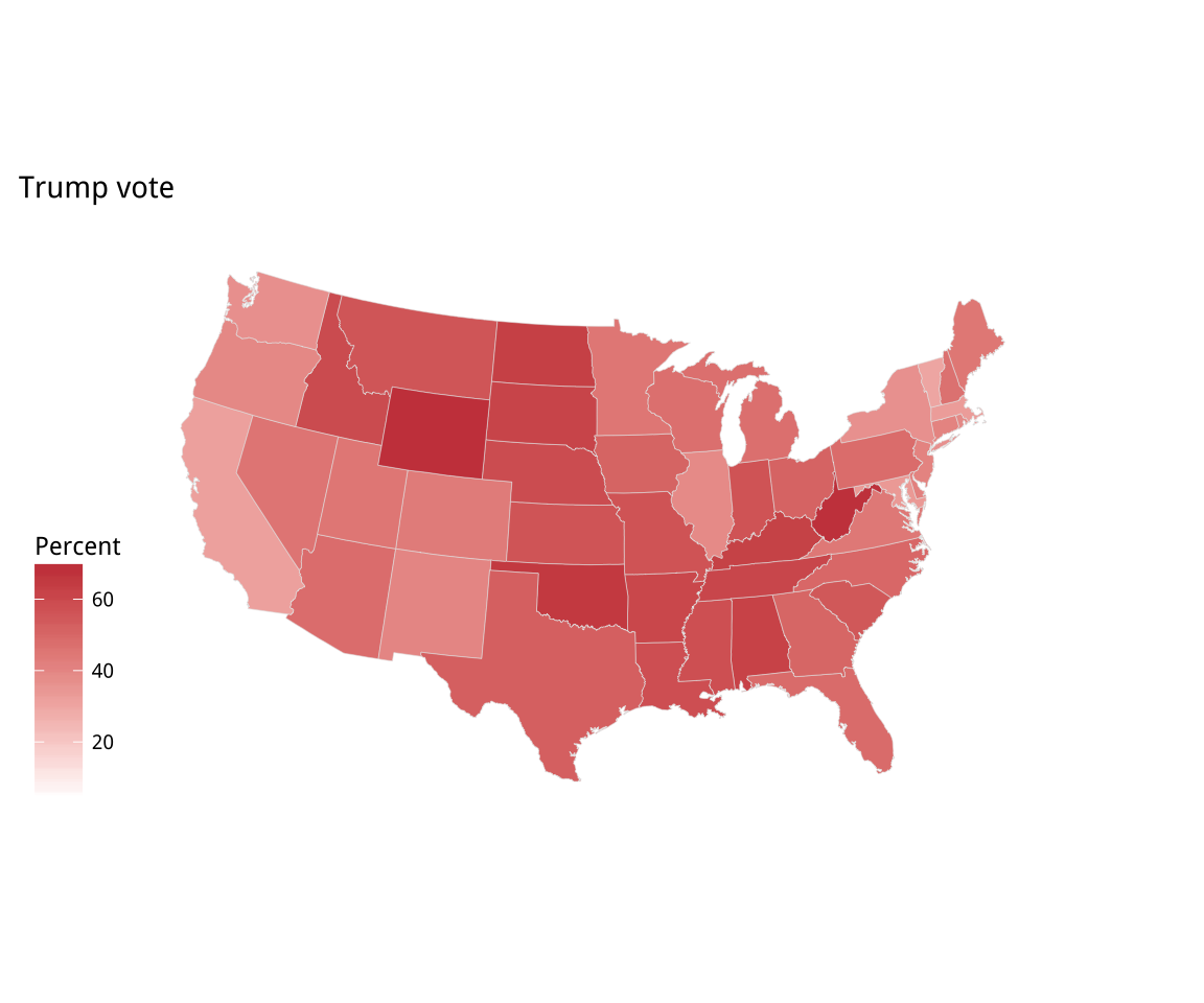 Figure 7.8: Two versions of Percent Trump by State
p0 <- ggplot(data = us_states_elec,
             mapping = aes(x = long, y = lat, group = group, fill = pct_trump))

p1 <- p0 + geom_polygon(color = "gray90", size = 0.1) +
    coord_map(projection = "albers", lat0 = 39, lat1 = 45)

p1 + labs(title = "Trump vote") + theme_map() + labs(fill = "Percent")

p2 <- p1 + scale_fill_gradient(low = "white", high = "#CB454A") +
        labs(title = "Trump vote")
p2 + theme_map() + labs(fill = "Percent")
The default color used in the p1 object is blue. Just for reasons of
convention, that isn’t what is wanted here. In addition, the gradient
runs in the wrong direction. In our case, the standard interpretation
is that a higher vote share makes for a darker color. We fix both
of these problems in the p2 object by specifying the scale directly. We’ll use the
values we created earlier in party_colors.
For election results, we might prefer a gradient that diverges from a
midpoint. The scale_gradient2() function gives us a blue-red
spectrum that passes through white by default. Alternatively, we can
re-specify the mid-level color along with the high and low colors. We
will make purple our midpoint, and use the muted() function from the
scales library to tone down the color a little.
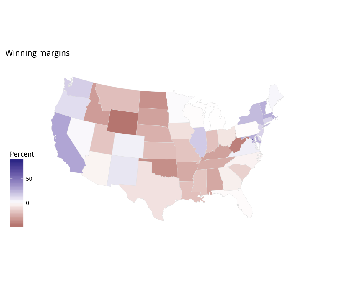
 Figure 7.9: Two views of Trump vs Clinton share: a white midpoint, and a Purple America version.
p0 <- ggplot(data = us_states_elec,
             mapping = aes(x = long, y = lat, group = group, fill = d_points))

p1 <- p0 + geom_polygon(color = "gray90", size = 0.1) +
    coord_map(projection = "albers", lat0 = 39, lat1 = 45)

p2 <- p1 + scale_fill_gradient2() + labs(title = "Winning margins")
p2 + theme_map() + labs(fill = "Percent")

p3 <- p1 + scale_fill_gradient2(low = "red", mid = scales::muted("purple"),
                                high = "blue", breaks = c(-25, 0, 25, 50, 75)) +
    labs(title = "Winning margins")
p3 + theme_map() + labs(fill = "Percent")
If you take a look at the gradient scale for this first “purple America” map, in Figure 7.9, you’ll see that it extends very high on the Blue side. This is because Washington DC is included in the data, and hence the scale. Even though it is barely visible on the map, DC has by far the highest points margin in favor of the Democrats of any unit of observation in the data. If we omit it, we’ll see that our scale shifts in a way that does not just affect the top of the blue end, but re-centers the whole gradient and makes the red side more vivid as a result. Figure 7.10 shows the result.
p0 <- ggplot(data = subset(us_states_elec,
                           region %nin% "district of columbia"),
             aes(x = long, y = lat, group = group, fill = d_points))

p1 <- p0 + geom_polygon(color = "gray90", size = 0.1) +
    coord_map(projection = "albers", lat0 = 39, lat1 = 45)

p2 <- p1 + scale_fill_gradient2(low = "red",
                                mid = scales::muted("purple"),
                                high = "blue") +
    labs(title = "Winning margins")
p2 + theme_map() + labs(fill = "Percent")
Figure 7.10: A Purple America version of Trump vs Clinton that excludes results from Washington, DC.
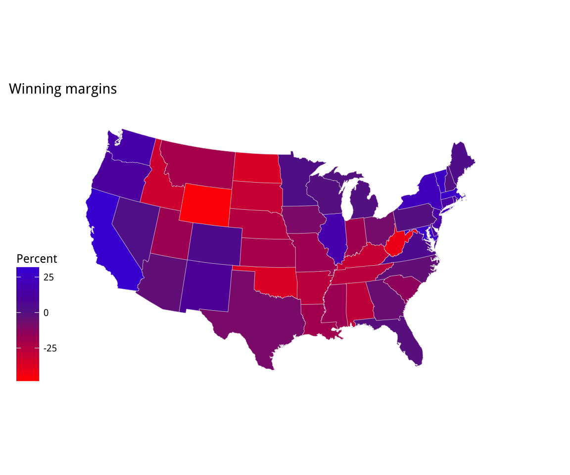
This brings out the familiar choropleth problem of having geographical areas that only partially represent the variable we are mapping. In this case, we’re showing votes spatially, but what really matters is the number of people who voted.
7.2 America’s ur-choropleths
In the U.S. case, administrative areas vary widely in geographical area and they also vary widely in population size. The problem is evident at the state level, as we have seen, also arises even more at the county level. County-level US maps can be aesthetically pleasing, because of the added detail they bring to a national map. But they also make it easy to present a geographical distribution to insinuate an explanation. The results can be tricky to work with. When producing county maps, it is important to remember that the states of New Hampshire, Rhode Island, Massachussetts, and Connecticut are all smaller in area than any of the ten largest Western counties. Many of those counties have fewer than a hundred thousand people living in them. Some have fewer than ten thousand inhabitants.
The result is that most choropleth maps of the U.S. for whatever variable in effect show population density more than anything else. The other big variable, in the U.S. case, is Percent Black. Let’s see how to draw these two maps in R. The procedure is essentially the same as it was for the state-level map. We need two data frames, one containing the map data, and the other containing the fill variables we want plotted. Because there are more than three thousand counties in the United States, these two data frames will be rather larger than they were for the state-level maps.
The datasets are included in the socviz library. The county map data
frame has already been processed a little in order to transform it to
an Albers projection, and also to relocate (and rescale) Alaska and
Hawaii so that they fit into an area in the bottom left of the figure. This
is better than throwing away two states from the data. The steps for this transformation and relocation are not shown here. If you want to see how it’s done, consult the Supplementary Material for details. Let’s take a look at our county map data first:
county_map %>% sample_n(5)## long lat order hole piece group id
## 116977 -286097 -1302531 116977 FALSE 1 0500000US35025.1 35025
## 175994 1657614 -698592 175994 FALSE 1 0500000US51197.1 51197
## 186409 674547 -65321 186409 FALSE 1 0500000US55011.1 55011
## 22624 619876 -1093164 22624 FALSE 1 0500000US05105.1 05105
## 5906 -1983421 -2424955 5906 FALSE 10 0500000US02016.10 02016It looks the same as our State map data frame, but it is much larger, running to almost 200,000 rows. The id field is the FIPS code for the county. Next, we have a data frame with county-level demographic, geographic, and election data:
county_data %>%
    select(id, name, state, pop_dens, pct_black) %>%
    sample_n(5)
## id name state pop_dens pct_black
## 3029 53051 Pend Oreille County WA [ 0, 10) [ 0.0, 2.0)
## 1851 35041 Roosevelt County NM [ 0, 10) [ 2.0, 5.0)
## 1593 29165 Platte County MO [ 100, 500) [ 5.0,10.0)
## 2363 45009 Bamberg County SC [ 10, 50) [50.0,85.3]
## 654 17087 Johnson County IL [ 10, 50) [ 5.0,10.0)This data frame includes information for entities besides counties, though not for all variables. If you look at the top of the object with head() you’ll notice that the first row of has an id of 0. Zero is the FIPS code for the entire United States, and thus the data in this row are for the whole country. Similarly, the second row has an id of 01000, which corresponds to the State FIPS of 01, for the whole of Alabama. As we merge county_data in to county_map, these state rows will be dropped, along with the national row, as county_map only has county-level data.
We merge the data frames using the shared FIPS id column:
county_full <- left_join(county_map, county_data, by = "id")With the data merged, we can map the population density per square mile.
p <- ggplot(data = county_full,
            mapping = aes(x = long, y = lat,
                          fill = pop_dens,
                          group = group))

p1 <- p + geom_polygon(color = "gray90", size = 0.05) + coord_equal()

p2 <- p1 + scale_fill_brewer(palette="Blues",
                             labels = c("0-10", "10-50", "50-100", "100-500",
                                        "500-1,000", "1,000-5,000", ">5,000"))

p2 + labs(fill = "Population per\nsquare mile") +
    theme_map() +
    guides(fill = guide_legend(nrow = 1)) +
    theme(legend.position = "bottom")
Figure 7.11: US population density by county.
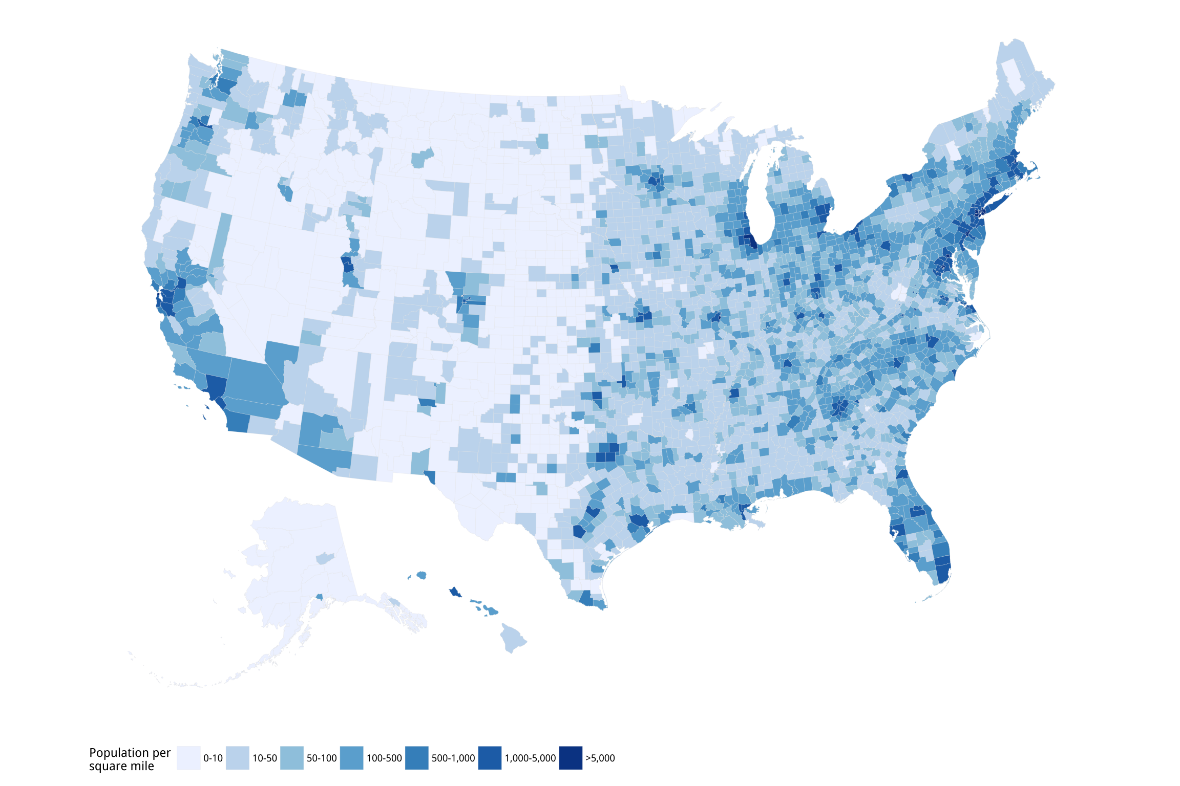
If you try out the p1 object you will see that ggplot produces a legible map, but by default it chooses an unordered categorical layout. This is because the pop_dens variable is not ordered. We could recode it so that R is aware of the ordering. Alternatively, we can manually supply the right sort of scale using the scale_fill_brewer() function, together with a nicer set of labels. We will learn more about this scale function in the next chapter. We also tweak how the legend is drawn using the guides() function to make sure each element of the key appears on the same row. Again, we will see this use of guides() in more detail in the next chapter. The use of coord_equal() makes sure that the relative scale of our map does not change even if we alter the overall dimensions of the plot.
We can now do exactly the same thing for our map of percent Black
population by county. Once again, we specify a palette for the fill
mapping using scale_fill_brewer(), this time choosing a different
range of hues for the map.
p <- ggplot(data = county_full,
            mapping = aes(x = long, y = lat, fill = pct_black,
                          group = group))
p1 <- p + geom_polygon(color = "gray90", size = 0.05) + coord_equal()
p2 <- p1 + scale_fill_brewer(palette="Greens")

p2 + labs(fill = "US Population, Percent Black") +
    guides(fill = guide_legend(nrow = 1)) +
    theme_map() + theme(legend.position = "bottom")
Figure 7.12: Percent Black population by county.
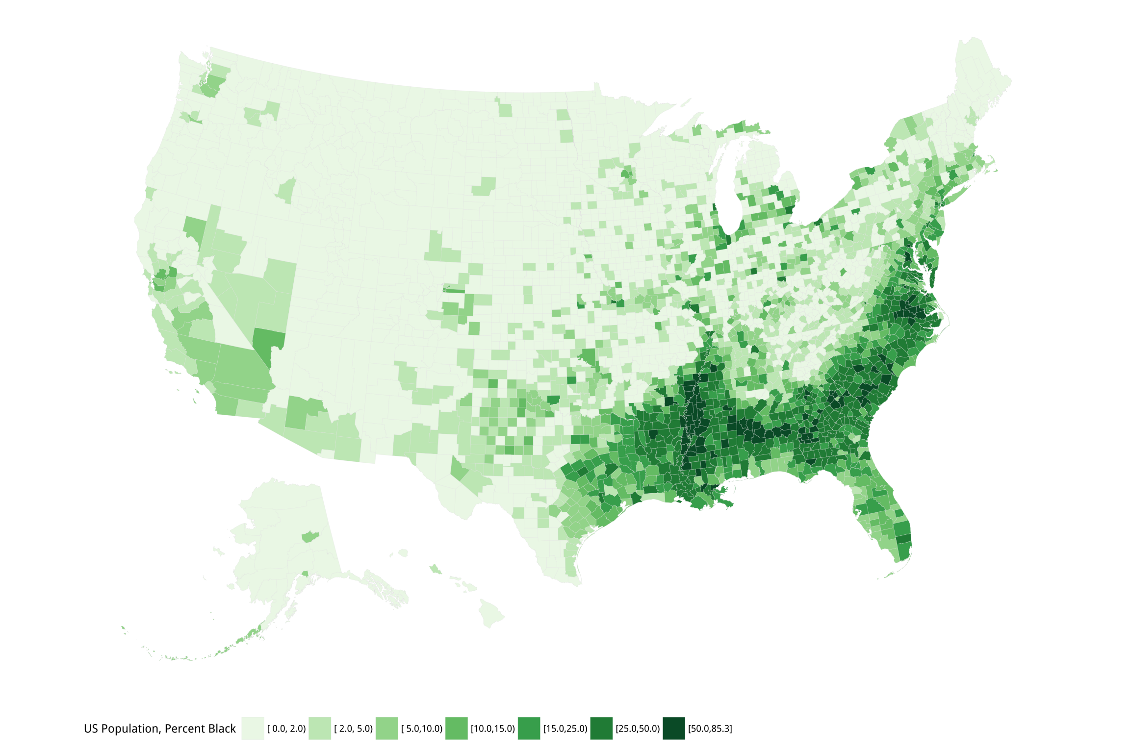
Figures 7.11 and 7.12 are America’s “ur-choropleths”. Between the two of them, population density and percent Black will do a lot to obliterate many a suggestively-patterned map of the United States. These two variables aren’t explanations of anything in isolation, but if it turns out that it is more useful to know one or both of them instead of the thing you’re plotting, you probably want to reconsider your theory.
As an example of the problem in action, let’s draw two new
county-level choropleths. The first is an effort to replicate a
poorly-sourced but widely-circulated county map of firearm-related
suicide rates in the United States. The su_gun6 variable in
county_data (and county_full) is a measure of the rate of all
firearm-related suicides between 1999 and 2015. The rates are binned
into six categories. We have a pop_dens6 variable that divides the
population density into six categories, too.
We first draw a map with the su_gun6 variable. We will match the
color palettes between the maps, but for the population map we will
flip our color scale around so that less populated areas are shown in
a darker shade. We do this by using a function from the RColorBrewer
library to manually create two palettes. The rev() function used
here reverses the order of a vector.
orange_pal <- RColorBrewer::brewer.pal(n = 6, name = "Oranges")
orange_pal
## [1] "#FEEDDE" "#FDD0A2" "#FDAE6B" "#FD8D3C" "#E6550D"
## [6] "#A63603"orange_rev <- rev(orange_pal)
orange_rev## [1] "#A63603" "#E6550D" "#FD8D3C" "#FDAE6B" "#FDD0A2"
## [6] "#FEEDDE"The brewer.pal() function produces evenly-spaced color schemes to
order from any one of several named palettes. The colors are specified
in hexadecimal format. Again, we will learn more about color
specifications and how to manipulate palettes for mapped variables in
Chapter 8.
gun_p <- ggplot(data = county_full,
            mapping = aes(x = long, y = lat,
                          fill = su_gun6,
                          group = group))

gun_p1 <- gun_p + geom_polygon(color = "gray90", size = 0.05) + coord_equal()

gun_p2 <- gun_p1 + scale_fill_manual(values = orange_pal)

gun_p2 + labs(title = "Gun-Related Suicides, 1999-2015",
              fill = "Rate per 100,000 pop.") +
    theme_map() + theme(legend.position = "bottom")
Having drawn the gun plot, we use almost exactly the same code to draw the reverse-coded population density map.
pop_p <- ggplot(data = county_full, mapping = aes(x = long, y = lat,
                                                  fill = pop_dens6,
                                                  group = group))

pop_p1 <- pop_p + geom_polygon(color = "gray90", size = 0.05) + coord_equal()

pop_p2 <- pop_p1 + scale_fill_manual(values = orange_rev)

pop_p2 + labs(title = "Reverse-coded Population Density",
              fill = "People per square mile") +
    theme_map() + theme(legend.position = "bottom")
It’s clear that the two maps are not identical. However, the visual impact of the first has a lot in common with the second. The dark bands in the West (except for California) stand out, and fade as we move toward the center of the country. There are some strong similarities elsewhere on the map too, such as in the Northeast.
The gun-related suicide measure is already expressed as a rate. It is the number of qualifying deaths in a county, divided by that county’s population. Normally, we standardize in this way to “control for” the fact that larger populations will tend to produce more gun-related suicides just because they have more people in them. However, this sort of standardization has its limits. In particular, when the event of interest is not very common, and there is very wide variation in the base size of the units, then the denominator (e.g., the population size) starts to be expressed more and more in the standardized measure.
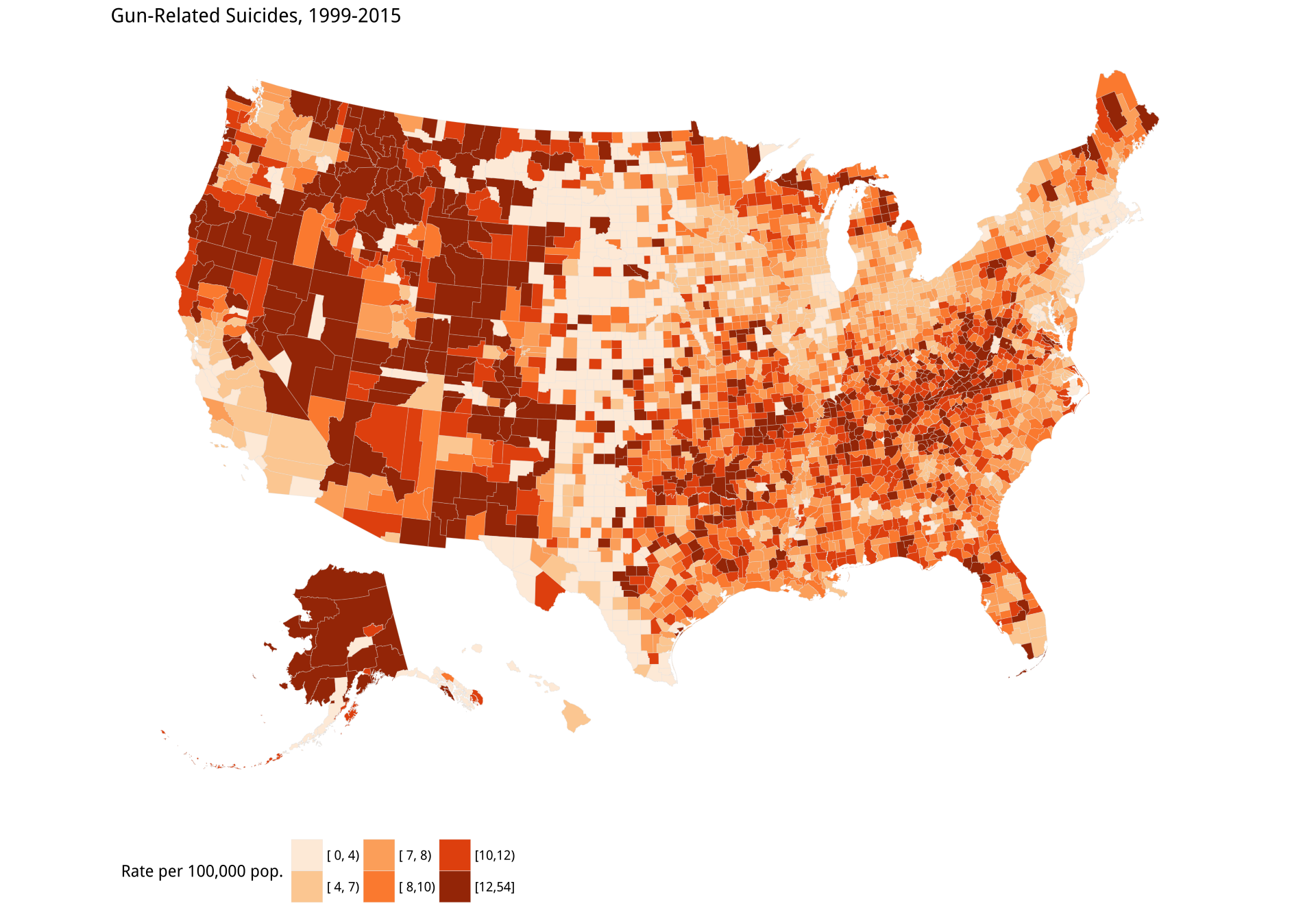
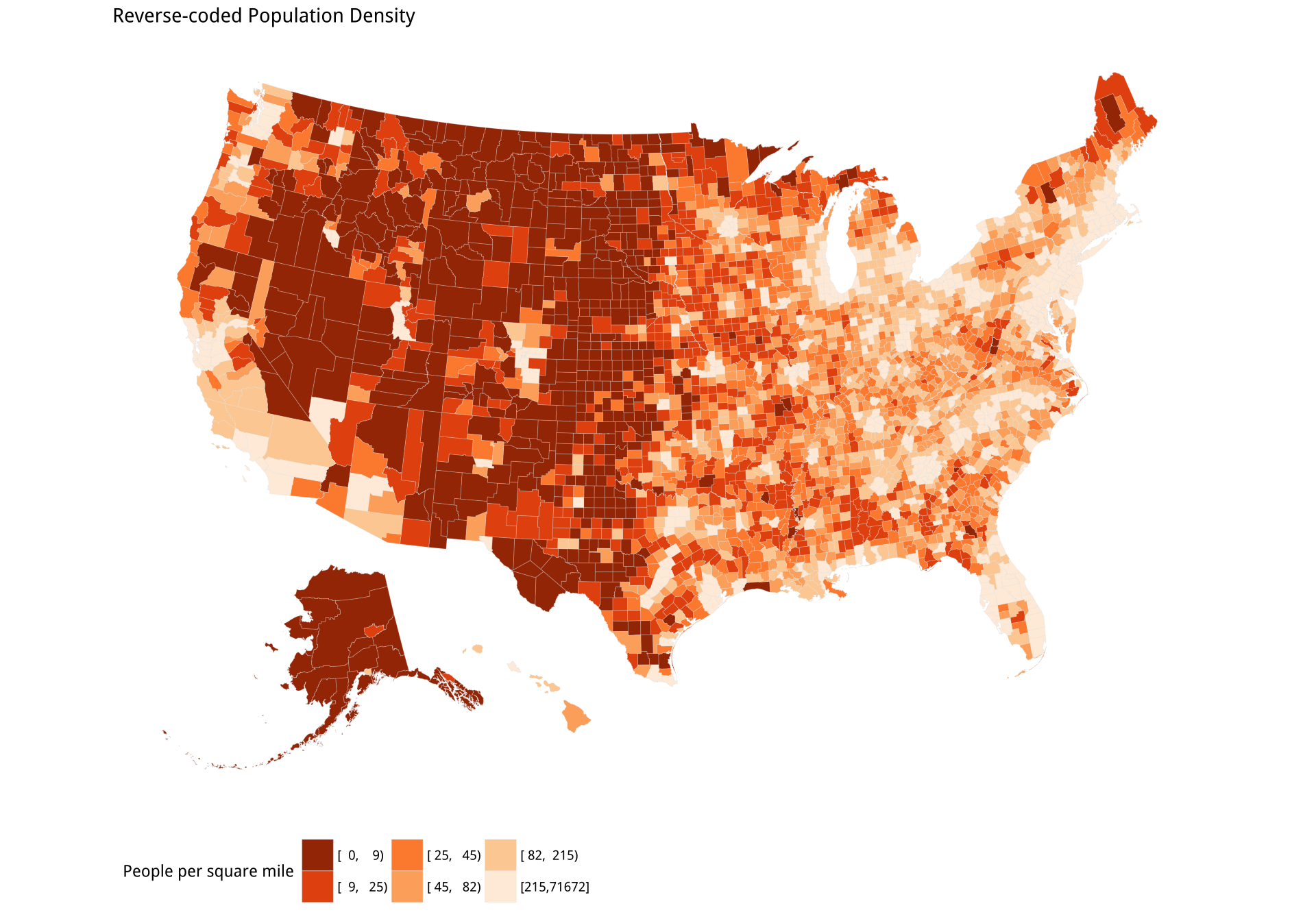
Figure 7.13: Gun-related suicides by county; Reverse-coded population density by county. Before tweeting this picture, please read the text for discussion of what is wrong with it.
Third, and more subtly, the data is subject to reporting constraints connected to population size. If there are fewer than ten events per year for a cause of death, the Centers for Disease Control (CDC) will not report them at the county level because it might be possible to identify particular deceased individuals. Assigning data like this to bins creates a threshold problem for choropleth maps. Look again Figure 7.13. The gun-related suicides panel seems to show a north-south band of counties with the lowest rate of suicides running from the Dakotas down through Nebraska, Kansas, and into West Texas. Oddly, this band borders counties in the West with the very highest rates, from New Mexico on up. But from the density map we can see that many counties in both these regions have very low population densities. Are they really that different in their gun-related suicide rates?
Probably not. More likely, we are seeing an artifact arising from how the data is coded. For example, imagine a county with 100,000 inhabitants that experiences nine gun-related suicides in a year. The CDC will not report this number. Instead it will be coded as “suppressed”, accompanied by a note saying any standardized estimates or rates will also be unreliable. But if we are determined to make a map where all the counties are colored in, we might be tempted to put any suppressed results into the lowest bin. After all, we know that the number is somewhere between zero and ten. Why not just code it as zero?Do not do this. One standard alternative is to estimate the suppressed observations using a count model. An approach like this might naturally lead to more extensive, properly spatial modeling of the data. Meanwhile, a county with 100,000 inhabitants that experiences twelve gun-related suicides a year will be numerically reported. The CDC is a responsible organization, and so although it provides the absolute number of deaths for all counties above the threshold, the notes to the data file will still warn you that any rate calculated with this number will be unreliable. If we push ahead and do it anyway, then 12 deaths in a small population might well put a sparsely-populated county in the highest category of suicide rate. Meanwhile, a low-population counties just under that threshold would be coded as being in the lowest (lightest) bin. But in reality they might not be so different, and in any case efforts to quantify that difference will be unreliable. If estimates for these counties cannot be obtained directly or estimated with a good model, then it is better to drop those cases as missing, even at the cost of your beautiful map, than have large areas of the country painted with a color derived from an unreliable number.
Small differences in reporting, combined with miscoding, will produce spatially misleading and substantively mistaken results. It might seem that focusing on the details of variable coding in this particular case is a little too much in the weeds for a general introduction. But it is exactly these details that can dramatically alter the appearance of any graph, but especially maps, in a way that can be hard to detect after the fact.
7.3 Statebins
As an alternative to state-level choropleths, we can consider
statebins, using a package developed by Bob Rudis. We will use it to
look again at our state-level election results. Statebins is similar
to ggplot but has a slightly different syntax from the one we’re used
to. It needs several arguments including the basic data frame (the
state_data argument), a vector of state names (state_col), and the
value being shown (value_col). In addition, we can optionally tell
it the color palette we want to use and the color of the text to label
the state boxes. For a continuous variable we can use
statebins_continuous(), as follows:
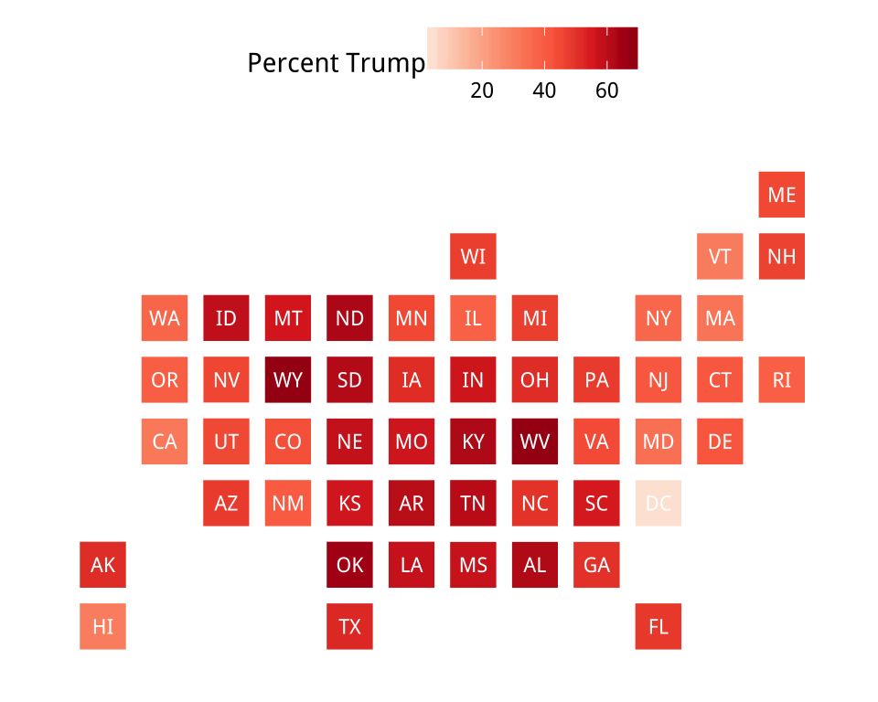
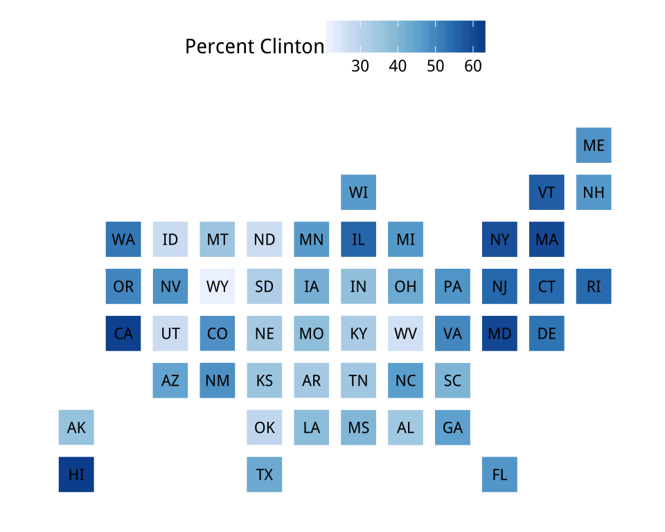 Figure 7.14: Statebins of the election results. We omit DC from the Clinton map to prevent the scale becoming unbalanced.
library(statebins)

statebins_continuous(state_data = election, state_col = "state",
                     text_color = "white", value_col = "pct_trump",
                     brewer_pal="Reds", font_size = 3,
                     legend_title="Percent Trump")

statebins_continuous(state_data = subset(election, st %nin% "DC"),
                     state_col = "state",
                     text_color = "black", value_col = "pct_clinton",
                     brewer_pal="Blues", font_size = 3,
                     legend_title="Percent Clinton")
Sometimes we will want to present categorical data. If our variable is
already cut into categories we can use statebins_manual() to
represent it. Here add a new variable to the election data called
color, just mirroring party names with two appropriate color names.
We do this because we need to specify the colors we are using by way
of a variable in the data frame, not as a proper mapping. We tell the
statebins_manual() function that the colors are contained in column
named color.
Alternatively, we can have statebins() cut the data for us using the
breaks argument, as in the second plot.
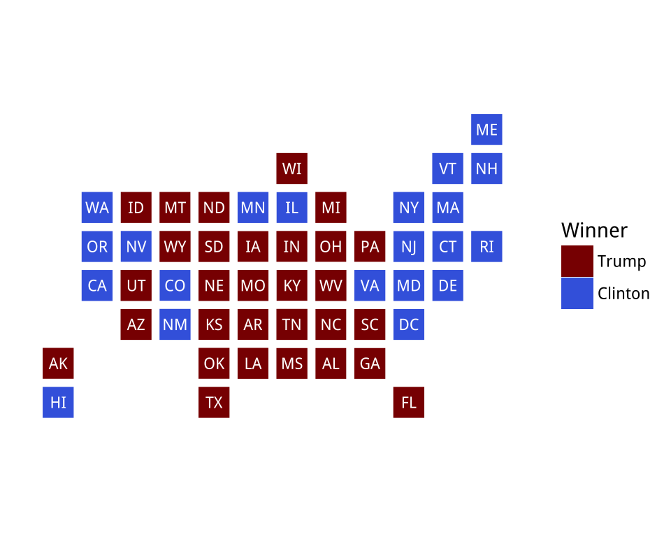
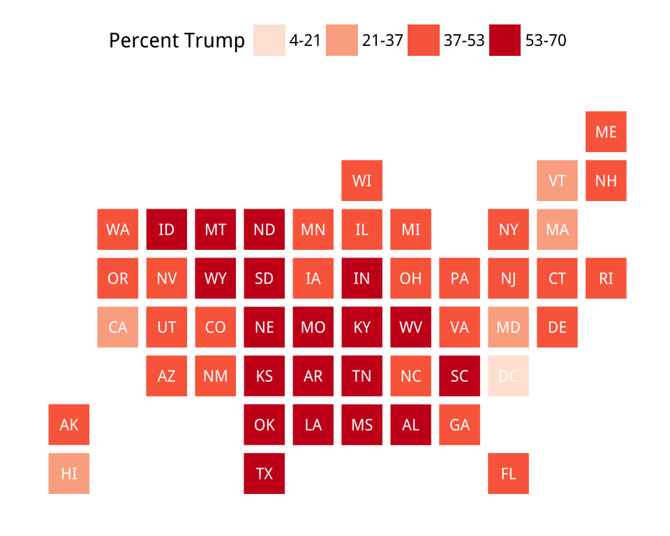 Figure 7.15: Manually specifying colors for statebins.
election <- election %>% mutate(color = recode(party, Republican = "darkred",
                                               Democrat = "royalblue"))

statebins_manual(state_data = election, state_col = "st",
                 color_col = "color", text_color = "white",
                 font_size = 3, legend_title="Winner",
                 labels=c("Trump", "Clinton"), legend_position = "right")

statebins(state_data = election,
          state_col = "state", value_col = "pct_trump",
          text_color = "white", breaks = 4,
          labels = c("4-21", "21-37", "37-53", "53-70"),
          brewer_pal="Reds", font_size = 3, legend_title="Percent Trump")
7.4 Small-multiple maps
Sometimes we have geographical data with repeated observations over time. A common case is to have a country- or state-level measure observed over a period of years. In these cases, we might want to make a small multiple map to show changes over time. For example, the opiates data has state-level measures of the death rate from opiate-related causes (such as heroin or fentanyl overdoses) between 1999 and 2014.
opiates## # A tibble: 800 x 11
## year state fips deaths population crude adjusted
## <int> <chr> <int> <int> <int> <dbl> <dbl>
## 1 1999 Alabama 1 37 4430141 0.800 0.800
## 2 1999 Alaska 2 27 624779 4.30 4.00
## 3 1999 Arizona 4 229 5023823 4.60 4.70
## 4 1999 Arkansas 5 28 2651860 1.10 1.10
## 5 1999 California 6 1474 33499204 4.40 4.50
## 6 1999 Colorado 8 164 4226018 3.90 3.70
## 7 1999 Connecticut 9 151 3386401 4.50 4.40
## 8 1999 Delaware 10 32 774990 4.10 4.10
## 9 1999 District o… 11 28 570213 4.90 4.90
## 10 1999 Florida 12 402 15759421 2.60 2.60
## # ... with 790 more rows, and 4 more variables:
## # adjusted_se <dbl>, region <ord>, abbr <chr>,
## # division_name <chr>As before, we can take our us_states object, the one with the state-level map details, and merge it with our opiates dataset. As before, we convert the State variable in the opiates data to lower-case first, to make the match work properly.
opiates$region <- tolower(opiates$state)
opiates_map <- left_join(us_states, opiates)
Because the opiates data includes the Year variable, we are now in
a position to make a faceted small-multiple with one map for each year
in the data. The following chunk of code is similar to the single
state-level maps we have drawn so far. We specify the map data as
usual, adding geom_polygon() and coord_map() to it, with the arguments those
functions need. Instead of cutting our data into bins we will plot the continuous values for the adjusted death rate variable (adjusted) directly.If you want to experiment with cutting the data in to groups on the fly, take a look at the cut_interval() function. To help plot this variable effectively, we will use a new scale function from the viridis library. The viridis colors run in low-to-high sequences and do a very good
job of combining perceptually uniform colors with easy-to-see,
easily-contrasted hues along their scales. The viridis library provides continuous and discrete versions, both in several alternatives. Some balanced palettes can be a little washed out at their lower end, especially, but the viridis palettes avoid this. In this code, the _c_ suffix in the scale_fill_viridis_c() function signals that it is the scale for continuous data. There is a scale_fill_viridis_d() equivalent for discrete data.
We facet the maps just like any other small-multiple with facet_wrap(). We use the theme()
function to put the legend at the bottom and remove the default shaded
background from the year labels. We will learn more about this use of
the theme() function in Chapter 8. The final map is
shown in Figure 7.16.
library(viridis)

p0 <- ggplot(data = subset(opiates_map, year > 1999),
             mapping = aes(x = long, y = lat,
                 group = group,
                 fill = adjusted))

p1 <- p0 + geom_polygon(color = "gray90", size = 0.05) +
    coord_map(projection = "albers", lat0 = 39, lat1 = 45)

p2 <- p1 + scale_fill_viridis_c(option = "plasma")

p2 + theme_map() + facet_wrap(~ year, ncol = 3) +
    theme(legend.position = "bottom",
          strip.background = element_blank()) +
    labs(fill = "Death rate per 100,000 population ",
title = "Opiate Related Deaths by State, 2000-2014") 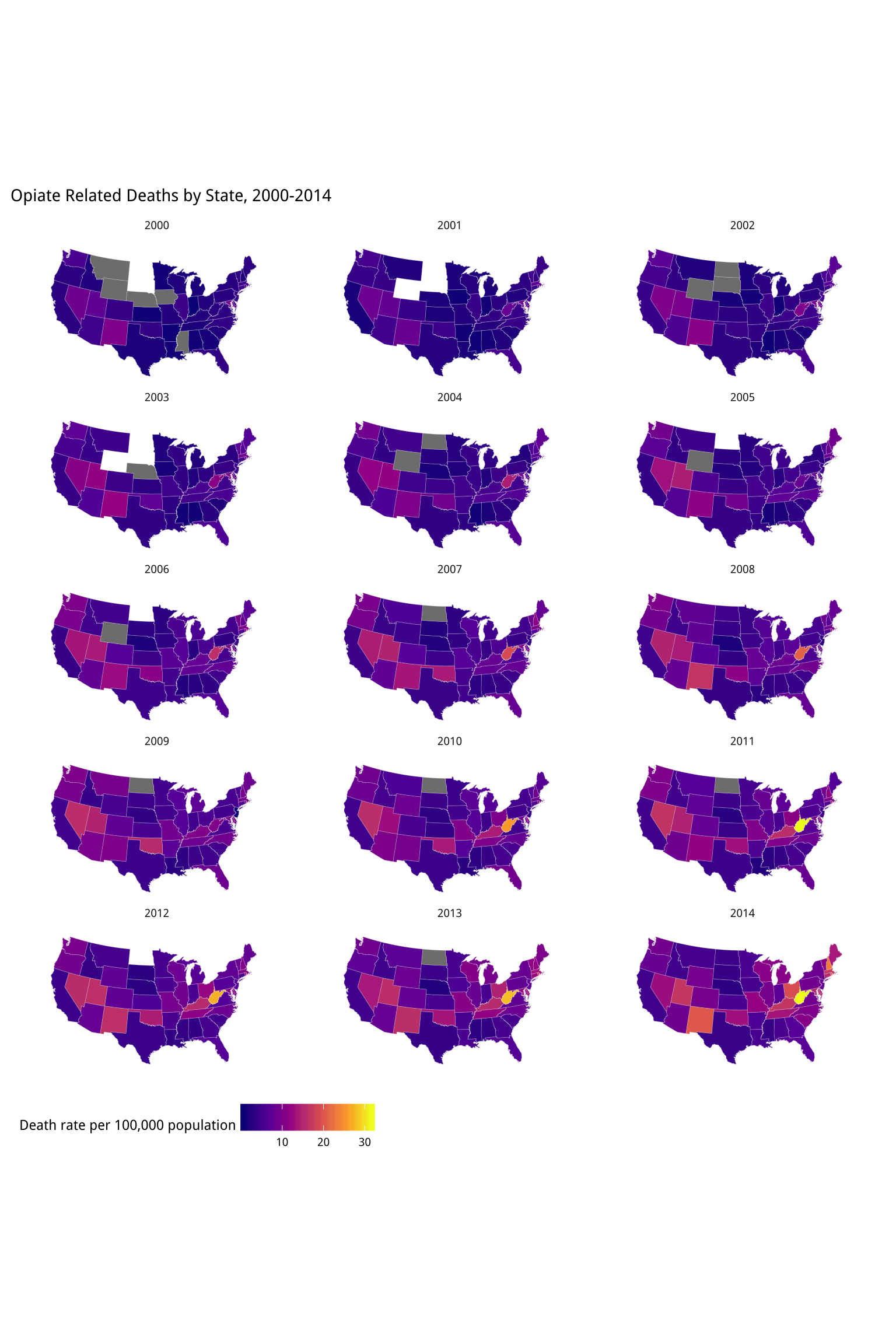
Figure 7.16: A small multiple map. States in grey reported too few deaths for a reliable population estimate in that year. States in white reported no data.
Is this a good way to visualize this data?Try revisiting your code for the ur-choropleths, but use continuous rather than binned measures, as well as the viridis palette. Instead of pct_black use the black variable. For the population density, divide pop by land_area. You will need to adjust the scale_ functions. How do the maps compare to the binned versions? What happens to the population density map, and why? As we discussed above,
choropleth maps of the U.S. tend to track first the size of the local
population and secondarily the percent of the population that is
African-American. The differences in the geographical size of states
makes spotting changes more difficult again. And it is quite difficult
to compare repeatedly across spatial regions. The repeated measures do
mean that some comparison is possible, and the strong trends for this
data make things a little easier to see. In this case, a casual viewer
might think, for example, that the opiod crisis was worst
in the desert southwest in comparison to many other parts of the
country, although it also seems that something serious is happening in
the Appalachians.
7.5 Is your data really spatial?
As we noted at the beginning of the Chapter, even if our data is collected via or grouped into spatial units, it is always worth asking whether a map is the best way to present it. Much county- state- and national data is not properly spatial, insofar as it is really about individuals (or some other unit of interest) rather than the geographical distribution of those units per se. Let’s take our state-level opiates data and redraw it as a time-series plot. We will keep the state-level focus (these are state-level rates, after all), but try to make the trends more directly visible.
We could just plot the trends for every state, as we did at the very
beginning with the gapminder data. But fifty states is too many
lines to keep track of at once.
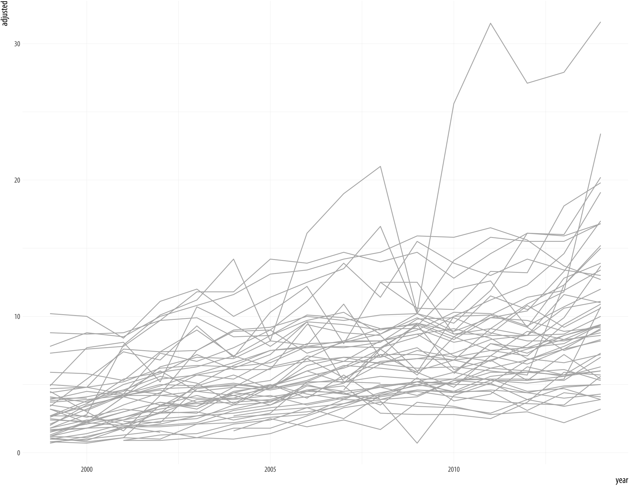 Figure 7.17: All the states at once.
p <- ggplot(data = opiates,
            mapping = aes(x = year, y = adjusted,
                          group = state))
p + geom_line(color = "gray70")
A more informative approach is to take advantage of the geographical
structure of the data by using the census regions to group the States.
Imagine a faceted plot showing state-level trends within each region
of the country, perhaps with a trend line for each region. To do this,
we will take advantage of ggplot’s ability to layer geoms one on top
of another, using a different dataset in each case. We begin by taking
the opiates data (removing Washington DC, as it is not a state), and
plotting the adjusted death rate over time.
p0 <- ggplot(data = drop_na(opiates, division_name),
            mapping = aes(x = year, y = adjusted))

p1 <- p0 + geom_line(color = "gray70",
              mapping = aes(group = state))
The drop_na() function deletes rows that have observations missing on the specified variables, in this case just division_name, because Washington DC is not part of any Census Division. We map the group aesthetic to state in geom_line(), which gives
us a line plot for every state. We use the color argument in to set
the lines to a light gray. Next, we add a smoother:
p2 <- p1 + geom_smooth(mapping = aes(group = division_name),
                       se = FALSE)
For this geom we set the group aesthetic to division_name. (Division is a smaller Census classification than Region.) If we set it to state we would get fifty separate smoothers in addition to our fifty trend lines. Then, using what we learned in Chapter 4, we add a geom_text_repel() object that puts the label for each state at the
end of the series. Because we are labeling lines rather than points,
we only want the state label to appear at the end of the line. The
trick is to subset the data so that only the points the last year
observed are used (and thus labeled). We also must remember to remove
Washington DC again here, as the new data argument supersedes the
original one in p0.
p3 <- p2 + geom_text_repel(data = subset(opiates,
                                         year == max(year) & abbr !="DC"),
                     mapping = aes(x = year, y = adjusted, label = abbr),
                     size = 1.8, segment.color = NA, nudge_x = 30) +
         coord_cartesian(c(min(opiates$year),
                    max(opiates$year)))
By default, geom_text_repel will at little line segments that
indicate what the labels refer to. But that is not helpful here, as we
are already dealing with the end point of a line. So we turn them off
with the argument segment.color = NA. We also bump the labels off to
the right of the lines a little, using the nudge_x argument, and use
coord_cartesian() to set the axis limits so that there is enough
room for them.
Finally, we facet the results by Census Division and add our labels. A
useful adjustment is to reorder the panels by the average death rate.
We put a minus in front of adjusted to that the divisions with the
highest average rates appear in the chart first.
p3 + labs(x = "", y = "Rate per 100,000 population",
       title = "State-Level Opiate Death Rates by Census Division, 1999-2014") +
    facet_wrap(~ reorder(division_name, -adjusted, na.rm = TRUE), nrow  = 3)
Our new plot brings out much of the overall story that is in the maps, but also shifts the emphasis a bit. It is easier to see more clearly what is happening in some parts of the country. In particular you can see the climbing numbers in New Hampshire, Rhode Island, Massachussetts, and Connecticut. You can more easily see the state-level differences in the West, for instance between Arizona, on the one hand, and New Mexico or Utah on the other. And as was also visible on the maps, the astonishingly rapid rise in West Virginia’s death rate is also evident. Finally, the time-series plots are better at conveying the diverging trajectories of various states within regions. There is a lot more variance at the end of the series than at the beginning, especially in the Northeast, Midwest, and South, and while this can be inferred from the maps it is easier to see in the trend plots.
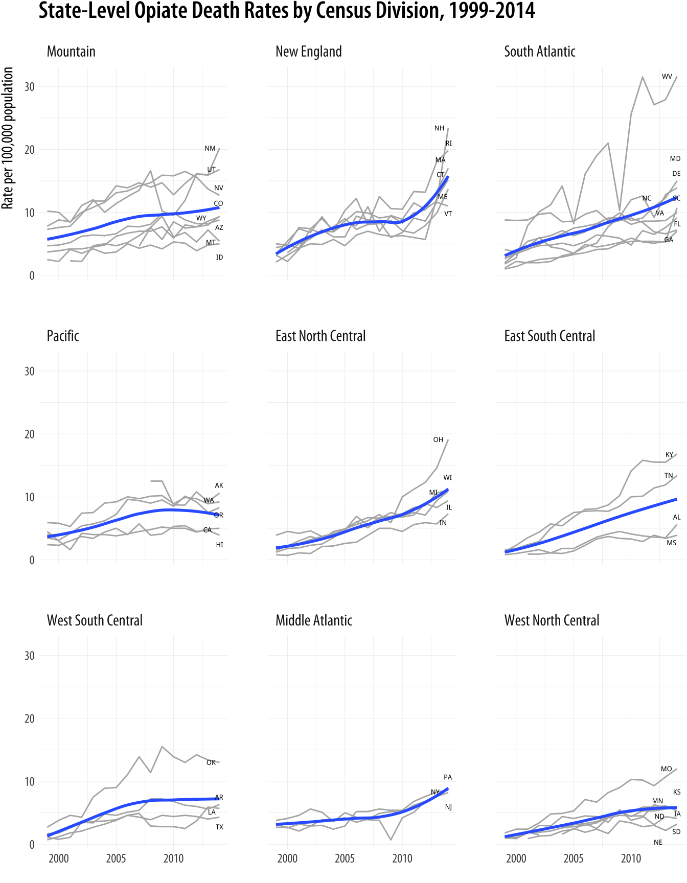
Figure 7.18: The opiate data as a faceted time-series.
The unit of observation in this graph is still the state-year. The geographically-bound nature of the data never goes away. The lines we draw still represent states. Thus, the basic arbitrariness of the representation cannot be made to disappear. In some sense, an ideal dataset here would be collected at some much more fine-grained level of unit, time, and spatial specificity. Imagine individual-level data with arbitrarily precise information on personal characteristics, times, and location of death. In a case like that, we could then aggregate up to any categorical, spatial, or temporal units we liked. But data like that is extremely rare, often for very good reasons that range from practicality of collection to the privacy of individuals. In practice we need to take care not to commit a kind of fallacy of misplaced concreteness that mistakes the unit of observation for the thing of real substantive or theoretical interest. This is a problem for most kinds of social-scientific data. But their striking visual character makes maps perhaps more vulnerable to this problem than other kinds of visualization.
7.6 Where to go next
In this chapter, we learned how to begin work with state-level and county-level data organized by FIPS codes. But this barely scratches the surface of visualization where spatial features and distributions are the main focus. The analysis and visualization of spatial data is its own research area, with its own research disciplines in Geography and Cartography. Concepts and methods for representing spatial features are both well-developed and standardized. Until recently, most of this functionality was accessible only through dedicated Geographical Information Systems. Their mapping and spatial analysis features were not well connected. Or at least, they were not conveniently connected to software oriented to the analysis of tabular data.
This is changing fast. Brundson & Comber (2015) provide an
introduction to some of R’s mapping capabilities. Meanwhile, very recently these
tools have become much more easily accessible via the tidyverse. Of
particular interest to social scientistsr-spatial.github.io/sf/. Also see news and updates at r-spatial.org. is Edzer Pebesma’s ongoing development of the sf package, which implements the standard Simple Features data model for spatial features in a tidyverse-friendly way. Relatedly, Kyle Walker and Bob Rudis’s tigris packagegithub.com/walkerke/tigris allows for (sf-library combatible) access to the U.S. Census Bureau’s TIGER/Line shapefiles, which allow you to map data for many different
geographical, administrative, and Census-related subdivisions of the United States, as well as things roads and water features. Finally, Kyle Walker’s tidycensus packagewalkerke.github.io/tidycensus (Walker, 2018) makes it much easier to tidily get both substantive and spatial feature data from the U.S. Census and the
American Community Survey.